You're viewing version 3.7 of the OpenSearch documentation. This version is no longer maintained. For the latest version, see the current documentation. For information about OpenSearch version maintenance, see Release Schedule and Maintenance Policy.
Explore the Visualize application
The Visualize application lets you create charts, maps, tables, and other visual representations of your data using a point-and-click interface.
Prerequisites
The example on this page uses the Sample flight data dataset that is already installed in OpenSearch Playground.
If you’re using a local installation of OpenSearch Dashboards and haven’t added sample data yet, see Prepare your data.
Try it: Create a line chart with sample data
Follow these steps to use the Visualize application to create a line chart that shows flight count over time:
- In the left navigation menu, select OpenSearch Dashboards > Visualize.
- Select Create visualization.
- In the New Visualization dialog, select Line.
- In the Choose a source dialog, select opensearch_dashboards_sample_data_flights.
- Set the time filter to Last 7 days.
- Under Buckets, select Add > X-axis.
- Set Aggregation to Date Histogram and Field to timestamp.
-
Select Update. The chart displays flight count per time interval, as shown in the following image.
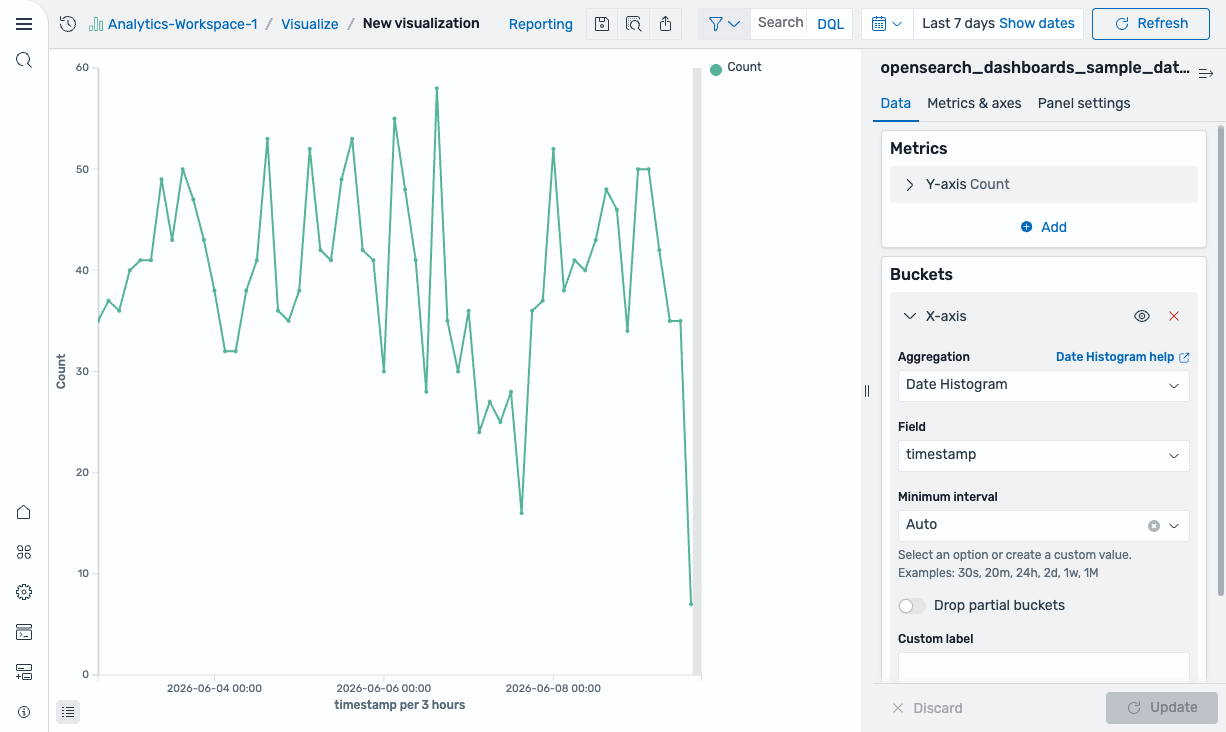
-
From the toolbar, select Save (the disk icon).
Saving is not available in the OpenSearch Playground because it is read-only.
- In the Save visualization dialog, enter
Flight count over timeas the title. - Select Save.
The visualization is saved and appears in the Visualizations list.
Further reading
- For the full Visualize reference, see Creating visualizations in the Visualize application.
- For a hands-on tutorial, see Creating aggregation-based visualizations.
Next steps
- Assemble visualizations into a dashboard using Explore the Dashboards application.