You're viewing version 3.7 of the OpenSearch documentation. This version is no longer maintained. For the latest version, see the current documentation. For information about OpenSearch version maintenance, see Release Schedule and Maintenance Policy.
Gauge visualizations
A gauge visualization displays a data field in a simulated analog instrument like a speedometer. The gauge value can be instantly compared with marked ranges or thresholds. The visualization can show a single value or multiple bucketed values.
When to use gauge visualizations
Use gauge visualizations to monitor a key indicator against an acceptable range in a dashboard.
Creating a gauge visualization
The examples on this page use the Sample flight data dataset. Before you begin, complete the prerequisites.
To create a gauge visualization, follow these steps:
-
In the New Visualization dialog, select Gauge, then select your index pattern (for example, opensearch_dashboards_sample_data_flights).
The visualization displays a gauge showing a count of the documents in the index pattern. For the
opensearch_dashboards_sample_data_flightsdata, this is13059if the date range contains all the documents. - Under Metrics, expand Metric count.
- Set Aggregation to Median and Field to FlightTimeMin.
-
Select Update.
The gauge displays
502.775, presented as the full range of gauge.If your visualization displays a different value, make sure that your time filter window is large enough to encompass all the sample flight data.
-
Now that you have some idea of the magnitude of the data, change the display range so that the displayed value falls within it.
- Select the Options tab.
-
In the Ranges panel, edit the three default ranges as follows:
From To 0 250 250 500 500 750 - Select Update.
-
To compare two different conditions in one visualization, bucket the data.
- Under Buckets, select Add > Split group.
- Set Aggregation to Terms and Field to FlightDelay.
- Select Update.
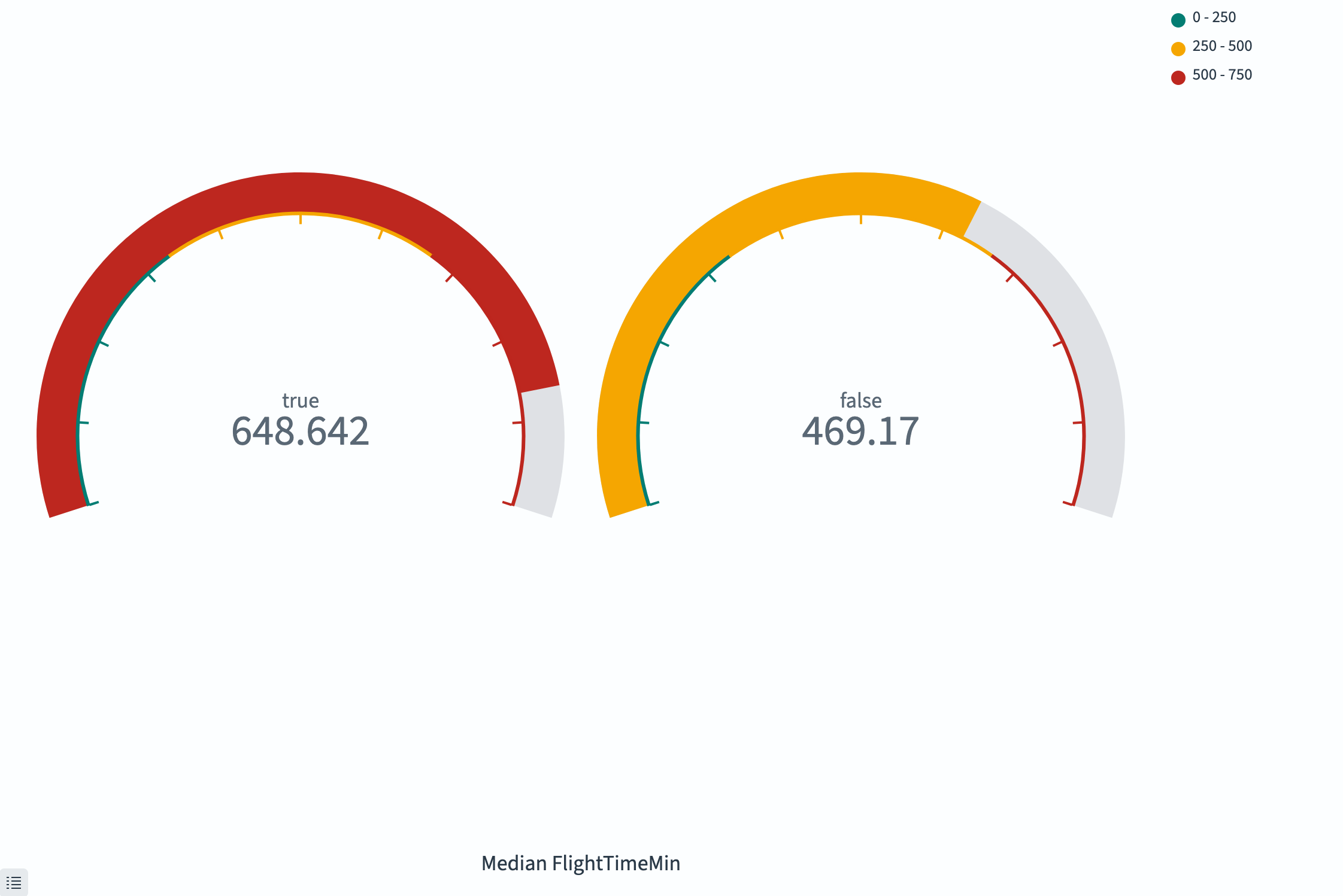
The visualization displays two gauges, with median flight times for delayed and undelayed flights, as shown in the following image.
Configuring a gauge visualization
For information about general visualization configuration, see Configuring visualizations.
Options tab
| Setting | Description |
|---|---|
| Ranges | Defines the color-coded segments of the gauge arc. Each range has a start and end value. |
| Percentage mode | When enabled, displays the value as a percentage of the maximum range value. |
| Show scale | When enabled, displays tick marks on the gauge. |
| Color options | Controls the colors assigned to each range segment. |
Next steps
- To choose a different visualization type, see Visualization types.
- To add this visualization to a dashboard, see Creating dashboards.