You're viewing version 3.7 of the OpenSearch documentation. This version is no longer maintained. For the latest version, see the current documentation. For information about OpenSearch version maintenance, see Release Schedule and Maintenance Policy.
Goal visualizations
A goal visualization displays a value in a speedometer-like gauge. It shows the value as a proportion of a predefined goal. The visualization also displays the metric, either as an absolute value or as a percentage of the goal. The visualization can show a single value or multiple bucketed values. If bucketed, the goal is the same for all buckets.
When to use goal visualizations
Use goal visualizations to monitor a key indicator against a goal value.
Creating a goal visualization
The examples on this page use the Sample flight data dataset. Before you begin, complete the prerequisites.
To create a goal visualization, follow these steps:
-
In the New Visualization dialog, select Goal, then select your index pattern (for example, opensearch_dashboards_sample_data_flights).
The visualization displays a gauge showing the document count as a percentage of a default goal of
10,000. For theopensearch_dashboards_sample_data_flightsdata, this is130.59%if the date range contains all the documents. - Under Metrics, expand Metric count.
- Set Aggregation to Sum and Field to DistanceKilometers.
-
To see how close the dataset is to recording a total of a hundred million kilometers, set 100,000,000 as the goal:
- Select the Options tab.
-
In the Ranges boxes, enter
1e8as the top of the range.Numerical entries cannot take group separators. Use exponential notation for large numbers.
- Deselect Percentage mode.
- Select Update.
The visualization displays
92,616,288.34, the sum of all flight distances in kilometers. This value shows as about 93% of the gauge maximum, which is calibrated to the goal, as shown in the following image.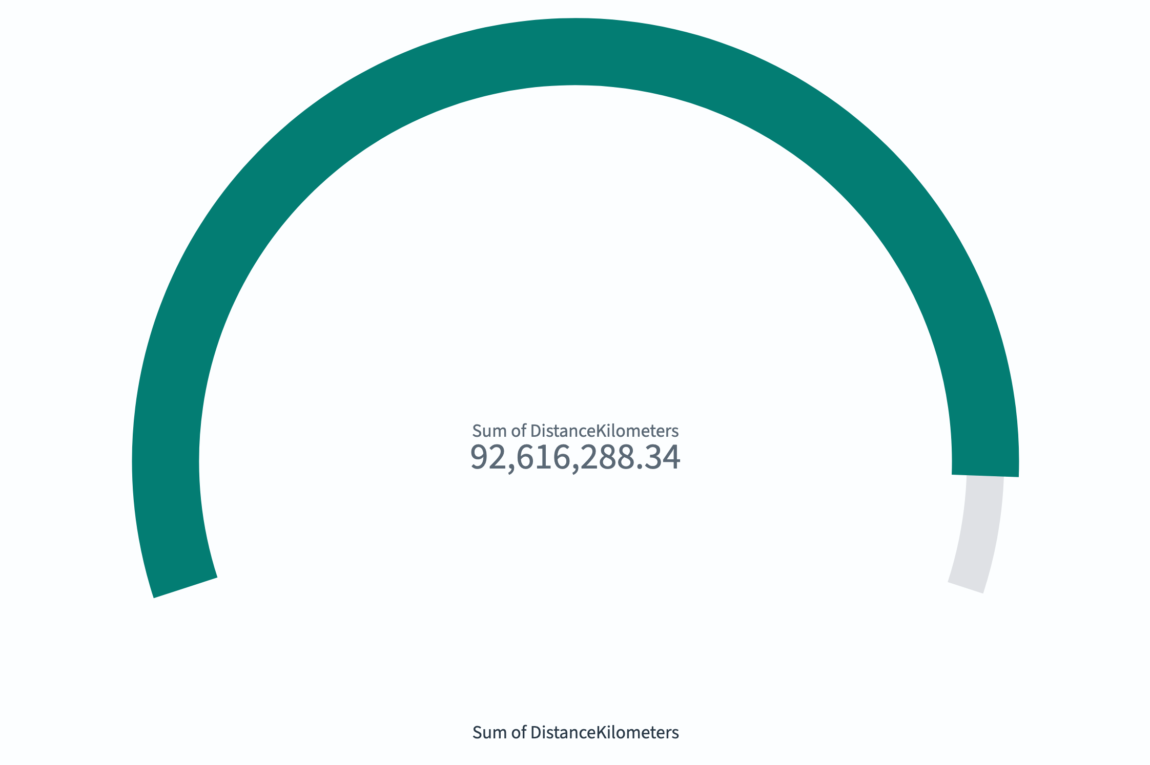
- (Optional) Combine gauge and goal displays by adding a scale as described in Gauge visualizations.
Configuring a goal visualization
For information about general visualization configuration, see Configuring visualizations.
Options tab
| Setting | Description |
|---|---|
| Ranges | Defines the target range. The maximum value represents the goal. |
| Percentage mode | When enabled, displays the value as a percentage of the goal. |
| Show scale | When enabled, displays tick marks on the progress bar. |
| Color options | Controls the colors assigned to each range segment. |
Next steps
- To choose a different visualization type, see Visualization types.
- To add this visualization to a dashboard, see Creating dashboards.