You're viewing version 3.7 of the OpenSearch documentation. This version is no longer maintained. For the latest version, see the current documentation. For information about OpenSearch version maintenance, see Release Schedule and Maintenance Policy.
Pie chart
A pie chart displays data as proportional slices of a circle, making it ideal for visualizing part-to-whole relationships.
Creating a pie chart
The following examples build on each other, starting with a basic chart and adding customization. Before you begin, complete the prerequisites.
Basic pie chart
Start with an aggregation query that counts events by category:
source = opensearch_dashboards_sample_data_flights | stats count() by Carrier
After running this query, the visualization editor maps the fields automatically:
- The Size displays the
count()field. - The Color displays the
Carrierfield.
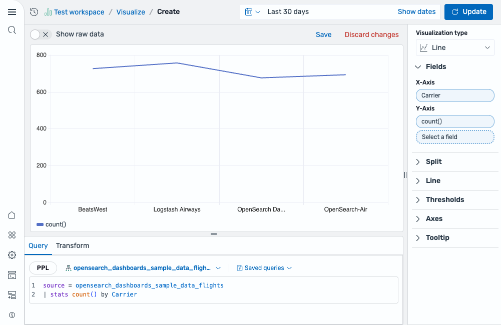
The default rendering is a Donut chart. Each airline carrier appears as a colored slice proportional to its event count, as shown in the following image.
Customizing the pie chart
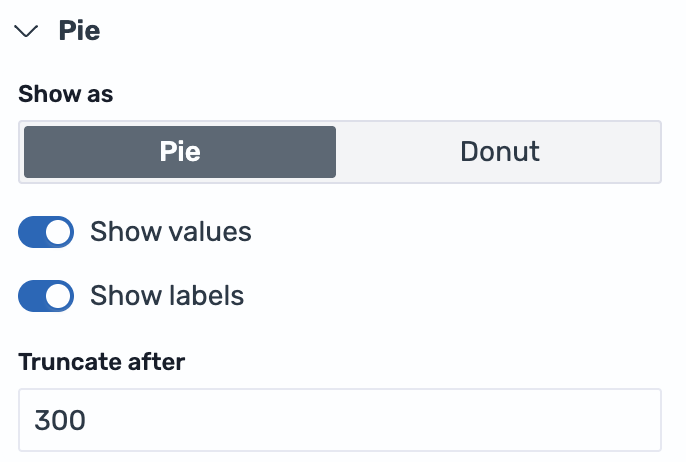
Open the Pie settings panel and configure the following options:
- Change Show as from Donut to Pie to render a full circle without a center hole.
- Enable Show values to display the count on each slice.
- Enable Show labels to display the carrier name alongside each slice.
- Set Truncate after to
300for longer label text, as shown in the following image.
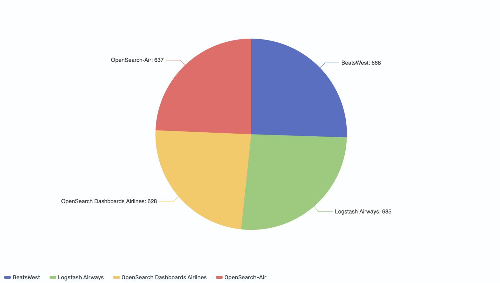
The result is a full pie chart with both category labels and numeric values displayed on each slice, as shown in the following image.
Configuring a pie chart
You can configure the following settings in the configuration panel.
Fields
In the Fields section, configure the data fields.
| Field | Description |
|---|---|
| Size | Select a numeric field that determines the size of each slice. For example, count() makes each slice proportional to the number of events in that category. |
| Color | Select a categorical field that splits the data into individual slices, each rendered in a different color. For example, use a Carrier field to display a slice for each airline. |
Split
In the Split by dropdown list, select a field to split the chart into separate elements by value. For more information, see Split.
Pie
The following table describes the pie chart settings.
| Setting | Description |
|---|---|
| Show as | Controls whether the chart renders as a full pie or a Donut (ring) shape. Donut is the default. |
| Show values | When enabled, shows the numeric value for each slice on the chart. |
| Show labels | When enabled, shows the category label for each slice on the chart. |
| Truncate after | Sets the maximum width in pixels for labels before truncation. Only visible when Show labels is enabled. |
Legend
The legend summarizes the visual color encodings used in the chart.
| Setting | Description |
|---|---|
| Show legend | Shows or hides the legend. |
| Position | Controls where the legend appears relative to the chart. Supported values: Left, Right, Top, Bottom. |
Tooltip
Toggle the Show tooltip selector to enable or disable tooltips.