You're viewing version 3.7 of the OpenSearch documentation. This version is no longer maintained. For the latest version, see the current documentation. For information about OpenSearch version maintenance, see Release Schedule and Maintenance Policy.
Histogram
A histogram displays the distribution of a numeric field by grouping values into bins (buckets) and showing the count of values in each bin as vertical bars.
Creating a histogram
The following example demonstrates a basic histogram visualization. Before you begin, complete the prerequisites.
Basic histogram
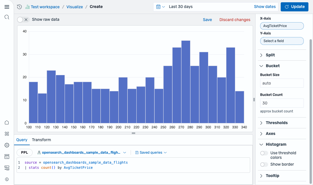
Start with a query that counts values grouped by a numeric field:
source = opensearch_dashboards_sample_data_flights | stats count() by AvgTicketPrice
After running this query, select Histogram as the chart type. The editor maps the field as follows:
- The X-Axis displays the
AvgTicketPricefield.
The result is a histogram showing the distribution of ticket prices, as shown in the following image.
Configuring a histogram
You can configure the following settings in the configuration panel.
Fields
In the Fields section, configure the fields displayed on each axis.
| Field | Description |
|---|---|
| X-Axis | Select a numeric field to distribute into buckets along the horizontal axis. |
| Y-Axis | Select a numeric field for the vertical axis. If left blank, the chart displays the count of values in each bucket. |
Split
In the Split by dropdown list, select a field to split the chart into separate elements by value. For more information, see Split.
Bucket
The following settings control how data is grouped into bins.
| Setting | Description |
|---|---|
| Bucket Size | Sets the width of each bin. Enter a numeric value or leave as auto to let the editor calculate an appropriate size. |
| Bucket count | Sets the maximum number of bins to display. |
Thresholds
For information about configuring thresholds, see Thresholds.
Axes
The X-axis and Y-axis share the same configuration options. For more information, see Axes.
Histogram
Use the following settings to customize the appearance of the histogram.
| Setting | Description |
|---|---|
| Use threshold colors | When enabled, colors bars based on threshold ranges. |
| Show border | When enabled, adds a border around each bar. |
Tooltip
Toggle the Show tooltip selector to enable or disable tooltips.