Explore the Visualize application
The Visualize application lets you create charts, maps, tables, and other visual representations of your data using a point-and-click interface.
Prerequisites
The example on this page uses the Sample flight data dataset that is already installed in OpenSearch Playground.
If you’re using a local installation of OpenSearch Dashboards and haven’t added sample data yet, see Prepare your data.
Try it: Create a line chart with sample data
Follow these steps to use the Visualize application to create a line chart that shows flight count over time:
- In the left navigation menu, select OpenSearch Dashboards > Visualize.
- Select Create visualization.
- In the New Visualization dialog, select Line.
- In the Choose a source dialog, select opensearch_dashboards_sample_data_flights.
- Set the time filter to Last 7 days.
- Under Buckets, select Add > X-axis.
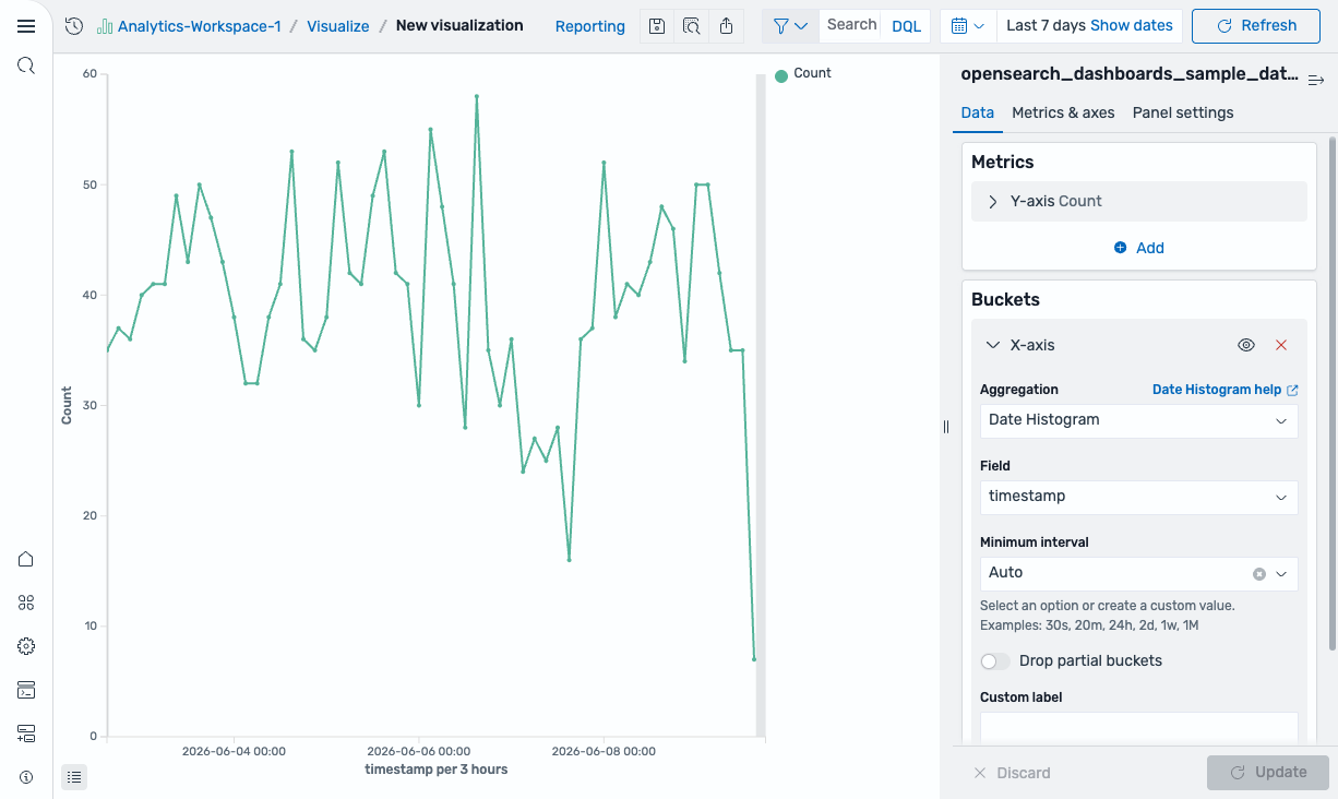
- Set Aggregation to Date Histogram and Field to timestamp.
-
Select Update. The chart displays flight count per time interval, as shown in the following image.
-
From the toolbar, select Save (the disk icon).
Saving is not available in the OpenSearch Playground because it is read-only.
- In the Save visualization dialog, enter
Flight count over timeas the title. - Select Save.
The visualization is saved and appears in the Visualizations list.
Further reading
For the full Visualize reference, see Creating visualizations in the Visualize application.
Next steps
- Assemble visualizations into a dashboard using Explore the Dashboards application.