Pie chart
A pie chart displays data as proportional slices of a circle, making it ideal for visualizing part-to-whole relationships.
Creating a pie chart
The following examples build on each other, starting with a basic chart and adding customization. Before you begin, complete the prerequisites.
Basic pie chart
Start with an aggregation query that counts events by category:
source = opensearch_dashboards_sample_data_flights | stats count() by Carrier
After running this query, the visualization editor maps the fields automatically:
- The Size displays the
count()field. - The Color displays the
Carrierfield.
The default rendering is a Donut chart. Each airline carrier appears as a colored slice proportional to its event count, as shown in the following image.

Customizing the pie chart
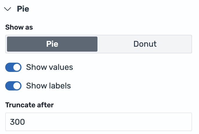
Open the Pie settings panel and configure the following options:
- Change Show as from Donut to Pie to render a full circle without a center hole.
- Enable Show values to display the count on each slice.
- Enable Show labels to display the carrier name alongside each slice.
- Set Truncate after to
300for longer label text, as shown in the following image.
The result is a full pie chart with both category labels and numeric values displayed on each slice, as shown in the following image.

Configuring a pie chart
You can configure the following settings in the configuration panel.
Fields
In the Fields section, configure the data fields.
| Field | Description |
|---|---|
| Size | Select a numeric field that determines the size of each slice. For example, count() makes each slice proportional to the number of events in that category. |
| Color | Select a categorical field that splits the data into individual slices, each rendered in a different color. For example, use a Carrier field to display a slice for each airline. |
Split
In the Split by dropdown list, select a field to split the chart into separate elements by value. For more information, see Split.
Pie
The following table describes the pie chart settings.
| Setting | Description |
|---|---|
| Show as | Controls whether the chart renders as a full pie or a Donut (ring) shape. Donut is the default. |
| Show values | When enabled, shows the numeric value for each slice on the chart. |
| Show labels | When enabled, shows the category label for each slice on the chart. |
| Truncate after | Sets the maximum width in pixels for labels before truncation. Only visible when Show labels is enabled. |
Legend
The legend summarizes the visual color encodings used in the chart.
| Setting | Description |
|---|---|
| Show legend | Shows or hides the legend. |
| Position | Controls where the legend appears relative to the chart. Supported values: Left, Right, Top, Bottom. |
Tooltip
Toggle the Show tooltip selector to enable or disable tooltips.