Goal visualizations
A goal visualization displays a value in a speedometer-like gauge. It shows the value as a proportion of a predefined goal. The visualization also displays the metric, either as an absolute value or as a percentage of the goal. The visualization can show a single value or multiple bucketed values. If bucketed, the goal is the same for all buckets.
When to use goal visualizations
Use goal visualizations to monitor a key indicator against a goal value.
Creating a goal visualization
The examples on this page use the Sample flight data dataset. Before you begin, complete the prerequisites.
To create a goal visualization, follow these steps:
-
In the New Visualization dialog, select Goal, then select your index pattern (for example, opensearch_dashboards_sample_data_flights).
The visualization displays a gauge showing the document count as a percentage of a default goal of
10,000. For theopensearch_dashboards_sample_data_flightsdata, this is130.59%if the date range contains all the documents. - Under Metrics, expand Metric count.
- Set Aggregation to Sum and Field to DistanceKilometers.
-
To see how close the dataset is to recording a total of a hundred million kilometers, set 100,000,000 as the goal:
- Select the Options tab.
-
In the Ranges boxes, enter
1e8as the top of the range.Numerical entries cannot take group separators. Use exponential notation for large numbers.
- Deselect Percentage mode.
- Select Update.
The visualization displays
92,616,288.34, the sum of all flight distances in kilometers. This value shows as about 93% of the gauge maximum, which is calibrated to the goal, as shown in the following image.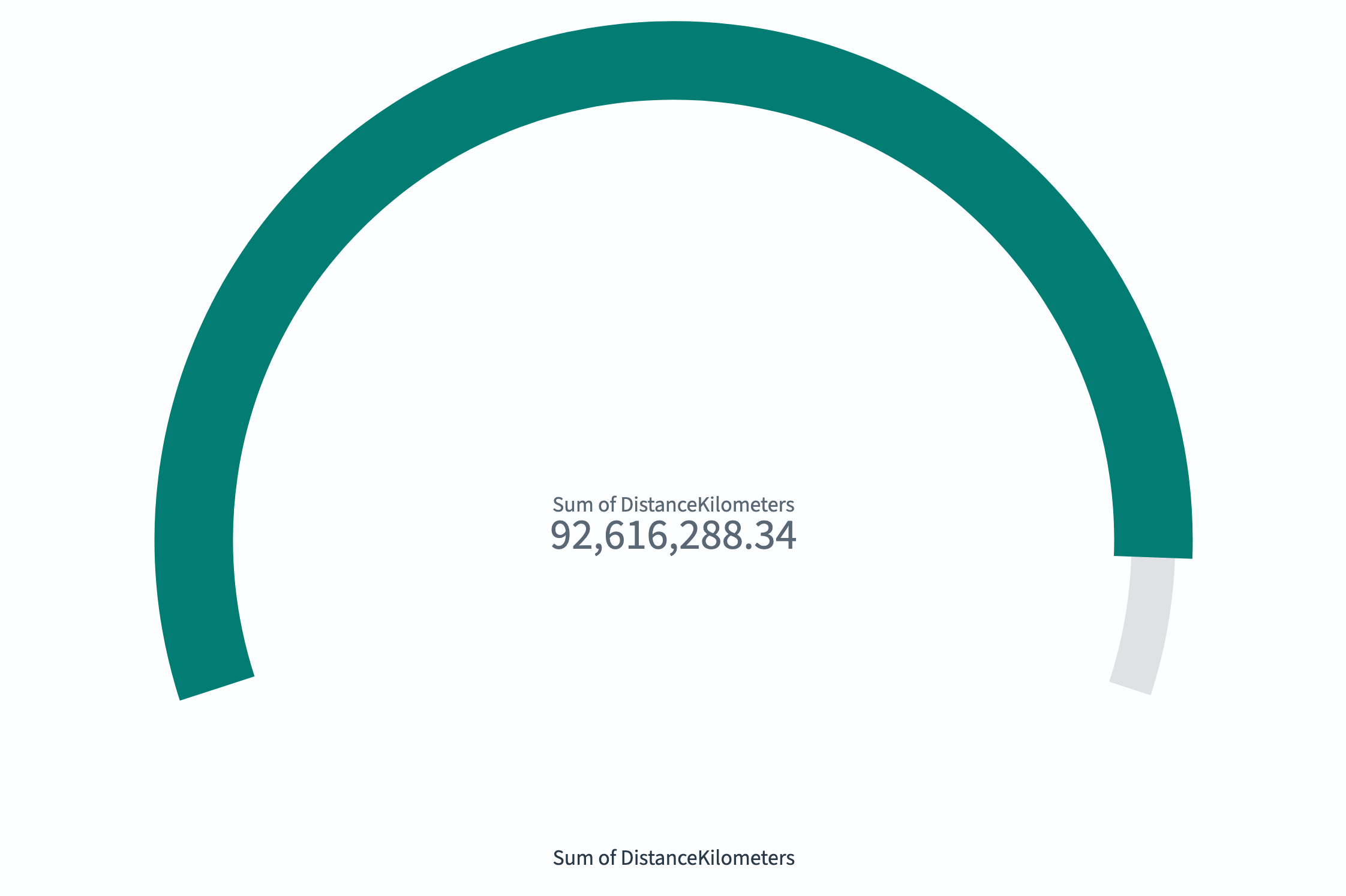
- (Optional) Combine gauge and goal displays by adding a scale as described in Gauge visualizations.
Configuring a goal visualization
For information about general visualization configuration, see Configuring visualizations.
Options tab
| Setting | Description |
|---|---|
| Ranges | Defines the target range. The maximum value represents the goal. |
| Percentage mode | When enabled, displays the value as a percentage of the goal. |
| Show scale | When enabled, displays tick marks on the progress bar. |
| Color options | Controls the colors assigned to each range segment. |
Next steps
- To choose a different visualization type, see Choosing a visualization type.
- To add this visualization to a dashboard, see Creating dashboards.