You're viewing version 3.8 of the OpenSearch documentation. This version is no longer maintained. For the latest version, see the current documentation. For information about OpenSearch version maintenance, see Release Schedule and Maintenance Policy.
Thresholds in the visualization editor
A threshold is a boundary value that, when reached or exceeded by a data point, triggers a visual change in color. Use thresholds to define meaningful ranges so that you can immediately understand whether values are within normal, warning, or critical zones.
Each threshold defines a value range. The base threshold applies to all values lower than the first threshold, and each additional threshold starts at its configured value and applies until the next threshold begins. For example, if the base color is green, a threshold at 50 is yellow, and a threshold at 80 is red, then values lower than 50 are green, values from 50 to less than 80 are yellow, and values of 80 or greater are red.
Supported chart types
Thresholds are available in the following chart types:
- Area chart
- Bar chart
- Bar gauge chart
- Gauge chart
- Heatmap
- Histogram
- Line chart
- Metric chart
- Scatter plot
- State timeline
- Table
Configuring thresholds
To add a threshold, open the Thresholds section in the configuration panel and select + Add threshold. For each threshold, configure the following settings.
| Setting | Description |
|---|---|
| Color | Select a color to apply to values that fall within this threshold’s range. Select a preset color or a custom color. |
| Value | Enter the numeric boundary at which this threshold begins. Values equal to or greater than this number (and lower than the next threshold) are displayed in this color. |
OpenSearch Dashboards automatically sorts thresholds by value. The base threshold is always present and represents the starting color for all values lower than the other thresholds. You can change the base color, but you cannot delete the base threshold or set a value for it. To delete any other threshold, select the trash icon next to it.
Threshold effects by chart type
Thresholds are applied differently depending on the chart type. Some visualizations use thresholds to color chart marks, some use thresholds as reference lines, and some require an additional chart-specific setting, such as Use threshold colors or Cell style. The following table describes how thresholds are applied in each chart type.
| Chart type | Threshold effect | Additional setting |
|---|---|---|
| Gauge | Colors the gauge arc by threshold range. When Use threshold colors is turned on, the displayed value also uses the matching threshold color. | Turn on Use threshold colors. |
| Bar gauge | Colors the bar gauge by threshold range. The visual result also depends on the selected display style, such as gradient, stack, or basic. | None. |
| Metric | Colors the metric value or background according to the metric value and the selected color mode. | Set Color mode and then turn on Use threshold colors. |
| Line and area | Displays threshold values as horizontal reference lines. The line or area mark itself does not change color. | Set Threshold lines mode to Solid lines, Dashed lines, or Dotted lines. |
| Bar and histogram | Colors bars by value range when threshold colors are turned on. You can also display threshold reference lines. | Turn on Use threshold colors to color bars. Set Threshold lines mode to display reference lines. |
| Heatmap | Colors cells by value range, overriding the selected color schema. | Turn on Use threshold colors. |
| Scatter | Colors points by value range when threshold colors are turned on. You can also display threshold reference lines. | Turn on Use threshold colors to color points. Set Threshold lines mode to display reference lines. |
| State timeline | Colors state regions by value range, overriding the value mapping colors. | Turn on Use threshold color. |
| Table | Colors numeric table cells by value range. | In Cell style, select a numeric field and then select Colored Text or Colored Background. |
State timeline charts also include settings for disconnecting values and connecting null values by a time threshold. Those settings control gaps in the timeline and do not affect the color thresholds described on this page.
Threshold examples
The following examples show how to apply thresholds to each supported chart type using the OpenSearch Dashboards sample data.
Gauge chart
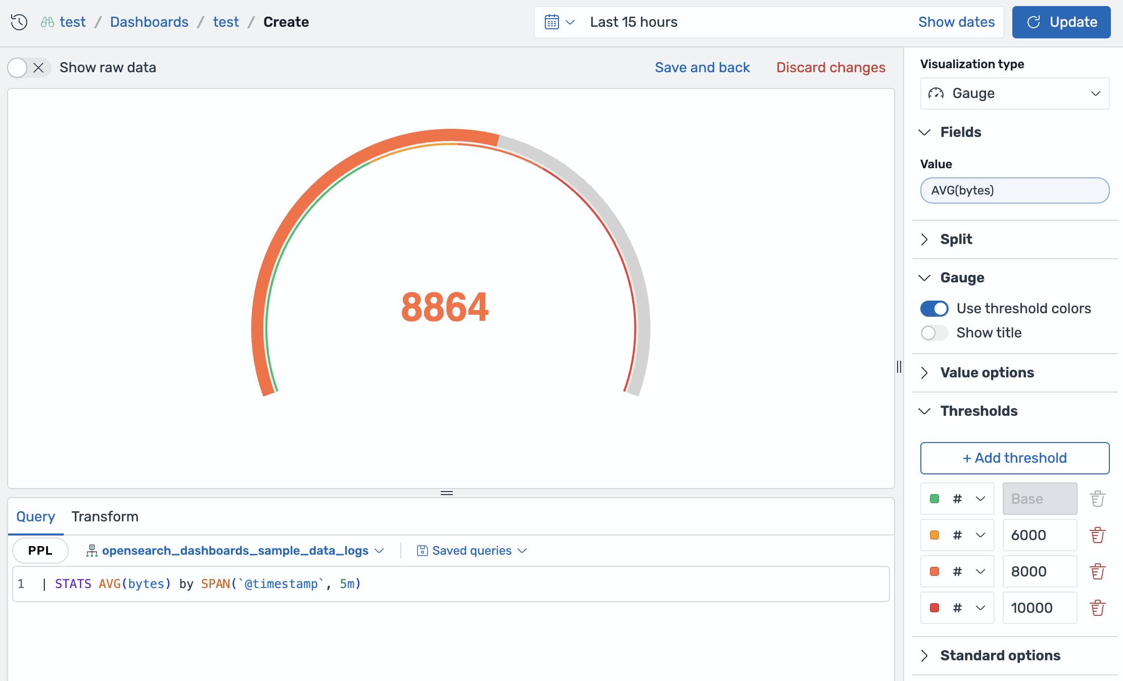
In gauge charts, thresholds color the arc directly. The Min and Max controls under Standard options define the scale range, and thresholds divide that scale into colored segments. To apply thresholds to a gauge chart, follow these steps:
- Select the
opensearch_dashboards_sample_data_logsdataset. -
Enter the following query and select Update:
| stats avg(bytes) by span(`@timestamp`, 5m) - Select Gauge as the visualization type.
- In the Gauge section, turn on Use threshold colors.
- Open the Thresholds section and select + Add threshold.
- Set the base color to green and add thresholds at
6000,8000, and10000.
The arc uses the threshold color for each range, and the displayed value uses the matching threshold color, as shown in the following image.
Bar gauge chart
In bar gauge charts, thresholds define the colored ranges of each bar. The result depends on the selected display style:
- Gradient shows a smooth transition across threshold colors.
- Stack divides the bar into distinct threshold segments.
- Basic colors the bar using the threshold range that contains the value.
To apply thresholds to a bar gauge chart, follow these steps:
- Select the
opensearch_dashboards_sample_data_logsdataset. -
Enter the following query and select Update:
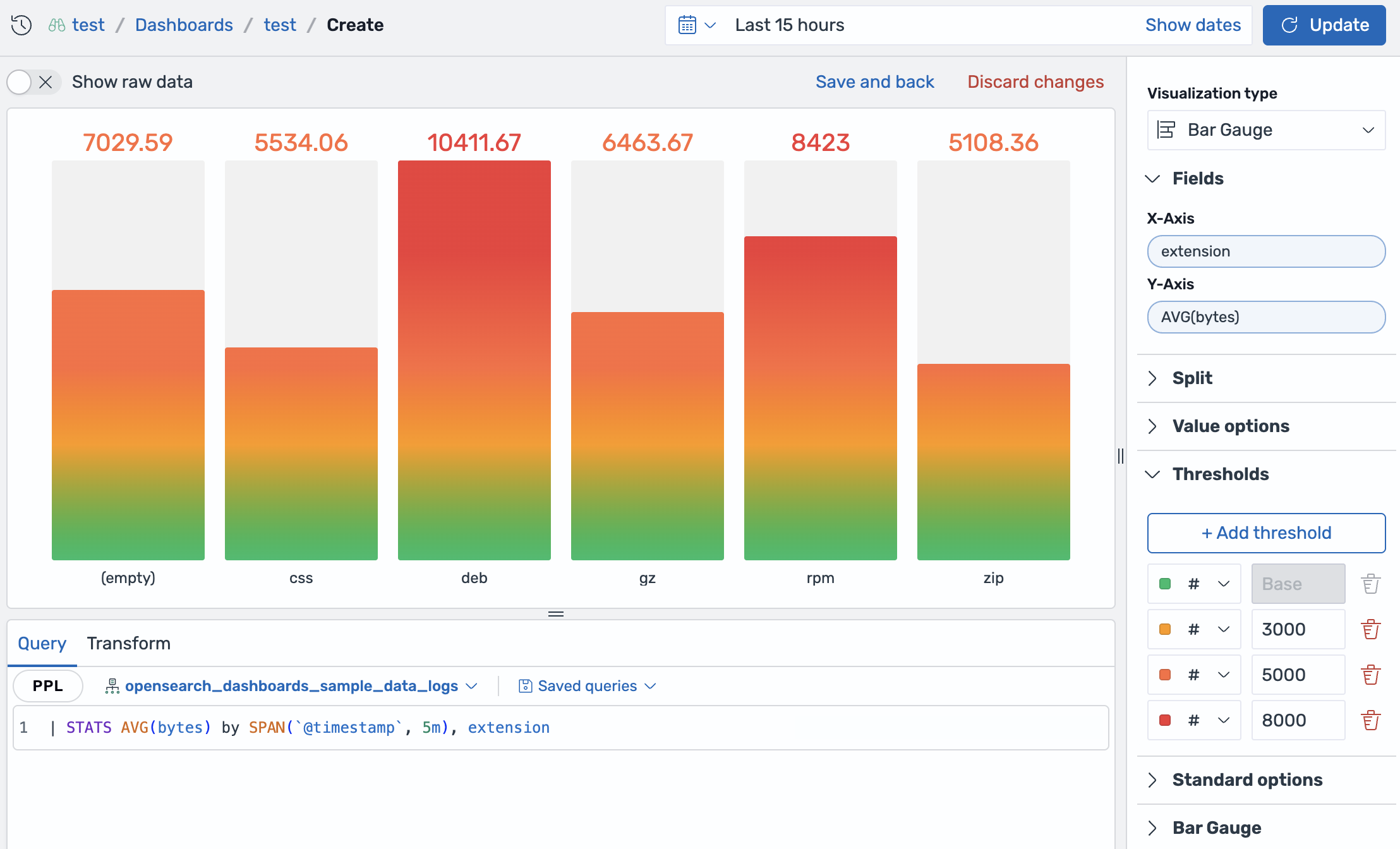
| stats avg(bytes) by span(`@timestamp`, 5m), extension - Select Bar Gauge as the visualization type.
- In the Fields section, set X-Axis to
extensionand Y-Axis toAVG(bytes). - In the Thresholds section, set thresholds at
3000,5000, and8000. - In the Bar Gauge section, select a Display style.
Each bar is colored by the threshold range that contains its value, as shown in the following image.
Metric chart
In metric charts, thresholds color the displayed value or its background according to the selected Color mode. To apply thresholds to a metric chart, follow these steps:
- Select the
opensearch_dashboards_sample_data_logsdataset. -
Enter the following query and select Update:
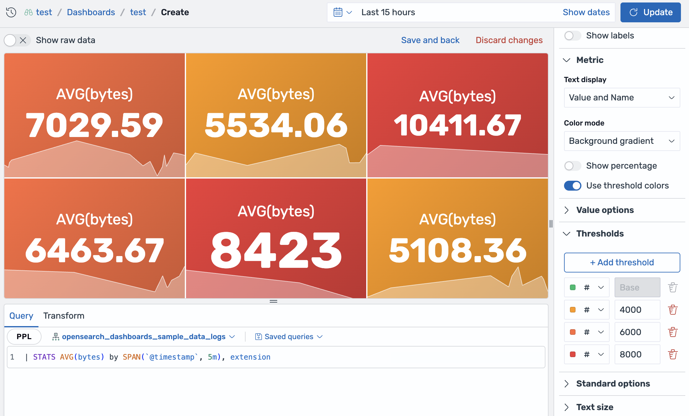
| stats avg(bytes) by span(`@timestamp`, 5m), extension - Select Metric as the visualization type.
- In the Metric section, set Color mode to Background gradient and turn on Use threshold colors.
- In the Thresholds section, set thresholds at
4000,6000, and8000.
The background of each metric uses the color of the threshold range that contains the metric value, as shown in the following image.
Line and area charts
In line and area charts, thresholds are displayed as horizontal reference lines across the chart. The line or area mark itself does not change color. To add threshold lines to a line or area chart, follow these steps:
- Select the
opensearch_dashboards_sample_data_logsdataset. -
Enter the following query and select Update:
| stats avg(bytes) by span(`@timestamp`, 5m) - Select Line as the visualization type.
- Open the Thresholds section and select + Add threshold.
- Set thresholds at
5000and8000. - Set Threshold lines mode to Dashed lines.
A dashed horizontal line appears at each threshold value, as shown in the following image.
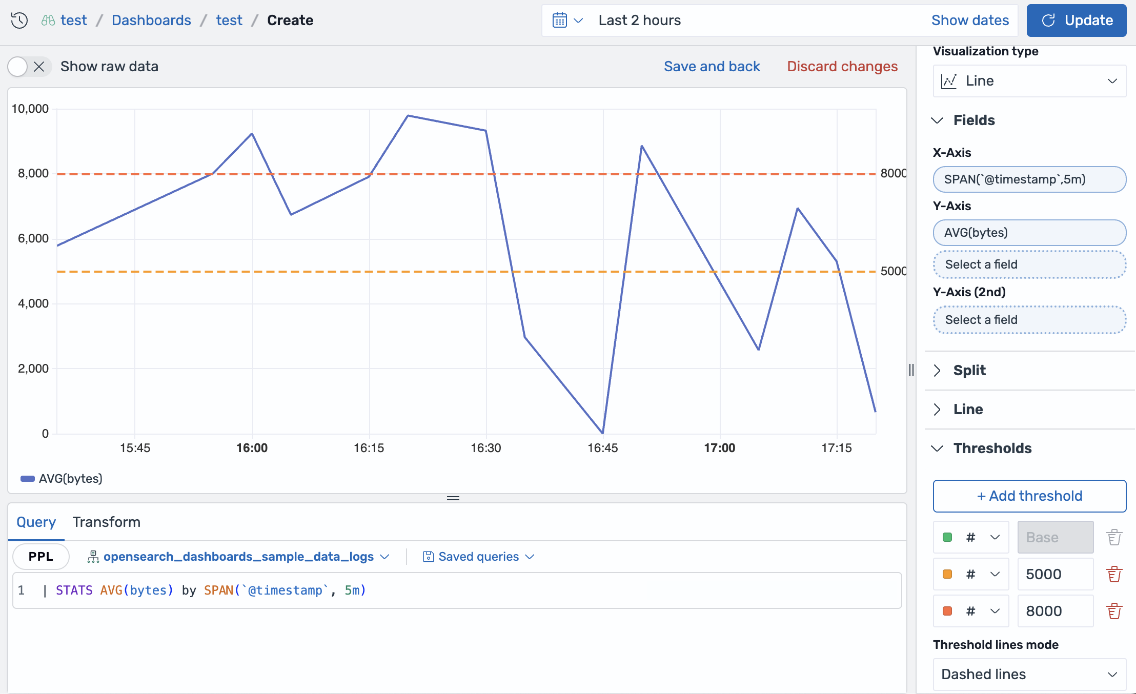
Use the Threshold lines mode setting to control the line appearance:
- Off: Displays no threshold lines.
- Solid lines: Draws solid horizontal lines at each threshold value.
- Dashed lines: Draws dashed horizontal lines at each threshold value.
- Dotted lines: Draws dotted horizontal lines at each threshold value.
Bar and histogram charts
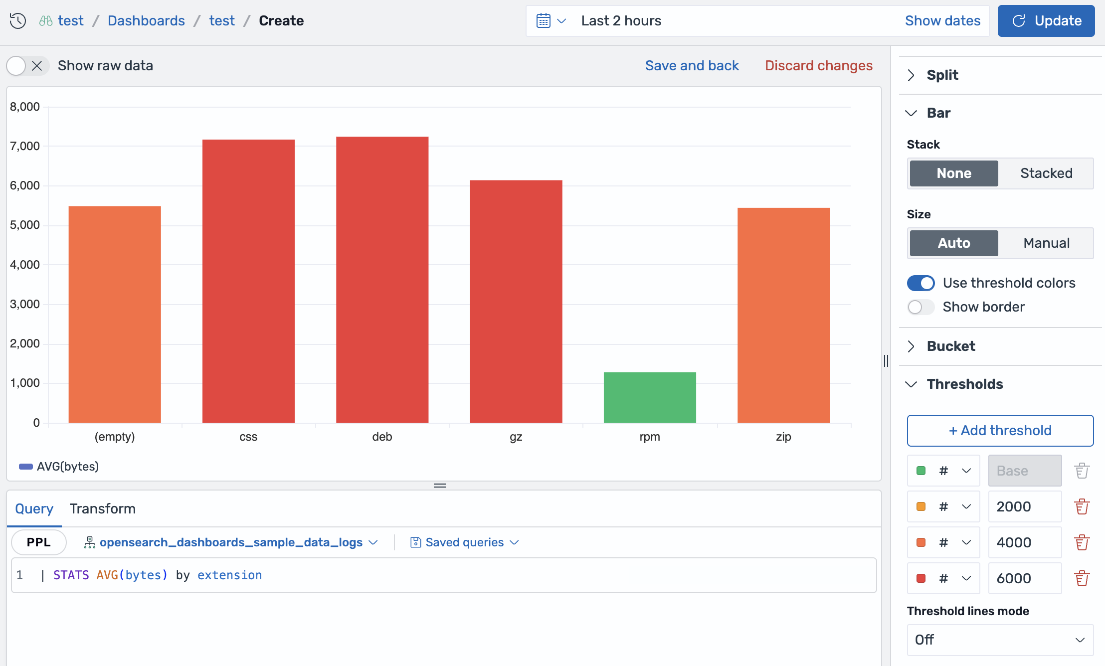
In bar and histogram charts, thresholds can color bars based on each bar’s value. These chart types can also display threshold reference lines. To apply threshold colors to a bar chart, follow these steps:
- Select the
opensearch_dashboards_sample_data_logsdataset. -
Enter the following query and select Update:
| stats avg(bytes) by extension - Select Bar as the visualization type.
- In the Fields section, set X-Axis to
extensionand Y-Axis toAVG(bytes). - In the Bar section, turn on Use threshold colors.
- In the Thresholds section, set thresholds at
2000,4000, and6000. - Set Threshold lines mode to Off.
Each bar is colored by the threshold range that contains its value, as shown in the following image.
Heatmap
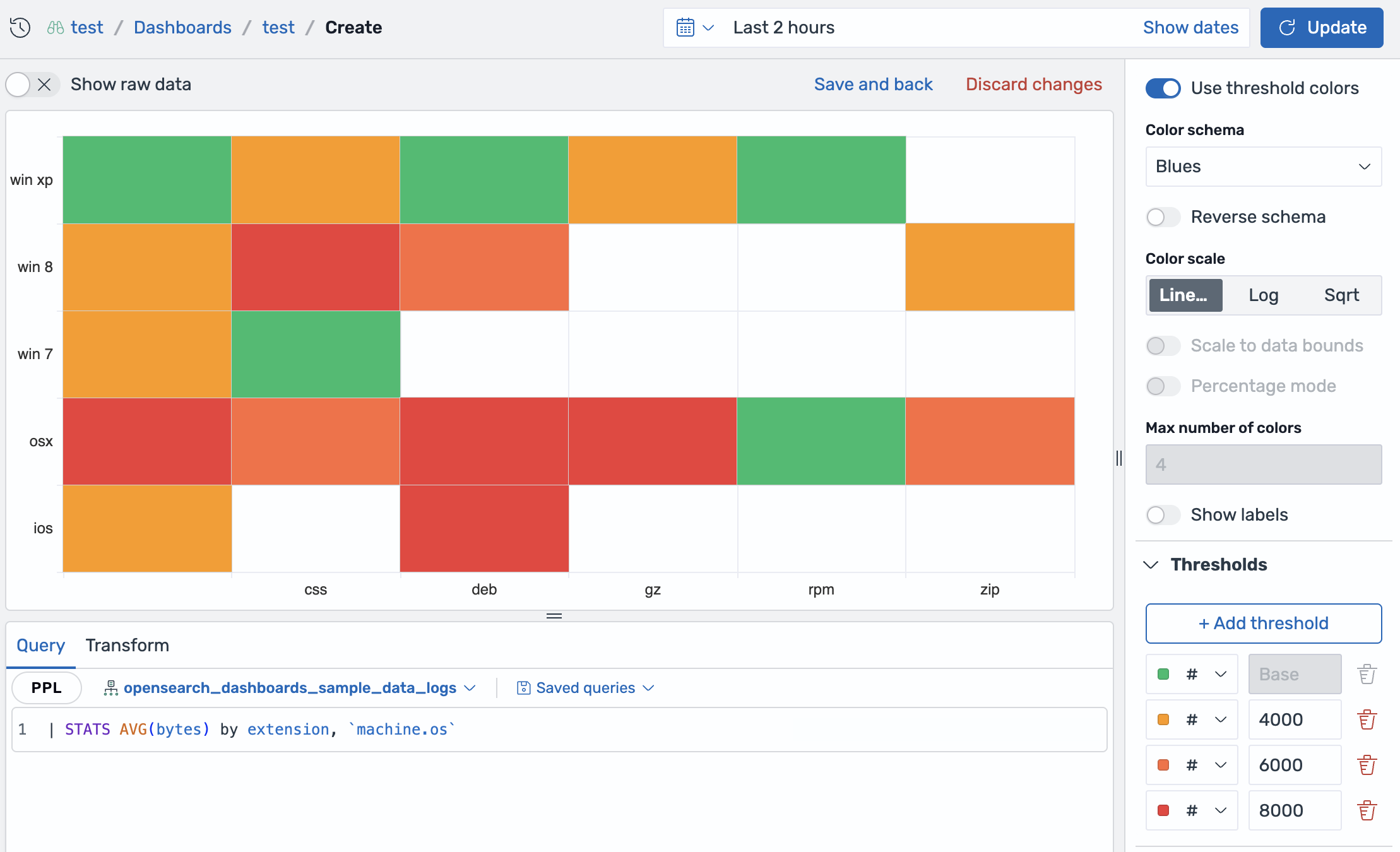
In heatmaps, thresholds color cells by value range, overriding the selected color schema. To apply thresholds to a heatmap, follow these steps:
- Select the
opensearch_dashboards_sample_data_logsdataset. -
Enter the following query and select Update:
| stats avg(bytes) by extension, `machine.os` - Select Heatmap as the visualization type.
- In the Fields section, set X-Axis to
extension, Y-Axis tomachine.os, and Value toAVG(bytes). - In the Heatmap section, turn on Use threshold colors.
- In the Thresholds section, set thresholds at
4000,6000, and8000.
Each cell is colored by the threshold range that contains its value, as shown in the following image.
Scatter plot
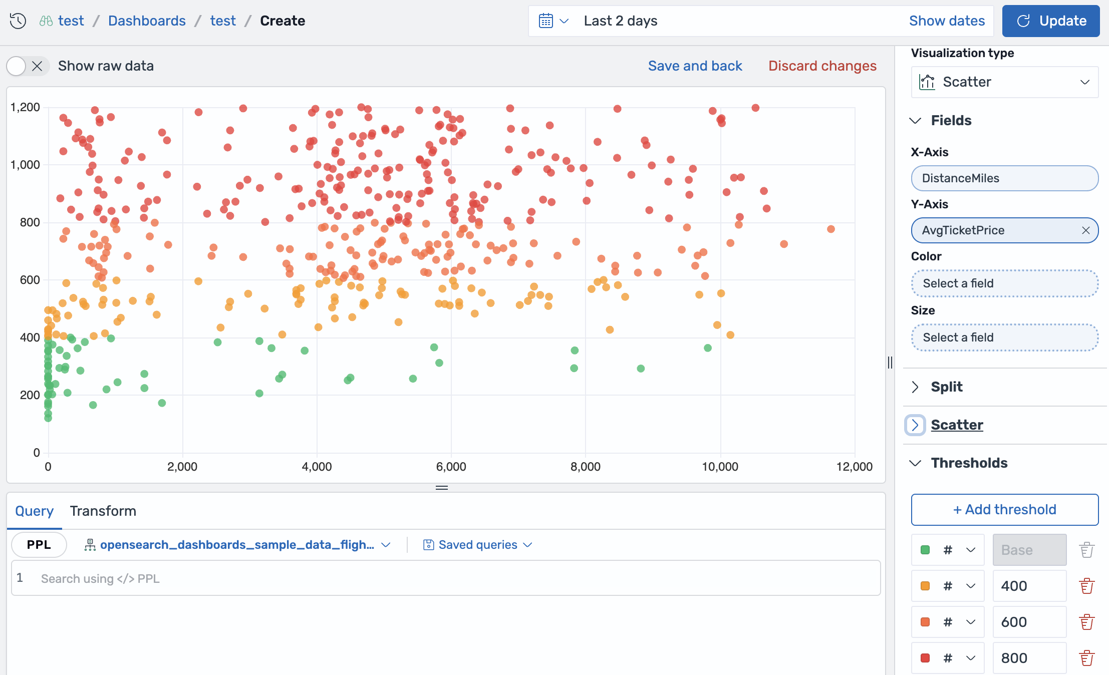
In scatter plots, thresholds can color points based on each point’s value. Scatter plots can also display threshold reference lines. To apply thresholds to a scatter plot, follow these steps:
- Select the
opensearch_dashboards_sample_data_flightsdataset and select Update. - Select Scatter as the visualization type.
- In the Fields section, set X-Axis to
DistanceMilesand Y-Axis toAvgTicketPrice. - Open the Thresholds section and select + Add threshold.
- Set thresholds at
400,600, and800.
Each point is colored by the threshold range that contains its ticket price, as shown in the following image.
State timeline
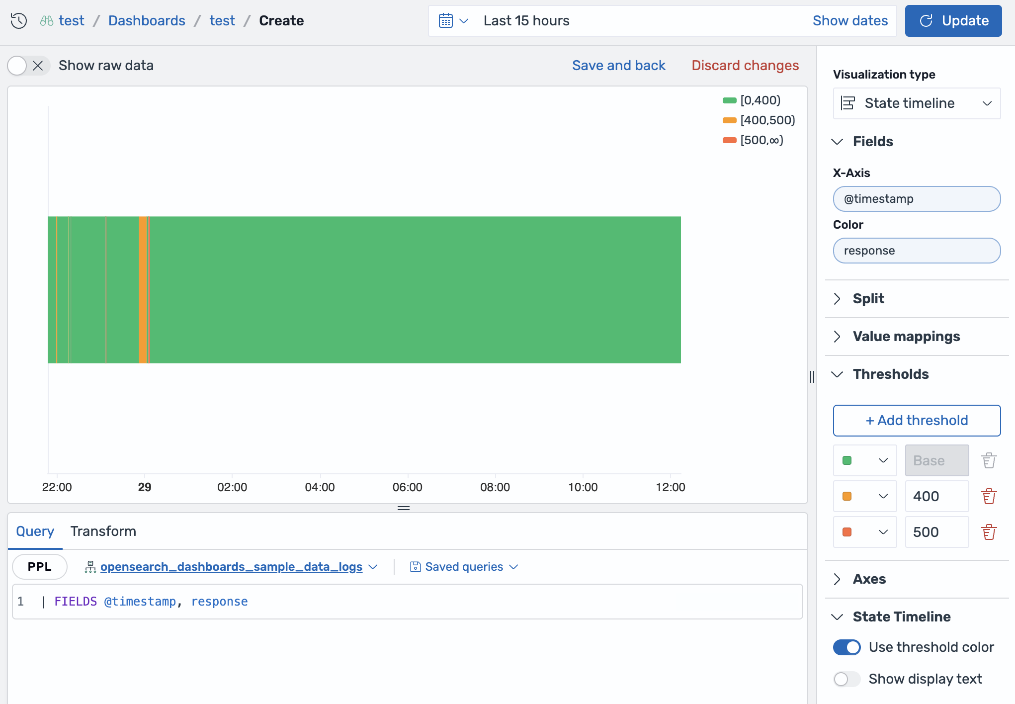
In state timelines, thresholds color state regions by numeric value range. Use thresholds when the color represents a range, such as successful, warning, and error response codes, rather than an individual value. To apply thresholds to a state timeline, follow these steps:
- Select the
opensearch_dashboards_sample_data_logsdataset. -
Enter the following query and select Update:
| FIELDS @timestamp, response - Select State Timeline as the visualization type.
- In the Fields section, set X-Axis to
@timestampand Color toresponse. Because theresponsefield is numeric, OpenSearch Dashboards can divide it into threshold ranges. - In the Thresholds section, keep the base color green and set thresholds at
400and500. - In the State Timeline section, turn on Use threshold color. To display only the threshold-colored regions, keep Show display text turned off.
The timeline regions are colored by response code range: values from 0 to less than 400, values from 400 to less than 500, and values of 500 or greater, as shown in the following image.
Table
In tables, thresholds color numeric cells. To apply thresholds to a table, follow these steps:
- Select the
opensearch_dashboards_sample_data_flightsdataset. -
Enter the following query and select Update:
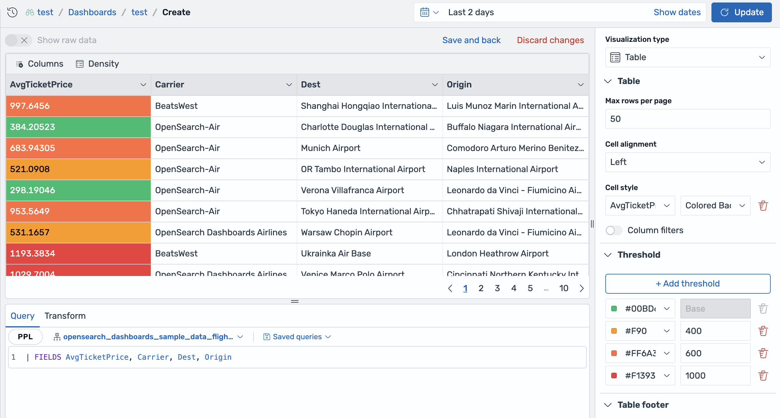
| FIELDS AvgTicketPrice, Carrier, Dest, Origin - Select Table as the visualization type.
- In the Table section, set Cell style to
AvgTicketPriceand select Colored Background. - In the Threshold section, set thresholds at
400,600, and1000.
Each AvgTicketPrice cell background is colored by the threshold range that contains its value, as shown in the following image.