Thresholds
A threshold is a boundary value that, when reached or exceeded by a data point, triggers a visual change in color. Use thresholds to define meaningful ranges so that you can immediately understand whether values are within normal, warning, or critical zones.
Supported chart types
Thresholds are available in the following chart types:
- Area chart
- Bar chart
- Bar gauge chart
- Gauge chart
- Heatmap chart
- Line chart
- Scatter chart
- State timeline chart
Configuring thresholds
To add a threshold, open the Thresholds section in the configuration panel and select + Add threshold. For each threshold, configure the following settings.
| Setting | Description |
|---|---|
| Color | Select a color to apply to values that fall within this threshold’s range. Select a preset color or a custom color. |
| Value | Enter the numeric boundary at which this threshold begins. Values at or above this number (and below the next threshold) are displayed in this color. |
The base threshold is always present and represents the starting color for values that fall below all other thresholds. You can change its color but not its value.
Thresholds are automatically sorted by value. To delete a threshold, select the trash icon next to it.
Specifying thresholds for different chart types
Thresholds behave differently depending on the chart type.
Gauge, bar gauge, and metric charts
In these charts, thresholds color the arc, bar, or value directly. The Min and Max controls under Standard options define the scale range, and thresholds divide that scale into colored segments. To apply thresholds to a gauge chart, follow these steps:
-
Enter the following query and select Update:
source = opensearch_dashboards_sample_data_flights | FIELDS AvgTicketPrice - Select Gauge as the visualization type.
- Enable Use threshold colors in the Gauge section.
- Open the Thresholds section and select + Add threshold.
- Set the base color to green and add a threshold at
500with the color orange.
The arc is green below 500 and orange at or above 500, as shown in the following image.

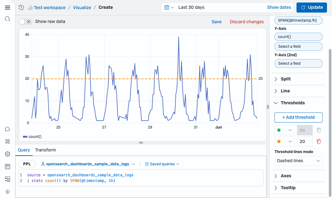
Line and area charts
In line and area charts, thresholds are displayed as horizontal reference lines across the chart. The line itself does not change color. To add threshold lines to a line chart, follow these steps:
-
Enter the following query and select Update:
source = opensearch_dashboards_sample_data_logs | stats count() by SPAN(@timestamp, 1h) - Select Line as the visualization type.
- Open the Thresholds section and select + Add threshold.
- Set a threshold at
20with a color. - Set Threshold lines mode to Dashed lines.
A dashed horizontal line appears at the threshold value, as shown in the following image.
Use the Threshold lines mode setting to control the line appearance:
- Off: No threshold lines are shown.
- Solid lines: Draws solid horizontal lines at each threshold value.
- Dashed lines: Draws dashed horizontal lines at each threshold value.
- Dotted lines: Draws dotted horizontal lines at each threshold value.
Bar, histogram, heatmap, scatter, and state timeline charts
In these charts, thresholds color individual data elements (bar fills, cell colors, or point colors) based on each data point’s value. The Threshold lines mode setting is also available for bar and scatter charts to add reference lines. To apply thresholds to a scatter chart, follow these steps:
-
Enter the following query and select Update:
source = opensearch_dashboards_sample_data_flights | fields AvgTicketPrice, DistanceMiles - Select Scatter as the visualization type.
- In the Scatter section, enable Use threshold colors.
- Open the Thresholds section and select + Add threshold.
- Set the base color to green and add a threshold at
6000with the color orange.
The scatter chart now displays points in green for distances below 6000 and orange for distances at or above 6000, as shown in the following image.
