Exploring search evaluation results
Introduced 3.2
In addition to retrieving the experiment results using the API, you can explore the results visually. The Search Relevance Workbench comes with dashboards that you can install to review search evaluation and hybrid search optimization experiment results.
Installing the dashboards
You can install the dashboards in one of the following ways:
-
In the Actions column, select a visualization icon in the experiment overview.
-
Select the Install Dashboards button in the upper-right corner of the experiment overview.
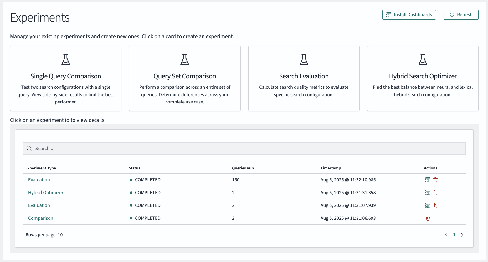
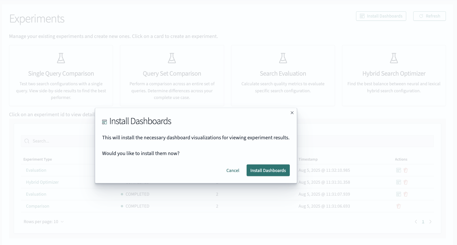
The modal offers to install the dashboards for the user.
Using the dashboards
Once you install the dashboards, in the Actions column, select the visualization icon in the experiment overview. This opens the experiment result dashboard. The view presented depends on the type of experiment you chose:
-
The search evaluation dashboard focuses on the individual query level and provides insights about well-performing queries and queries with open relevance potential.
-
The hybrid search dashboard provides an overview of how the different hybrid search parameter configurations performed and lets you identify candidate queries for further exploration and experimentation.
Search evaluation dashboard
The search evaluation dashboard, shown in the following image, aggregates performance metrics across all queries in your selected experiment. Use the search evaluation dashboard to get a high-level view of overall experiment performance and identify the queries that need attention.
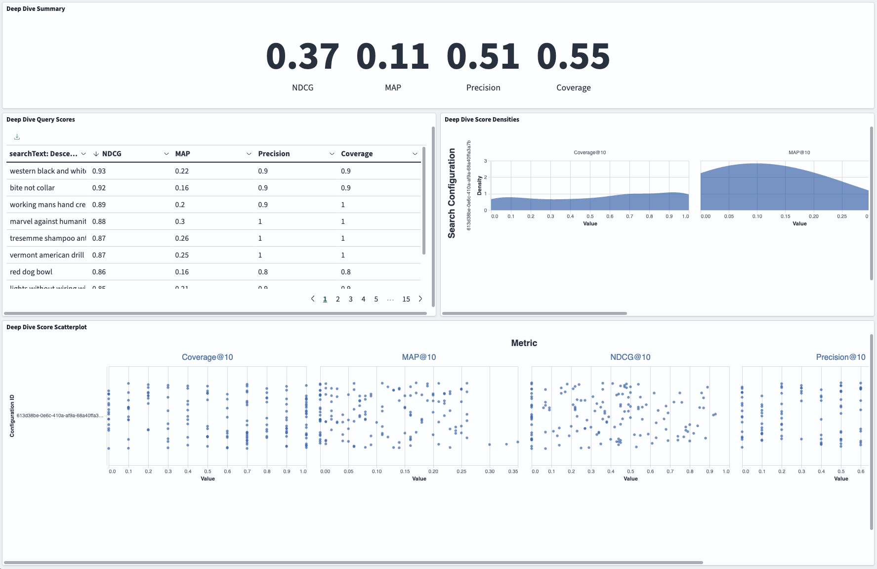
The Deep Dive Summary panel shows the aggregate metrics for NDCG, MAP, precision, and coverage (see Evaluating search quality).
The Deep Dive Query Scores pane shows individual query performance ranked by NDCG score (highest to lowest). Use this pane to identify your best- and worst-performing queries.
The Deep Dive Score Densities pane shows how metric values are distributed across your query set. Use this pane to understand whether poor performance is widespread or concentrated in specific queries. The x-axis shows metric values, while the y-axis shows how frequently those values occur.
The Deep Dive Score Scatter Plot pane shows an interactive view of the preceding distribution data, with each query shown as a separate point. Use this pane to investigate specific queries at performance extremes. Points are scattered vertically to prevent overlap while maintaining the same x-axis metric values as the preceding distribution view.
Hybrid search evaluation dashboard
Use the hybrid search evaluation dashboard, shown in the following image, to compare experiment variants and identify the optimal parameter configurations for your hybrid experiment.
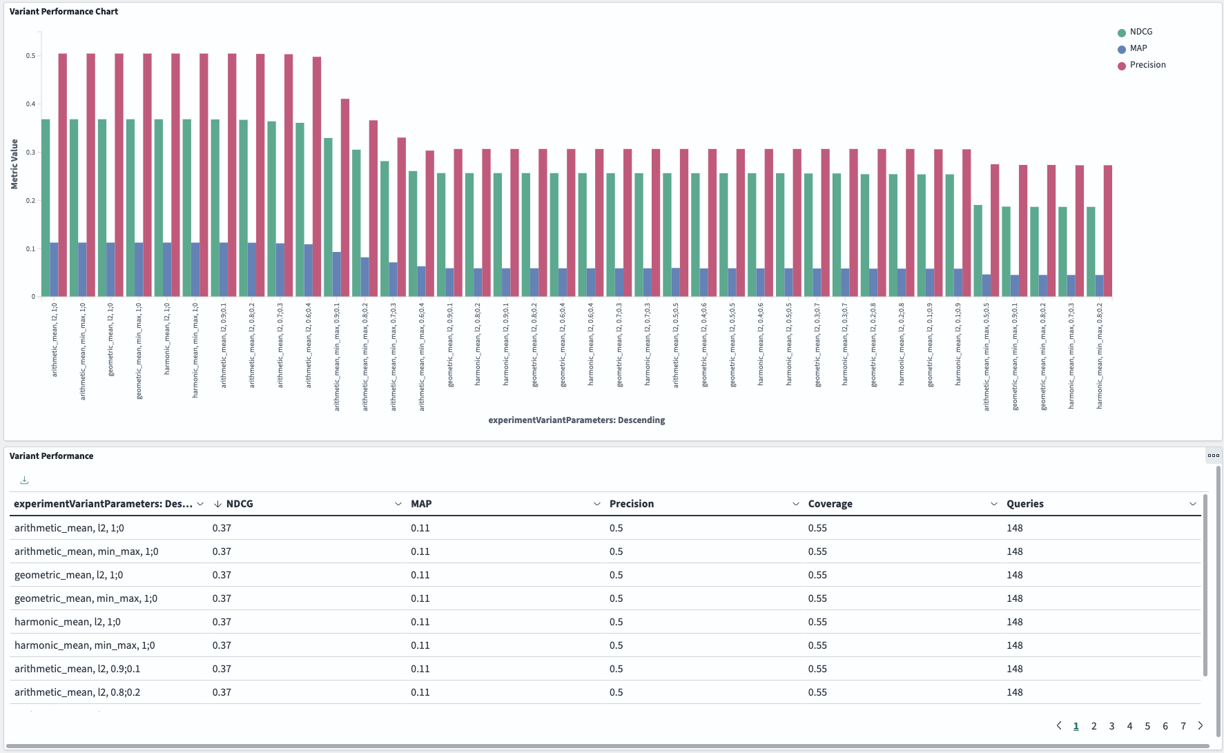
The Variant Performance Chart shows your experiment variants arranged visually from best to worst performing (left to right, by decreasing NDCG). Use this chart to quickly identify your top-performing queries and view performance patterns across different parameter combinations at a glance.
The Variant Performance pane shows the same variant data in a sortable table format with all metrics visible. Use this pane to compare specific metric values across variants and customize your analysis by sorting on different performance measures. To sort by a column, select the column header.
Customizing the dashboards
The dashboards are installed as saved objects. After installing them, you can edit the dashboards or clone and customize them to your specific requirements.
To learn how to customize the source files, see Updating the default dashboards.
Resetting dashboards
To reset the dashboards, select the Install Dashboards button in the upper-right corner of the experiment overview. This will reinstall the dashboards.