Creating dashboards
You can use the Dashboards application in OpenSearch Dashboards to build a dashboard, a page containing multiple panels showing different views of your data.
This documentation uses the following terms:
- OpenSearch Dashboards: The web UI for OpenSearch.
- Dashboards application: The application within OpenSearch Dashboards for creating dashboards.
- dashboard (lowercase): An individual collection of data visualizations created in the Dashboards application.
Dashboards typically contain visualizations, but can also contain searches.
A dashboard shows one or more panels, usually arranged to support a business goal such as operations, decision support, or observability. A dashboard can contain any number of panels, subject only to display and legibility constraints.
Prerequisites
The tutorials on this page use the Sample eCommerce data dataset that is already installed in OpenSearch Playground.
If you’ve installed a local OpenSearch Dashboards instance, add the sample data by following these steps:
- On the OpenSearch Dashboards home page, select Add sample data.
- In the Sample eCommerce data panel, select Add data.
For more information, see Adding sample data.
Navigating the Dashboards UI
The following image shows the main components of the Dashboards application.
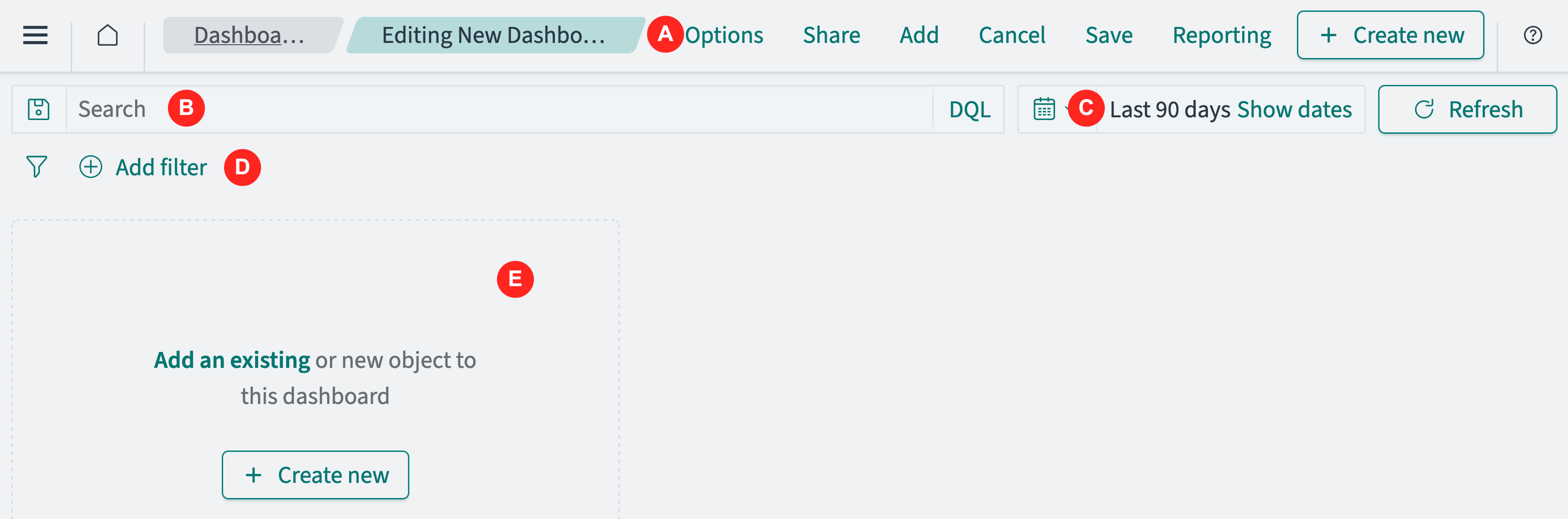
- The application menu (A) contains application options. This menu is context-sensitive and is different for other applications.
- The search bar (B) enables selection of data using a query language search.
- The time filter (C) enables selection of data based on a time and date range.
- The filter (D) provides a graphical interface for selecting data values and ranges.
- The application panel (E) displays the dashboard, which contains visualization and search panels.
Creating a dashboard and adding an existing visualization
The procedure for creating a dashboard is as follows:
-
Open a dashboard. You can start with a new (empty) dashboard, modify an existing dashboard, or clone an existing dashboard as a starting point for a similar dashboard. See Opening a dashboard.
-
Ensure that the data filters include the data you want to work on. This typically, but not always, means setting the time filter to include a range of timestamps. See Selecting a time range.
OpenSearch applications, including Dashboards, Visualize, and Discover, apply filters to all data in the application. The filter is applied to all index patterns used in the dashboard. For example, a time filter applied to a log monitoring dashboard selects the documents from all log visualizations on that dashboard, even if they include documents from different index patterns. See Index patterns.
-
Add panels to the dashboard. You can select saved panels or create new visualization within the Dashboards application. See Adding a visualization to a dashboard.
-
Arrange and resize panels on the dashboard. See Customizing a dashboard.
-
Save the completed (or work-in-progress) dashboard. See Saving a dashboard.
Next steps
-
For a quick introduction to viewing and filtering dashboards, see Explore the Dashboards application.
-
For a comprehensive end-to-end tutorial, see Tutorial: Creating a dashboard.