Application map
Introduced 3.6
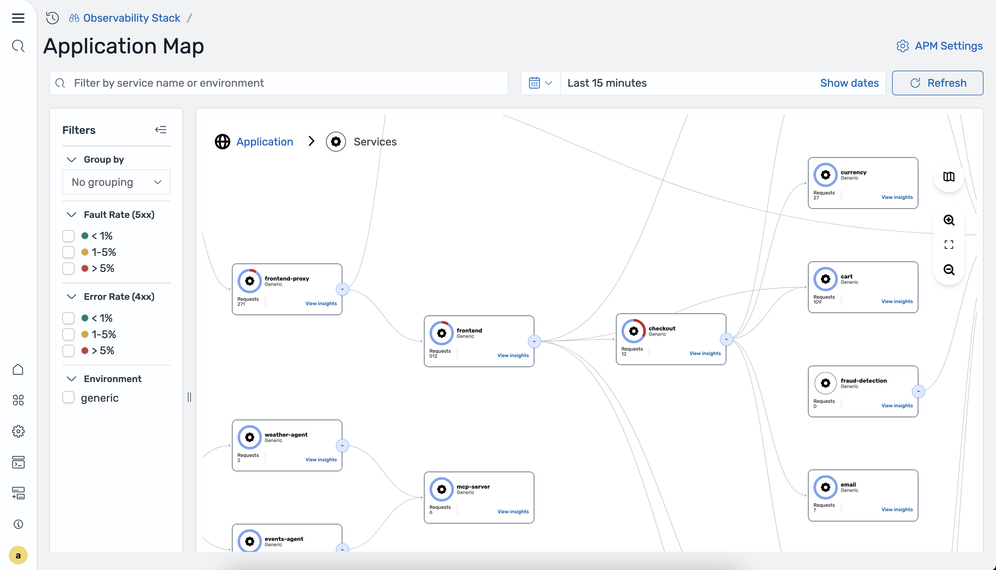
The application map provides an interactive topology visualization autogenerated from trace data by the Data Prepper otel_apm_service_map processor. The map displays your services as nodes with directional edges showing communication patterns, overlaid with Rate, Errors, Duration (RED) metrics for each service.
Accessing the application map
To access the Application map page, navigate to your Observability workspace and select APM > Application map from the left navigation menu. The following image shows the Application map page.
RED metrics on the map
Each node on the application map displays the following RED metrics computed from trace span data:
- Rate: The number of requests per second handled by the service.
- Errors: The percentage of requests resulting in errors, broken down by
4xx(client errors) and5xx(server faults). - Duration: The response time of the service, typically shown as P50 and P99 latency.
These metrics are generated by the otel_apm_service_map processor in Data Prepper and stored in Prometheus through remote write. For more information, see APM service map processor.
Topology visualization
The application map autogenerates a directed graph from your trace data:
- Nodes represent individual services in your application.
- Edges represent communication between services, with arrows indicating the direction of calls.
- Color coding indicates the health status of each service based on its error and fault rates.
The map updates automatically as new trace data is ingested, reflecting changes in your application topology in near real time.
Grouping services
You can group services by attributes to organize the map view. The following image shows services grouped by attributes.
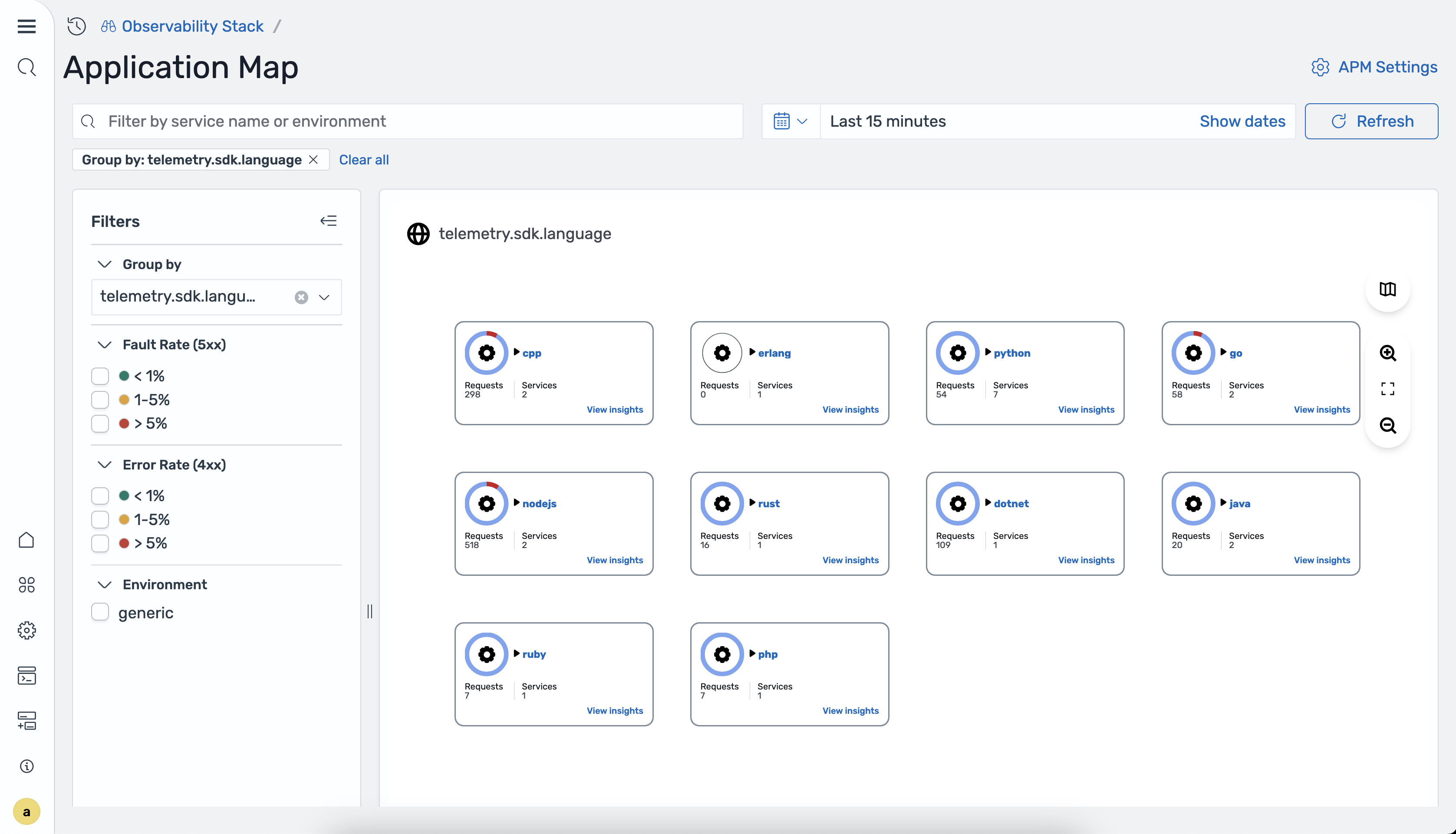
- Group by attributes: Select an attribute such as programming language, team, or environment to group related services together.
- Card grid view: When grouping is applied, the map reorganizes into a card grid layout where each card represents a group of services with aggregated metrics.
The group_by_attributes option in the otel_apm_service_map processor configuration determines which attributes are available for grouping. For example, setting group_by_attributes: [telemetry.sdk.language] enables grouping by programming language.
Viewing node details
Select a node on the map or choose View insights to open a detail panel on the right side of the screen.
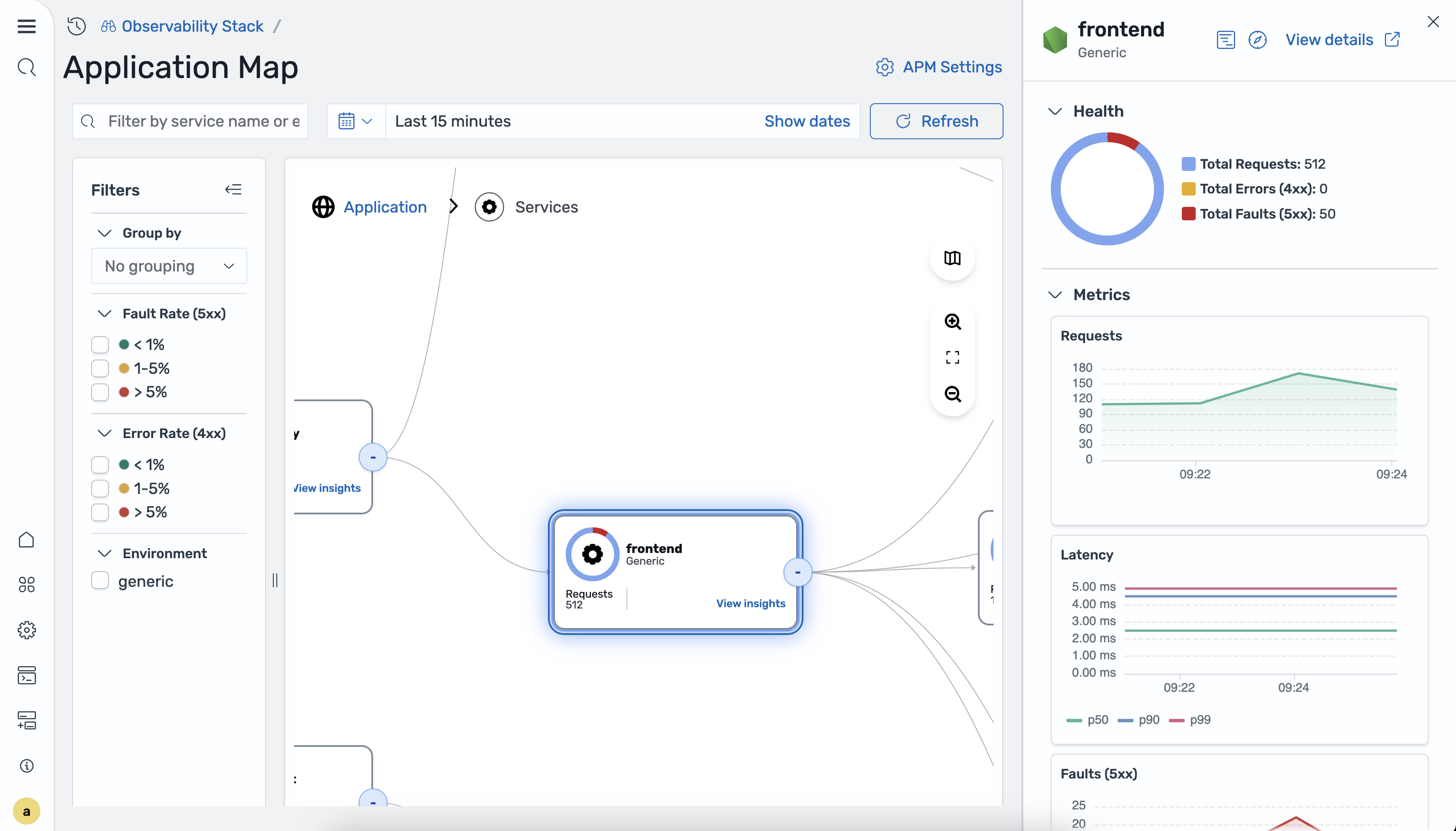
The detail panel includes the following sections:
-
Health:
- Total Requests: The total number of requests handled during the selected time range.
- Total Errors (
4xx): The count of client error responses. - Total Faults (
5xx): The count of server fault responses.
-
Metrics: Time-series charts showing the trend of each metric over the selected time range:
- Requests: Request volume over time.
- Latency: P50, P90, and P99 latency over time.
- Faults (
5xx): Server fault count over time. - Errors (
4xx): Client error count over time.
From the node detail panel, select View details to navigate directly to the Services detail view for the selected service.
Filtering the map
The following image shows the application map filtered by error rate.
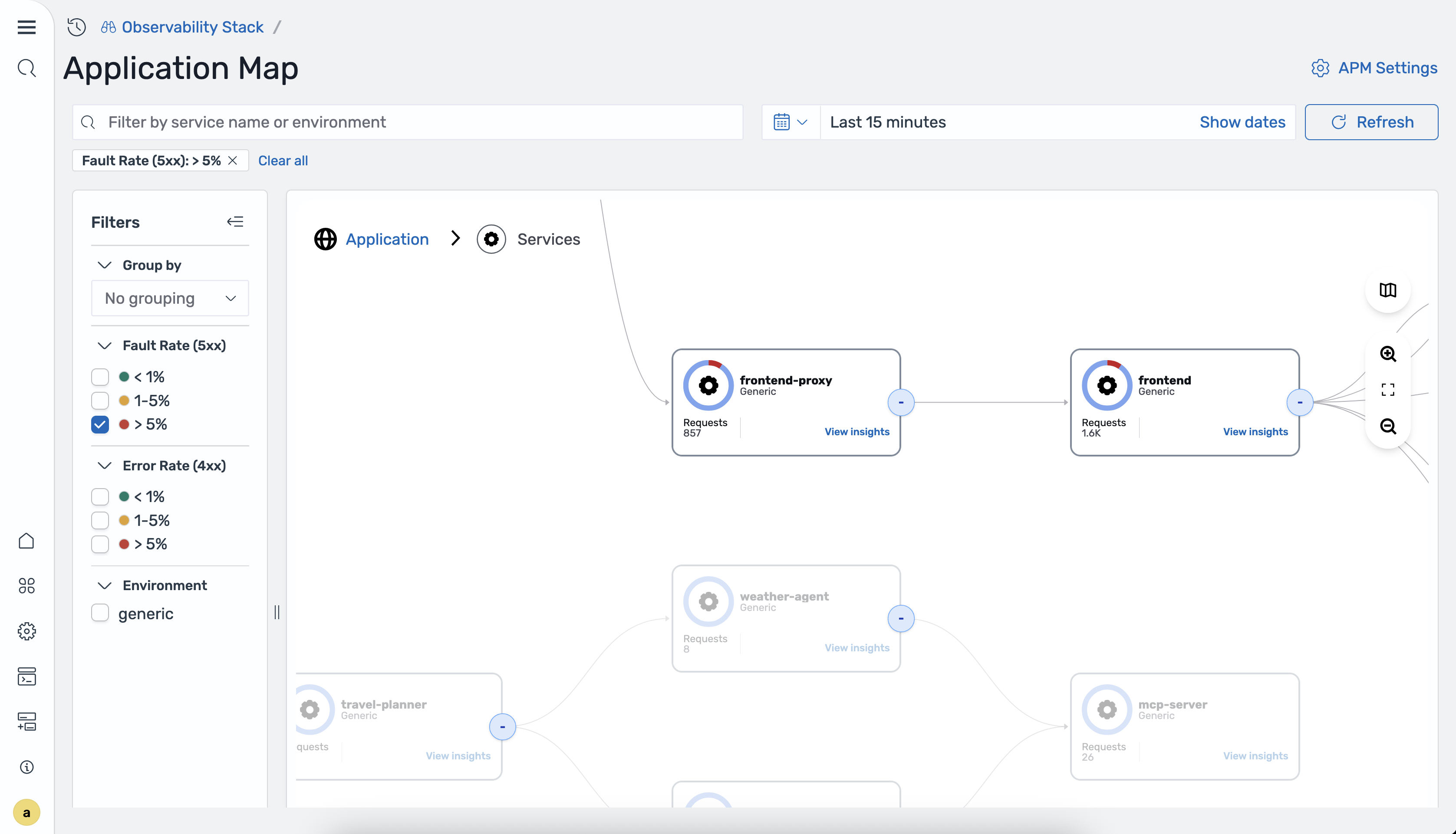
Use the filter controls to focus on specific areas of your application topology:
- Fault rate: Show only services with fault rates (
5xxerrors) exceeding a specified threshold. - Error rate: Show only services with error rates (
4xxerrors) exceeding a specified threshold. - Environment: Filter services by deployment environment (for example,
productionorstaging).
In-context correlations
The application map integrates with APM correlations to help you navigate from the topology view to detailed telemetry data:
- Application spans: Select a service node and choose View traces to see the individual trace spans associated with that service. This is useful for investigating the root cause of latency or error spikes visible on the map.
- Application logs: Select a service node and choose View logs to see log entries from that service during the selected time range. Log correlations require that you have configured a correlation between your trace and log datasets.
These in-context navigation paths allow you to move seamlessly from a high-level topology view to the detailed traces and logs needed for root cause analysis.