Tutorial: Creating a dashboard
You can use the Dashboards application in OpenSearch Dashboards to build a page containing multiple visual representations of your data.
Use the following tutorial to learn to create a dashboard using the Dashboards application and the OpenSearch sample data. The sample datasets have existing sample visualizations that you can use for the dashboard, or you can create your own visualizations. The tutorials demonstrate how to do both.
For an overview of the Dashboards UI, see Navigating the Dashboards UI.
Prerequisites
The tutorials on this page use the Sample eCommerce data dataset that is already installed in OpenSearch Playground.
If you’re using a local installation of OpenSearch Dashboards and haven’t added sample data yet, see Prepare your data.
The following tutorials assume you’re either using your existing installation of OpenSearch Dashboards or using the OpenSearch Playground. Depending on which one you use, certain capabilities may not be available. For example, sample datasets may not be included in your existing installation, and saving a dashboard isn’t an option in the OpenSearch Playground.
Creating a dashboard
To create a new dashboard, follow these steps:
-
In classic navigation In workspaces navigation - Select OpenSearch Dashboards > Dashboards.
- Select Dashboards.Select Dashboards. -
In classic navigation In workspaces navigation - In the Dashboards panel, select Create.
- From the drop-down, select Dashboard.From the application menu, select Create Dashboard.
Adding an existing visualization
To add a saved visualization to the dashboard, follow these steps:
-
From the application panel, choose Add an existing.
-
In the Add panels dialog, type
ecommercein the Search box to filter the list of available visualizations. -
From the Add panels dialog, choose [eCommerce] Sales by Category.
-
Choose the
 (cross) icon to close the dialog.
 -
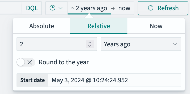
Use the time filter to select
Last 2 yearsas the time window as shown in the following image.
-
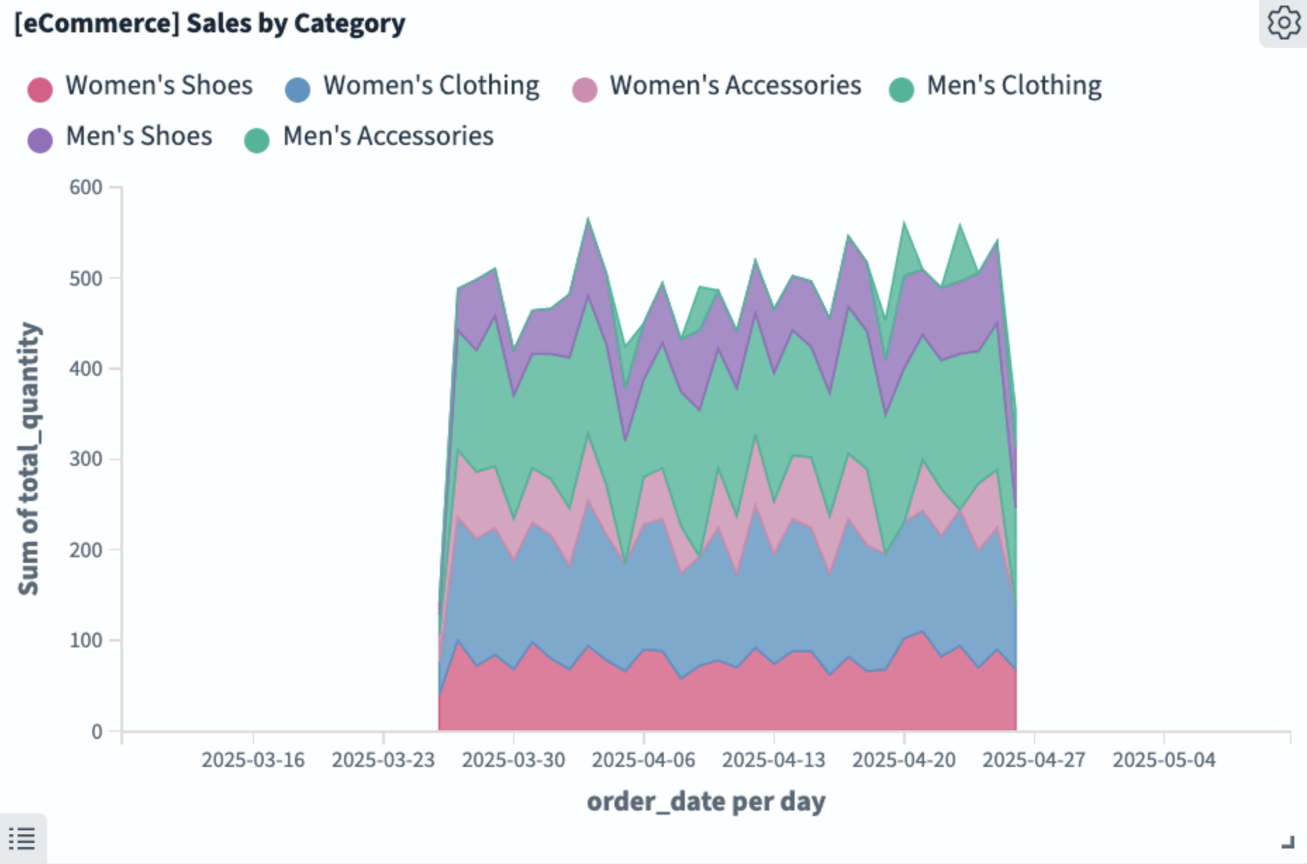
Drag-select the narrow band of data from the area chart as shown in the following image.
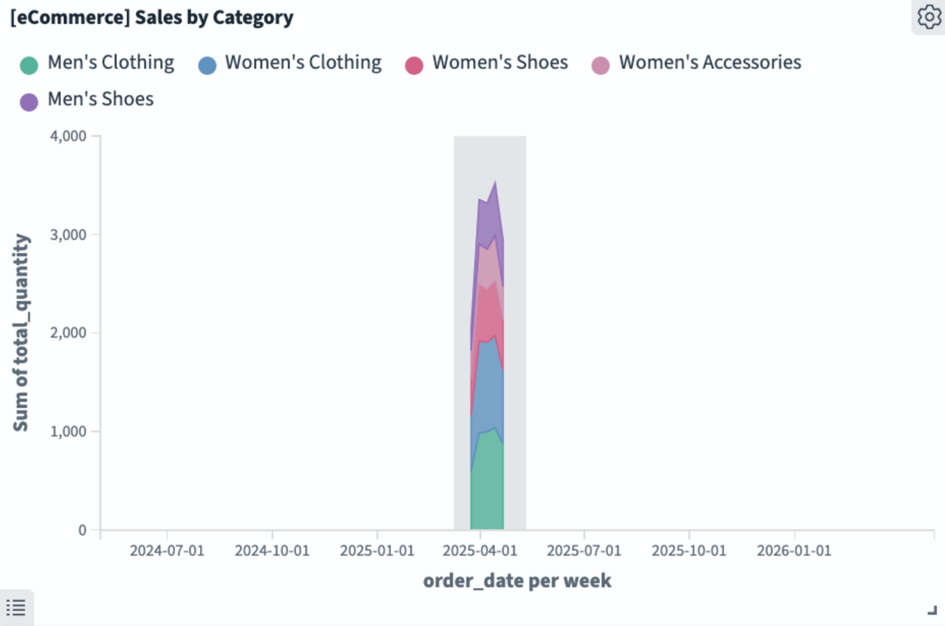
The data adjusts to span the width of the data display and the scale adjusts automatically, as shown in the following image.
Selecting a date range interactively results in an absolute time interval.
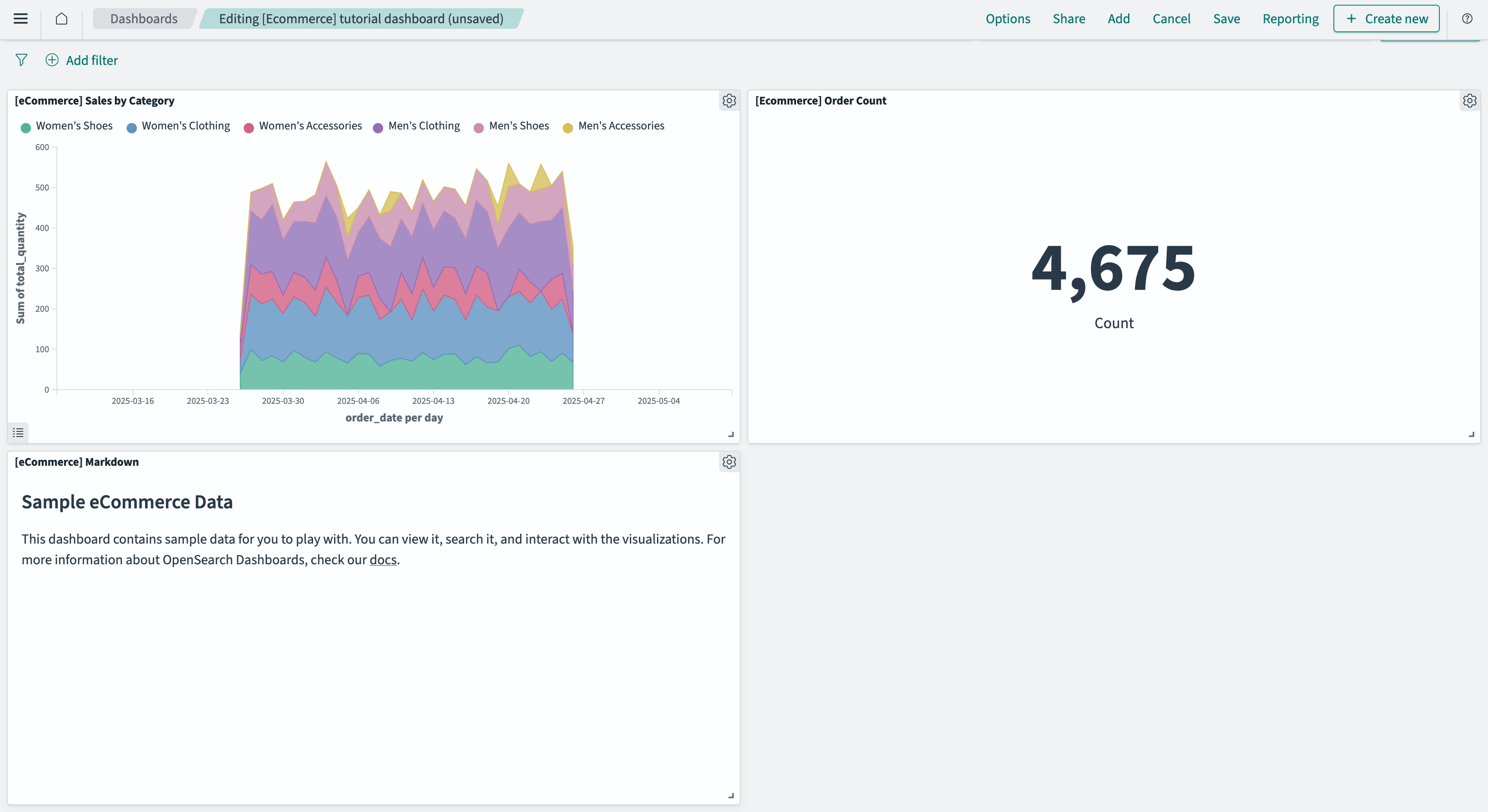
You’ve created a dashboard with a single panel, which you’ll continue to modify in this tutorial. Save the dashboard as described in the following section.
Saving a dashboard
To save a new dashboard, follow these steps:
-
In the Dashboards toolbar, choose Save.
-
In the Save dashboard dialog, enter
[Ecommerce] tutorial dashboardin the Title box. -
Save the time filter with the dashboard by selecting Store time with dashboard.
-
Choose Save.
-
Choose Edit from the application menu to continue editing the dashboard.
Creating a visualization
To create a new visualization in Dashboards, follow these steps:
-
From the application toolbar, choose Create new.
-
From the New Visualization window, choose Metric.
-
In the New Metric/Choose a source dialog, select the index pattern opensearch_dashboards_sample_data_ecommerce.
-
From the toolbar, choose Save.
-
In the Save visualization dialog, enter a title for the visualization. For this tutorial, enter
[eCommerce] Order Count. -
Choose Save and return.
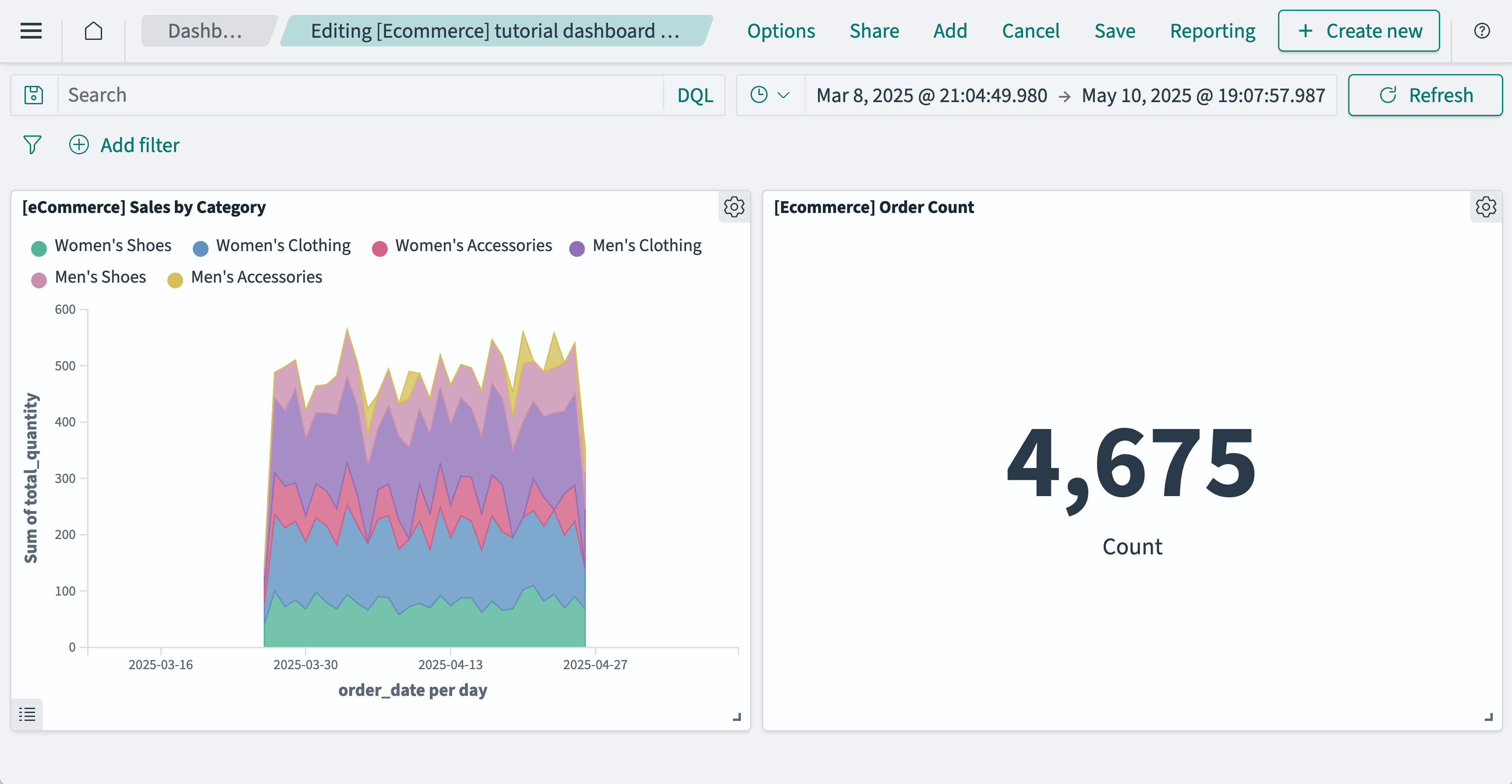
The Dashboards application saves the metric visualization and adds it to the dashboard as shown in the following image.
Adding subsequent panels
Add a Markdown visualization to the dashboard. Follow these steps:
-
From the dashboard toolbar, choose Add.
-
From the Add panels dialog, choose [eCommerce] Markdown.
-
Choose the
(cross) icon to close the dialog.The Dashboards application adds the Markdown panel to the dashboard as shown in the following image.
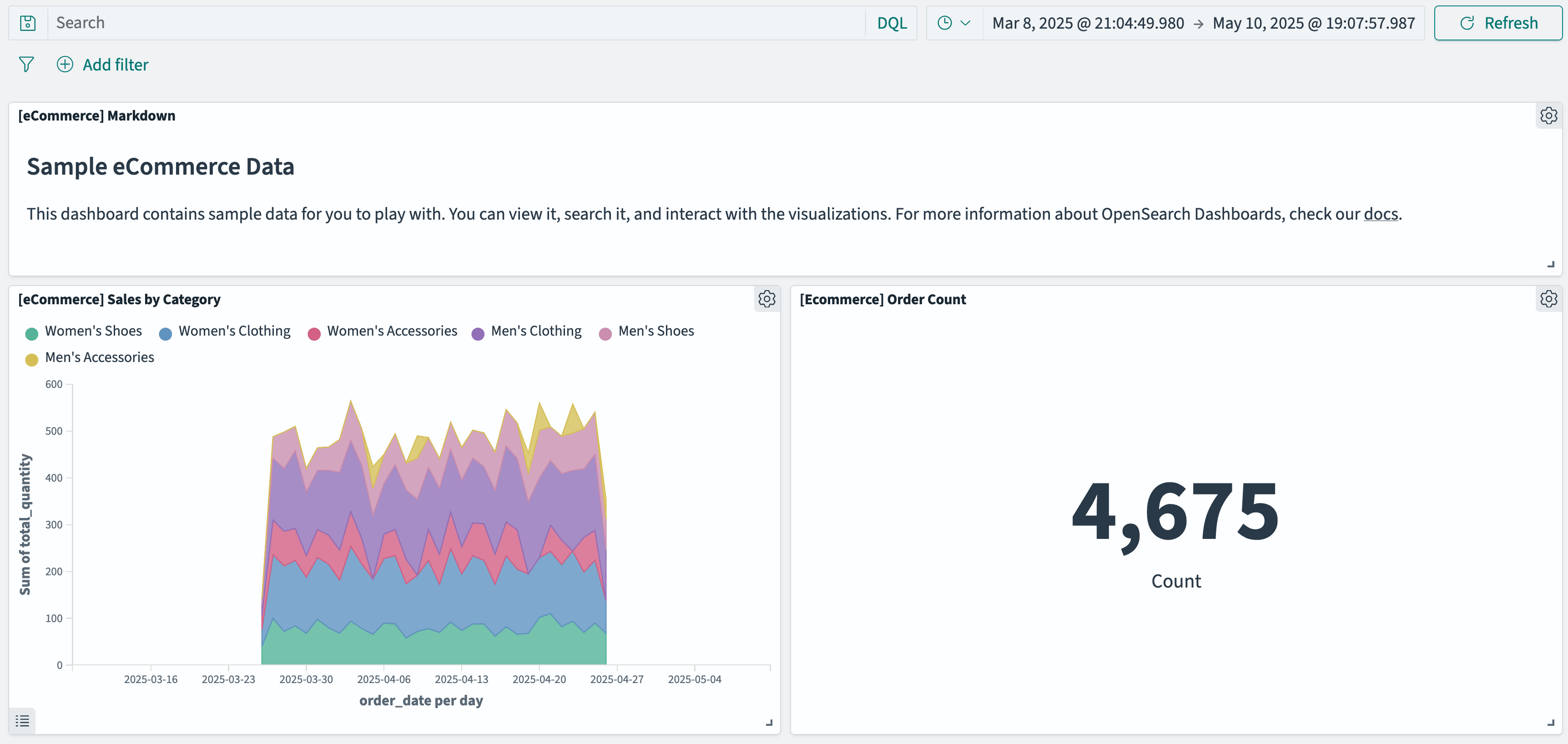
Organizing a dashboard
You can organize a dashboard by resizing and rearranging panels. Move and resize the Markdown panel to serve as a title and description for the dashboard. Follow these steps:
-
Select and hold the top of the panel anywhere to the left of the
 (options) icon.
 -
Drag the panel to the top of the application panel.
The Sales by Category panel automatically swaps places with the Markdown panel as you move it up.
-
Select and hold the
 (resize) icon in the panel’s lower-right corner.
 -
Drag to make the panel longer and narrower so that it serves as a banner across the entire upper part of the dashboard.
The metric panel automatically moves down to allow room for the resized Markdown panel.
The resulting dashboard should look like the following image.
-
Save your dashboard. See Saving a dashboard.