Heatmap
A heatmap uses color to represent the magnitude of values in a dataset. Each cell in the map corresponds to a combination of two dimensions, with the cell’s color intensity reflecting the value associated with that combination.
Creating a heatmap
The following examples build on each other, starting with a basic heatmap and adding complexity. Before you begin, complete the prerequisites.
Basic heatmap
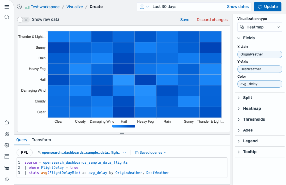
Start with a query that aggregates a numeric metric by two categorical fields:
source = opensearch_dashboards_sample_data_flights | where FlightDelay = true | stats avg(FlightDelayMin) as avg_delay by OriginWeather, DestWeather
After running this query, select Heatmap as the chart type. The fields are mapped as follows:
- The X-Axis displays the
OriginWeatherfield. - The Y-Axis displays the
DestWeatherfield. - The Value displays the
avg_delayfield.
The result is a grid of colored cells where each cell represents the average flight delay minutes for a specific origin-destination weather combination. Darker cells indicate higher values, as shown in the following image.
Customizing the color schema and scale
To better distinguish between values, change the color settings:
- In the Heatmap section, change Color schema to a different palette (for example, Yellow to Orange) to improve contrast.
- Enable Scale to data bounds to map the color range to the actual min and max of your data rather than calculated bounds.
- Change Max number of colors to increase or decrease the granularity of color bins, as shown in the following image.

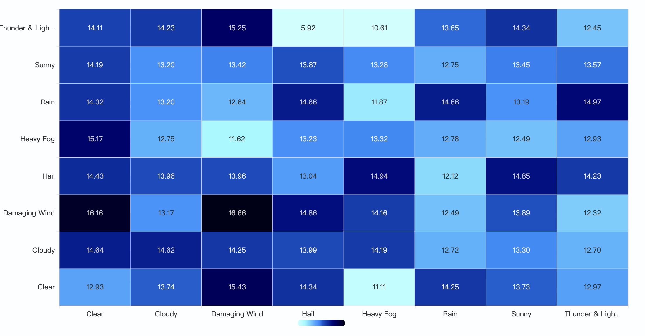
Enabling labels
To display the numeric value inside each cell, enable Show labels. If cells are narrow, enable Rotate to angle the labels for better readability, as shown in the following image.
Configuring a heatmap
You can configure the following settings in the configuration panel.
Fields
In the Fields section, configure the fields displayed on each axis.
| Field | Description |
|---|---|
| X-Axis | Select a categorical field to display along the horizontal axis. Each unique value becomes a column in the heatmap grid. |
| Y-Axis | Select a categorical field to display along the vertical axis. Each unique value becomes a row in the heatmap grid. |
| Value | Select a numeric field whose magnitude determines the color intensity of each cell. Each cell represents the intersection of one X-Axis category and one Y-Axis category. |
Split
In the Split by dropdown list, select a field to split the chart into separate elements by value. For more information, see Split.
Heatmap
Use the following settings to customize the appearance of the heatmap.
| Setting | Description |
|---|---|
| Use threshold colors | When enabled, cell colors are determined by threshold ranges rather than the selected color schema. |
| Color schema | Controls the color theme used to represent values across cells. Supported values: Greens, Blues, Reds, Greys, Green to Blue, Yellow to Orange. |
| Reverse schema | When enabled, the color mapping is inverted: higher values are represented with lighter colors, and lower values with darker colors. |
| Color scale | Defines how data values are mapped to colors. Supported values: Linear, Log, Sqrt. |
| Scale to data bounds | When enabled, calculates the minimum and maximum values from the dataset and maps the color scale accordingly. |
| Percentage mode | When enabled, values are converted to percentages and the color scale is normalized between 0 and 1. |
| Max number of colors | Controls the maximum number of discrete color bins used in the color scale. |
| Show labels | When enabled, displays the numeric value as a label inside each cell. |
The following settings are available when Show labels is enabled.
| Setting | Description |
|---|---|
| Rotate | When enabled, rotates the value labels by 45 degrees for better readability in narrow cells. |
| Overwrite automatic color | When enabled, sets a custom label color. |
| Color | Sets the custom label color when Overwrite automatic color is enabled. |
Thresholds
For information about configuring thresholds, see Thresholds.
Axes
The X-axis and Y-axis share the same configuration options. For more information, see Axes.
Legend
The legend summarizes the visual color encodings used in the chart.
| Setting | Description |
|---|---|
| Show legend | Shows or hides the legend. |
| Position | Controls where the legend appears relative to the chart. Supported values: Left, Right, Top, Bottom. |
Tooltip
Toggle the Show tooltip selector to enable or disable tooltips.