Line charts
A line chart shows one or more series of numerical data points on the Y-axis plotted against a numerical field on the X-axis. The points can be connected by a line. The X-axis value can be a timeline or any other continuous or discrete number series.
When to use line charts
Use line charts to reveal trends, cyclical behaviors, rate-of-change information, and inflection points across time or any continuous numerical quantity. Use multiple lines to show correlation between metrics.
Creating a line chart
The examples on this page use the Sample flight data dataset. Before you begin, complete the prerequisites.
To create a line chart, follow these steps:
- In the New Visualization dialog, select Line, then select your index pattern (for example, opensearch_dashboards_sample_data_flights).
- Under Metrics, expand Y-axis Count.
- Set Aggregation to Average and Field to AvgTicketPrice.
- (Optional) Enter a Custom label, for example
Average Ticket Price. -
Select Update.
The chart displays a single bar with height of a little over
$600, the average ticket price for every document in the flight database.If your visualization displays a different value, make sure that your time filter window is large enough to encompass all the sample flight data.
- Under Buckets, select Add > X-axis.
- Set Aggregation to Histogram and Field to DistanceKilometers.
-
Select Update.
The chart shows average ticket price as a function of bucketed flight distance.
Adding a split series
- Under Buckets, select Add > Split series.
- Set Sub aggregation to Terms, Field to dayOfWeek, Order by to Alphabetical, and Size to
7. -
Select Update.
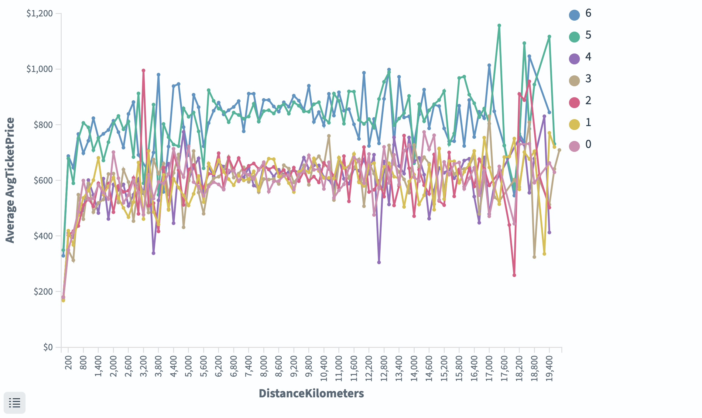
The average ticket price is displayed per weekday value in seven different lines, as shown in the following image. The average ticket price for weekday value keys 5 and 6 are significantly higher across most flight distances.
Configuring a line chart
For information about general visualization configuration, see Configuring visualizations.
Metrics & axes tab
| Setting | Description |
|---|---|
| Chart type | Override per series. Supports Line, Area, Bar. |
| Mode | Normal overlaps lines. Stacked is available when combining with area/bar types. |
| Line mode | Straight, Smoothed, or Stepped. |
| Y-axis scale | Linear, Log, or Square root. |
Next steps
- To choose a different visualization type, see Choosing a visualization type.
- To add this visualization to a dashboard, see Creating dashboards.