Bar chart
A bar chart displays data as vertical or horizontal bars, making it ideal for comparing discrete categories. You can use a Color field to break categories into sub-groups and add threshold lines to flag values higher or lower than a target.
Creating a bar chart
The following examples build on each other, starting with a basic chart and adding complexity. Before you begin, complete the prerequisites.
Basic bar chart
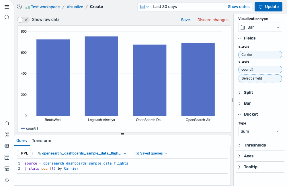
Start with an aggregation query that counts events by category:
source = opensearch_dashboards_sample_data_flights | stats count() by Carrier
After running this query, the visualization editor automatically selects a Bar chart and maps the fields:
- The X-Axis displays the
Carrierfield. - The Y-Axis displays the
count()field.
The result is a bar chart comparing the event count for each carrier, as shown in the following image.
Grouped bar chart
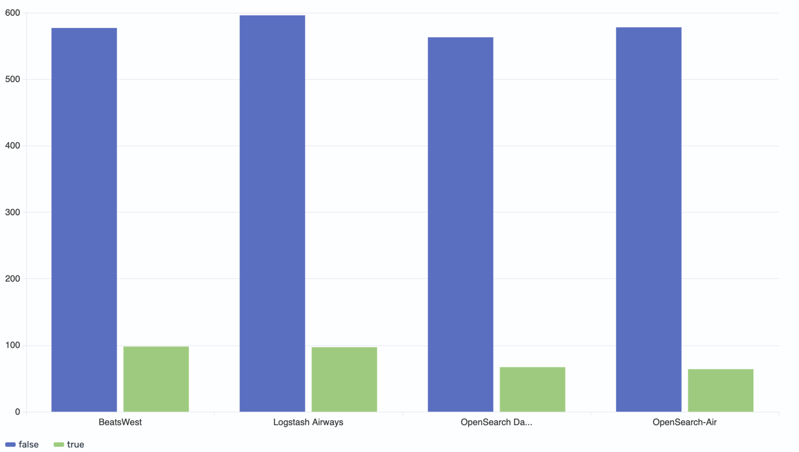
Add a second dimension to your query to split each category into sub-groups:
source = opensearch_dashboards_sample_data_flights | stats count() by Carrier, Cancelled
This query groups the count by both carrier and the Cancelled field. Select Cancelled as the Color field to render a separate bar for each cancellation status within each carrier.
The result is a grouped bar chart in which each carrier has two bars side by side—one for non-canceled flights and one for canceled flights—making it easy to compare the flight counts for each cancellation status, as shown in the following image.
Adding thresholds
Use thresholds to add reference lines and color-code bars based on a target value.
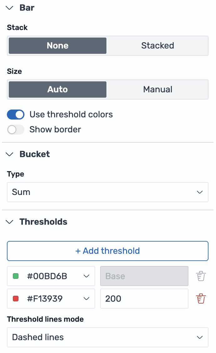
Using the same grouped bar chart from the previous example, configure the settings panel:
- In the Bar section, enable Use threshold colors.
- In the Thresholds section, select + Add threshold.
- Set the base color to green (
#00BD6B) and add a threshold at value200with a red color (#F13939). - Set Threshold lines mode to Dashed lines, as shown in the following image.
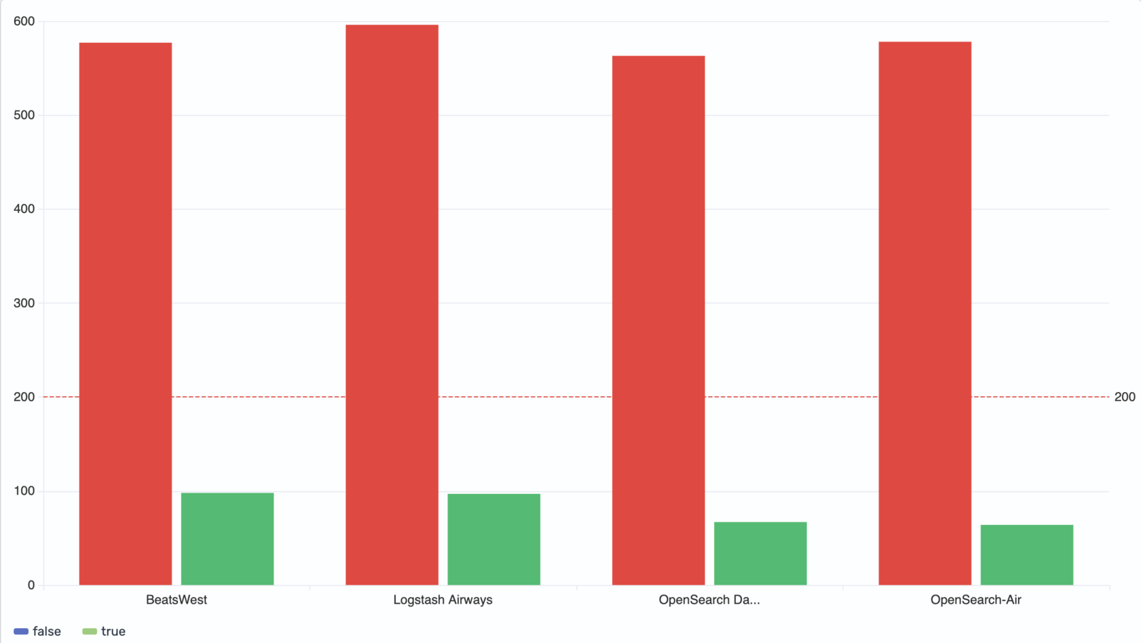
The result shows bars colored according to the threshold rules: bars below 200 appear green, while bars above 200 appear red. A dashed reference line at 200 provides a clear visual anchor, as shown in the following image.
Configuring a bar chart
You can configure the following settings in the configuration panel.
Fields
In the Fields section, configure the fields displayed on each axis.
| Field | Description |
|---|---|
| X-Axis | Select a categorical or date field that defines the groups along the horizontal axis (for example, Carrier). |
| Y-Axis | Select one or more numeric fields that determine the height of the bars. When multiple fields are selected, each renders as a separate bar within each category group. |
| Color | Select a categorical field to split each category into grouped bars, each rendered in a different color. For example, use a Cancelled field to show separate bars for canceled and non-canceled flights within each carrier. |
Split
In the Split by dropdown list, select a field to split the chart into separate elements by value. For more information, see Split.
Bar
The following settings control the display style and sizing of bars.
| Setting | Description |
|---|---|
| Stack | Controls whether grouped bars are displayed side by side (None) or stacked on top of each other (Stacked). |
| Size | Controls bar width. Auto sizes bars automatically. Manual sets a specific width percentage (1–100). |
| Use threshold colors | When enabled, the chart colors bars based on the threshold rules defined in the Thresholds section. |
| Show border | When enabled, adds a border around each bar. You can configure border width and color. |
Bucket
The following settings control how data is aggregated within each bar.
| Setting | Description |
|---|---|
| Type | The aggregation type used to calculate the value for each bucket. Supported values: Sum, Average, Min, Max, Count. |
| Interval | The time interval for grouping data into buckets. Supported values: Auto, Month, Day, Hour, Minute, Second. |
Thresholds
For information about configuring thresholds, see Thresholds.
Axes
The X-axis and Y-axis share the same configuration options. For more information, see Axes.
Tooltip
Toggle the Show tooltip selector to enable or disable tooltips.