Pie charts
A pie chart displays what percent of each condition makes up the entire count of a data field. The visualization can show a single value or multiple bucketed values.
When to use pie charts
Use pie charts to compare the relative share of each condition making up a metric. You can select pie segments to filter other visualizations on the same dashboard.
Creating a pie chart
The examples on this page use the Sample flight data dataset. Before you begin, complete the prerequisites.
To create a pie chart, follow these steps:
-
In the New Visualization dialog, select Pie, then select your index pattern (for example, opensearch_dashboards_sample_data_flights).
The visualization displays an annular (ring) style pie chart showing only one value. The tooltip reveals the value, a count of the documents in the index pattern. For the
opensearch_dashboards_sample_data_flightsdata, this is13059if the date range contains all the documents.If your visualization displays a different value, make sure that your time filter window is large enough to encompass all the sample flight data.
- Under Metrics, expand Slice size count.
-
Set Aggregation to Unique Count and Field to FlightNum.
For a pie chart, bucketed values of the metric must add to 100%. Only those aggregations with this property are displayed.
-
Select Update.
The pie chart displays
12,932, presented as a single-value annular pie chart. -
To visualize the composition of the field by different conditions, bucket the data:
- Under Buckets, select Add > Split slices.
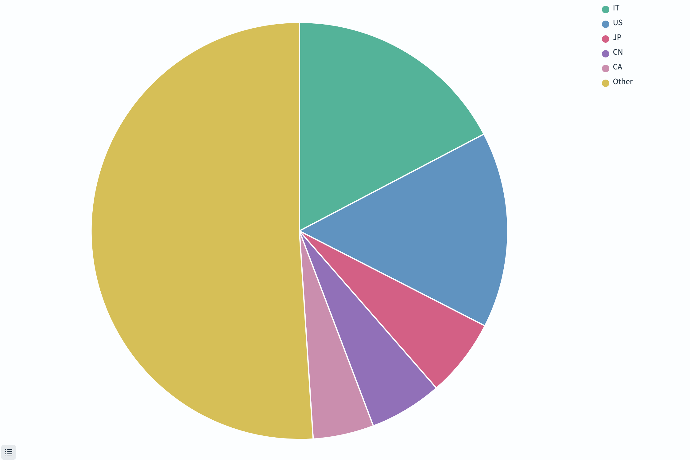
- Set Aggregation to Terms, Field to OriginCountry, and Size to
5. - Select Group other values in separate bucket so that the total number of unique flights is accurately represented.
- Select Update.
The visualization shows that Italy and the U.S. originate the most flights. The top five countries account for almost half of unique flight numbers.
-
(Optional) Display the visualization as a traditional rather than annular pie chart:
- Select the Options tab.
- In the Pie settings panel, deselect Donut.
- Select Update.
The visualization shows a wedge pie chart of the top five countries with all others grouped, as shown in the following image.
Configuring a pie chart
For information about general visualization configuration, see Configuring visualizations.
Options tab
| Setting | Description |
|---|---|
| Donut | When enabled, renders the chart as a ring (donut) rather than a filled circle. |
| Show labels | Displays category labels on each slice. |
| Show top level only | When nested buckets exist, shows only the outermost ring. |
Next steps
- To choose a different visualization type, see Choosing a visualization type.
- To add this visualization to a dashboard, see Creating dashboards.