Configuring visualizations
The configuration panel is on the right side of the Visualize application. It contains two or more tabs depending on the type of visualization being edited. For terminology definitions, see Concepts.
The configuration panel contains the following tabs:
- The Data tab enables the addition of metrics and data buckets to the visualization.
- The Metrics and axes tab controls display options such as how to display axes, labels, and scales; text display and alignment, and visualization-specific options. This tab is labeled Options for some visualization types.
- The Panel settings tab contains options for panel-wide settings such as the legend, tool tips, and grid lines.
Data tab
A typical Data tab is shown in the following image.
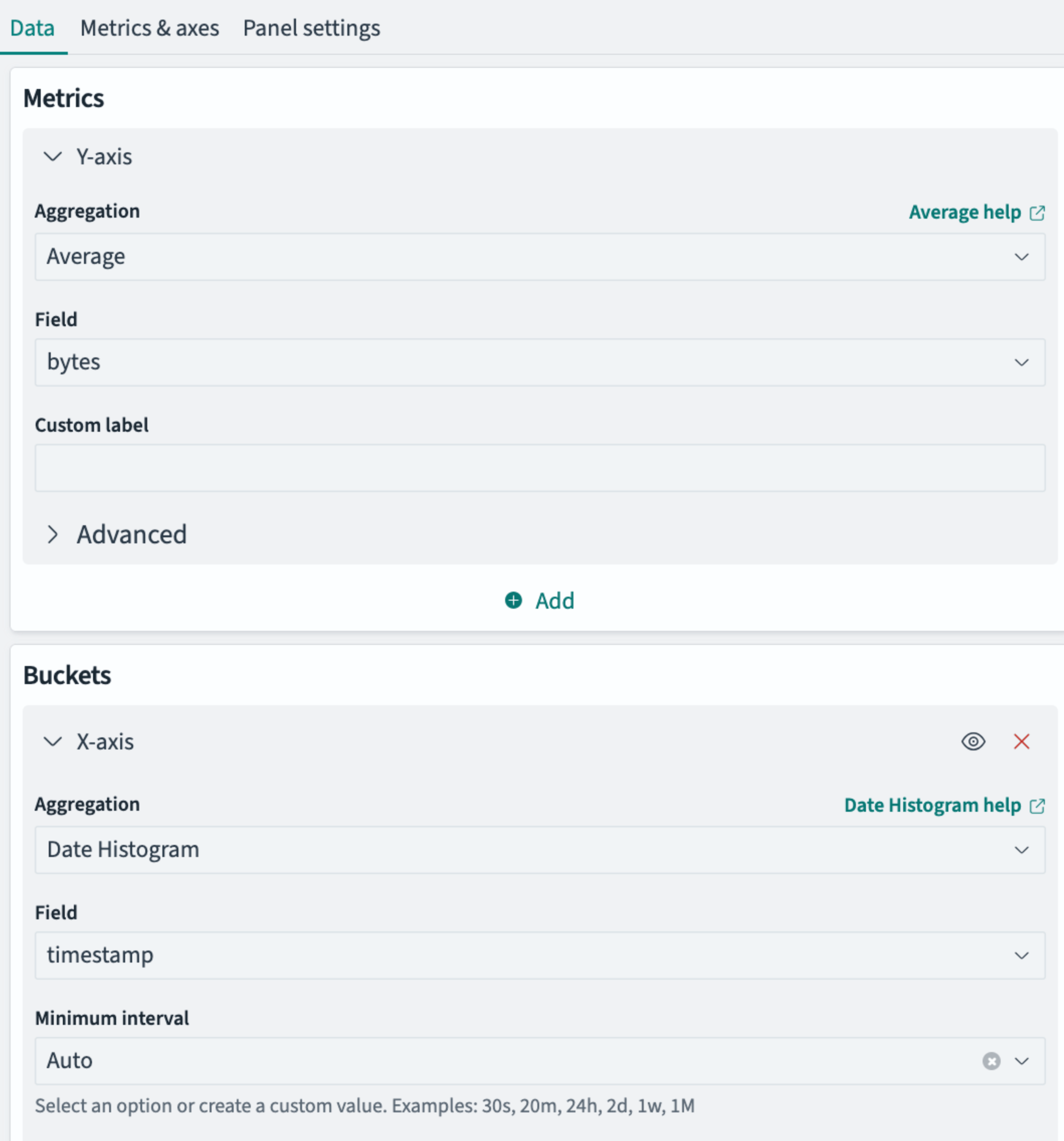
The Data tab generally contains two types of panels for adding elements to the visualization:
- Y-axis, Data or Metrics panels for choosing the field or fields to be displayed
- X-axis or Buckets panels for choosing how to segment the data for display
Metrics and Buckets panels both use progressive disclosure, meaning that subsequent options available to you are based on your last choice in the panel. A typical sequence for choosing a metric or bucket is as follows:
-
You select an aggregation type, such as average, count, max, or min, from a drop-down of available choices.
-
You select a field from a drop-down. The field selection is limited to data types to which your selected aggregation can be applied. For example, the Count aggregation applies to documents as a whole, so no field selection is presented. The Time histogram aggregation applies only to timestamp fields.
-
You optionally select other options such as range intervals or a custom name to label the field in the visualization.
-
You optionally add more fields or buckets. For example, after choosing an X-axis bucket type of histogram to display a cost variable across product category in a bar chart, you might add a split chart bucket to display a separate bar chart for each customer gender.
Metrics and axes tab
A typical Metrics tab is shown in the following image.
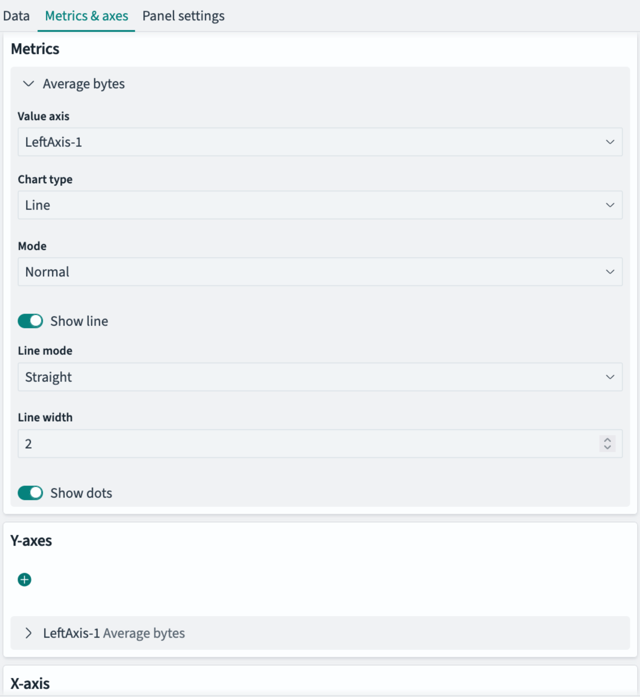
Like the Data tab, contents of the Metrics and axes (or Options) tab depend on the visualization type as well as the specifics of the data that you’ve selected. Options vary widely, but generally fall into the following categories. This is not an exhaustive list:
Metrics options
Metrics or display options include:
- The form factor of the graphic, such as Circle or Arc for gauges; or Line/Bar/Area chart types
- Visualization-specific options, such as Stacked or Normal (superimposed) area charts
- Whether to display lines and dots in line graphs, line width, and line style (such as straight or smoothed)
- Range widths
- Color schemas (for heat maps, for example)
Axis options
X- and Y-axis options include:
- Position of the axes
- Mode, such as normal or percentage scale
- Whether to display or truncate labels and their alignment
- Custom titles for axes
- Whether to display axis lines and tick marks
Panel settings
A typical Panel settings tab is shown in the following image.
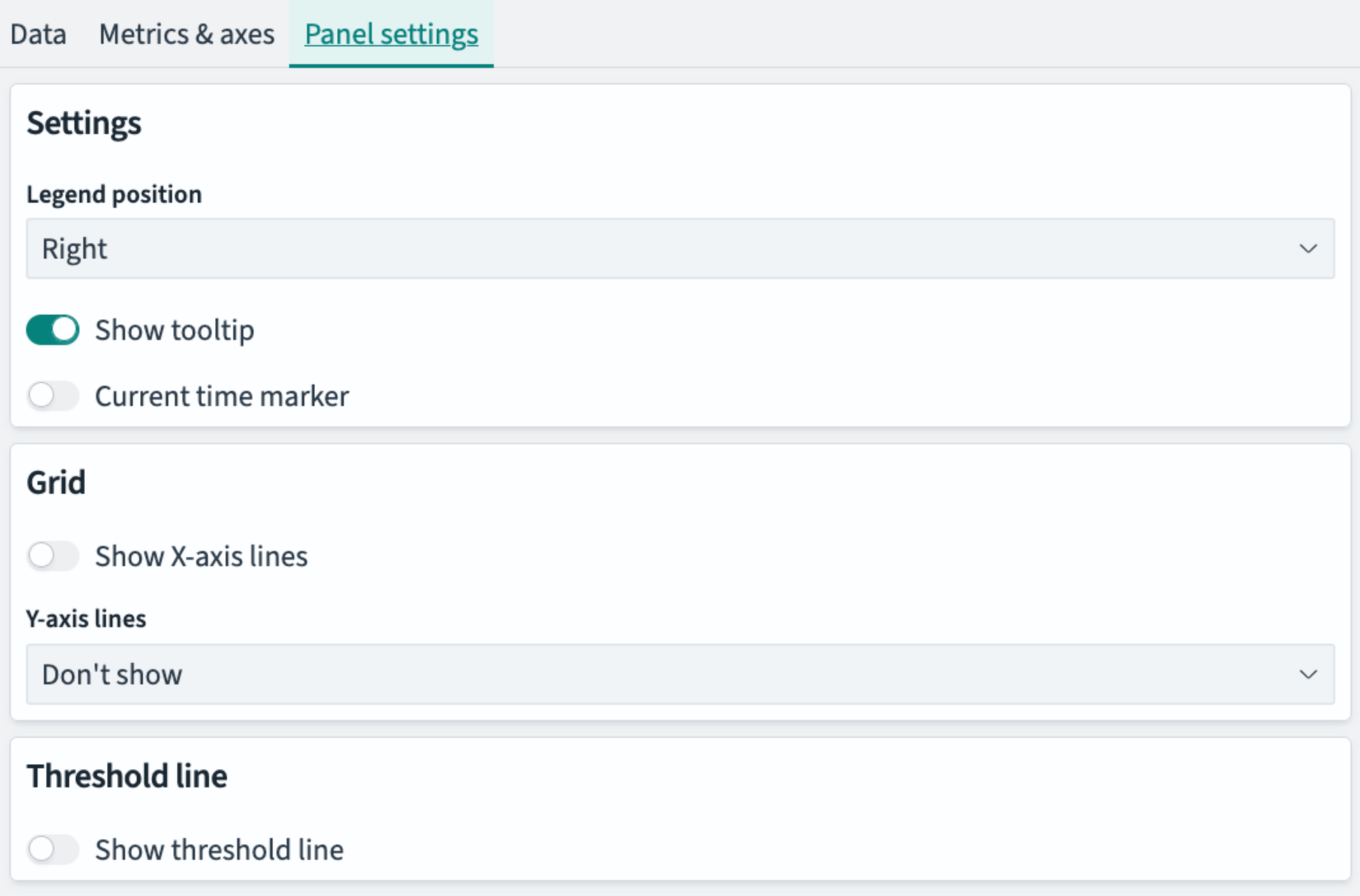
The Panel settings tab controls panel-wide display options such as the following:
- Change the position of the legend
- Show a threshold line
- Highlight the current time on a timeline
- Show or hide vertical or horizontal grid lines
- Label values on charts
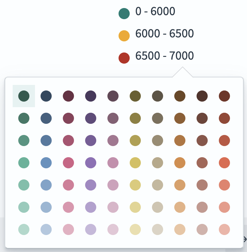
Legend colors
The legend shows the color key in charts where range, categorical, or text variables are represented by colors.
You can use the legend to change the colors of a graphical element. To change a color, do the following:
-
Select an entry in the legend.
-
Choose a color from the palette that appears.