Metric visualizations
A metric visualization displays a single data field. The visualization can show a single value or multiple bucketed values. Use metric visualizations for key indicators on dashboards, especially values that update frequently.
When to use metric visualizations
Use metric visualizations to communicate key business or operational values at a glance, especially real-time or frequently updated values that require constant monitoring, such as system health, business performance, or operational status.
Creating a metric visualization
The examples on this page use the Sample flight data dataset. Before you begin, complete the prerequisites.
To create a metric visualization, follow these steps:
-
In the New Visualization dialog, select Metric, then select your index pattern (for example, opensearch_dashboards_sample_data_flights).
The visualization displays a count of the documents in the index pattern. For the
opensearch_dashboards_sample_data_flightsdata, this is13059if the date range contains all the documents. - Under Metrics, expand Metric Count.
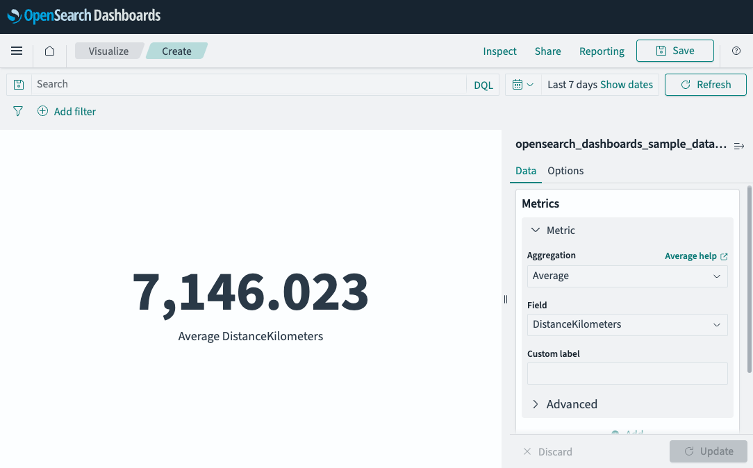
- Set Aggregation to Average and Field to DistanceKilometers.
-
Select Update.
The visualization displays
7092.142, the average distance in kilometers for every document in the flight database.If your visualization displays a different value, make sure that your time filter window is large enough to encompass all the sample flight data.
Configuring a metric visualization
For information about general visualization configuration, see Configuring visualizations.
Next steps
- To choose a different visualization type, see Choosing a visualization type.
- To add this visualization to a dashboard, see Creating dashboards.