PPL visualizations
PPL (Piped Processing Language) visualizations enable data processing and visualization using PPL queries. Selecting PPL from the New Visualization dialog opens the Observability Logs Explorer, where you write a PPL query and map the results to a chart.
When to use PPL visualizations
Use PPL visualizations when you want to write queries directly using the PPL pipeline syntax rather than configuring aggregations through the point-and-click interface. For more information, see Observability and Exploring data.
Creating a PPL visualization
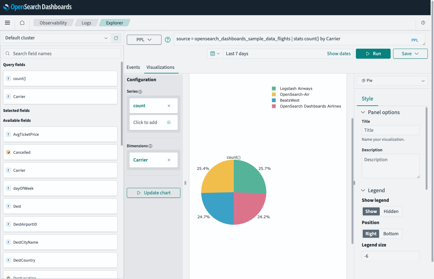
The examples on this page use the Sample flight data dataset. Before you begin, complete the prerequisites.
To create a PPL visualization, follow these steps:
- In the New Visualization dialog, select PPL. The Observability Logs Explorer opens.
-
In the PPL query bar, enter a query. For example:
source = opensearch_dashboards_sample_data_flights | stats count() by Carrier - Set the time filter to a range that contains data (for example, select Last 7 days).
- Select Run.
- Select the Visualizations tab to view the chart.
- (Optional) Use the chart type selector on the right to change the chart type (for example, Pie).
The explorer automatically maps query result fields to the chart. The Configuration panel shows Series (the metric) and Dimensions (the grouping field), as shown in the following image.
Related documentation
Next steps
- To choose a different visualization type, see Choosing a visualization type.
- To add this visualization to a dashboard, see Creating dashboards.