Bar charts
A bar chart compares values across categories by representing values as proportional bar lengths. Use vertical bars for time-series data or category comparisons, and horizontal bars when category labels are long or when comparing many categories.
When to use bar charts
Use bar charts to reveal variation over an independent variable, comparative performance across categories, and trends over time. Bar charts can show performance gaps, outliers, seasonal patterns, and comparative advantages across categories. You can select bars to filter other visualizations on the same dashboard.
Creating a bar chart
The examples on this page use the Sample flight data dataset. Before you begin, complete the prerequisites.
To create a bar chart, follow these steps:
- In the New Visualization dialog, select Vertical Bar (or Horizontal Bar), then select your index pattern (for example, opensearch_dashboards_sample_data_flights).
- Under Metrics, expand Y-axis Count.
- Set Aggregation to Average and Field to FlightDelayMin.
- (Optional) Enter a Custom label, for example
Flight delay in minutes. -
Select Update.
The chart displays a single bar with height of about
47, the average flight delay for every document in the flight database.If your visualization displays a different value, make sure that your time filter window is large enough to encompass all the sample flight data.
- Under Buckets, select Add > X-axis.
- Set Aggregation to Terms and Field to OriginWeather.
-
Set Order by to
Metric: FlightDelayMin, Order to Descending, and Size to8.Any number eight or higher displays all of the available
OriginWeatherterms. -
Select Update.
The chart shows the average delay for each weather type at the flight origin. The greatest average delay was for
Damaging Wind, as shown in the following image.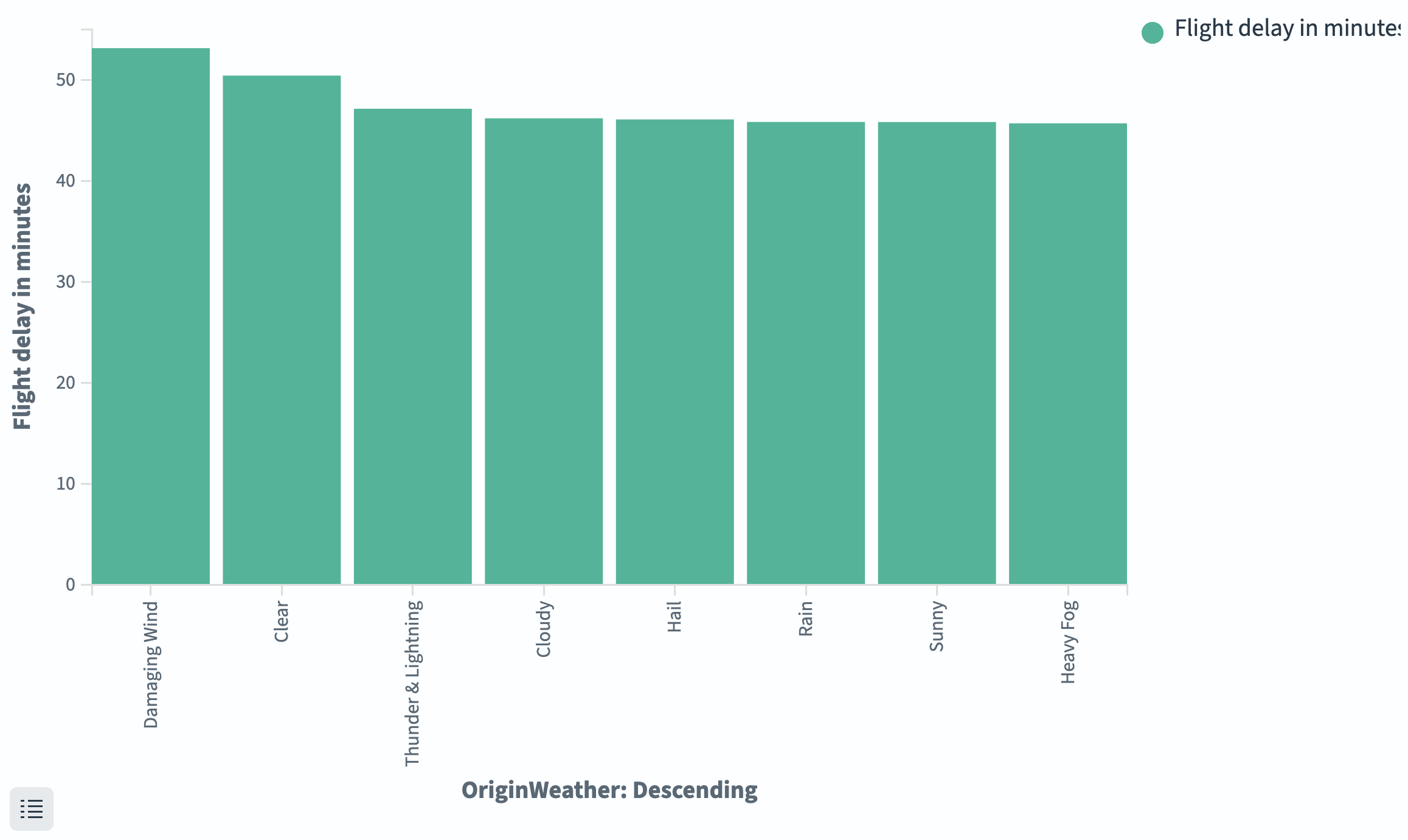
Configuring a bar chart
Bar charts share the same configuration tabs as other aggregation-based visualizations. For information about each tab, see Configuring visualizations.
Data tab
| Setting | Description |
|---|---|
| Metrics | Defines the Y-axis values. Supports all standard aggregations (Count, Average, Sum, Min, Max, Unique Count, Median, Percentiles, and others). |
| Buckets > X-axis | Groups bars along the horizontal axis. Use Terms for categorical data, Date Histogram for time-based data, or Histogram for numeric ranges. |
| Buckets > Split series | Splits each bar into grouped or stacked sub-bars by the values of a field. |
| Buckets > Split chart | Creates separate chart panels (small multiples) for each bucket value. |
Metrics & axes tab
| Setting | Description |
|---|---|
| Chart type | Override per series. Supports Line, Area, Bar. |
| Mode | Stacked layers bars on top of each other. Normal groups bars side by side. |
| Y-axis position | Left or Right. |
| Y-axis scale | Linear, Log, or Square root. |
Panel settings tab
| Setting | Description |
|---|---|
| Legend position | Top, Left, Right, Bottom. |
| Show tooltip | Displays values on hover. |
| Order buckets by sum | Orders split series by total value. |
| Show threshold line | Draws a horizontal reference line at a specified value. |
Next steps
- To choose a different visualization type, see Choosing a visualization type.
- To add this visualization to a dashboard, see Creating dashboards.