State timeline
A state timeline displays a series of horizontal bars that represent state changes over time. Each bar, known as a state region, represents a specific state, and its length indicates the duration of that state.
Creating a state timeline
The following examples build on each other, starting with a basic timeline and adding complexity. Before you begin, complete the prerequisites.
Single-category state timeline
Start with a query that returns a time field and a state field:
source = opensearch_dashboards_sample_data_logs | fields timestamp, response
After running this query, select State Timeline as the chart type. The fields are mapped as follows:
- The X-Axis displays the
timestampfield. - The Color displays the
responsefield.
The result is a single row of colored segments, where each segment represents a time period during which a particular response status code was recorded, as shown in the following image.

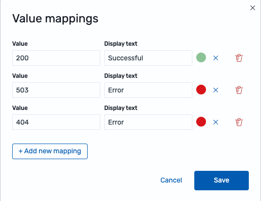
Applying value mappings
Use value mappings to assign custom labels and colors to specific state values. For example, to categorize HTTP response codes into meaningful groups:
- In the Value mappings section, select Edit value mappings.
- Select Add new mapping and select Value as the mapping type.
- In the Value field, enter
200. In the Display text field, enterSuccessful. Select the color green. - Repeat for
404with the labelErrorand the color orange. - Repeat for
503with the labelErrorand the color red, as shown in the following image, and then select Save.
Alternatively, select Range as the mapping type to group continuous values into bands. For example, map all status codes in the range [400, 600) to display as “Error” in red.
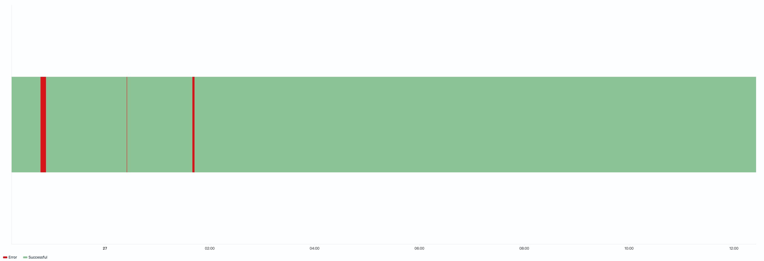
The timeline now displays user-configured labels for each data value and uses consistent colors—green for successful responses and red for errors, as shown in the following image.
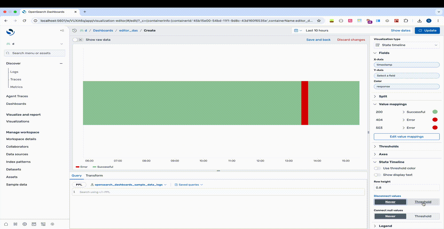
Handling data gaps
In a state timeline, each data point’s timestamp serves as the start time of a state region, and the next data point’s timestamp marks its end. When data has gaps (missing data points between timestamps), use the Disconnect values or Connect null values settings to control how these gaps are visualized.
You can apply only one of Disconnect values and Connect null values at a time.
The following example shows the effect of setting the Disconnect values threshold:
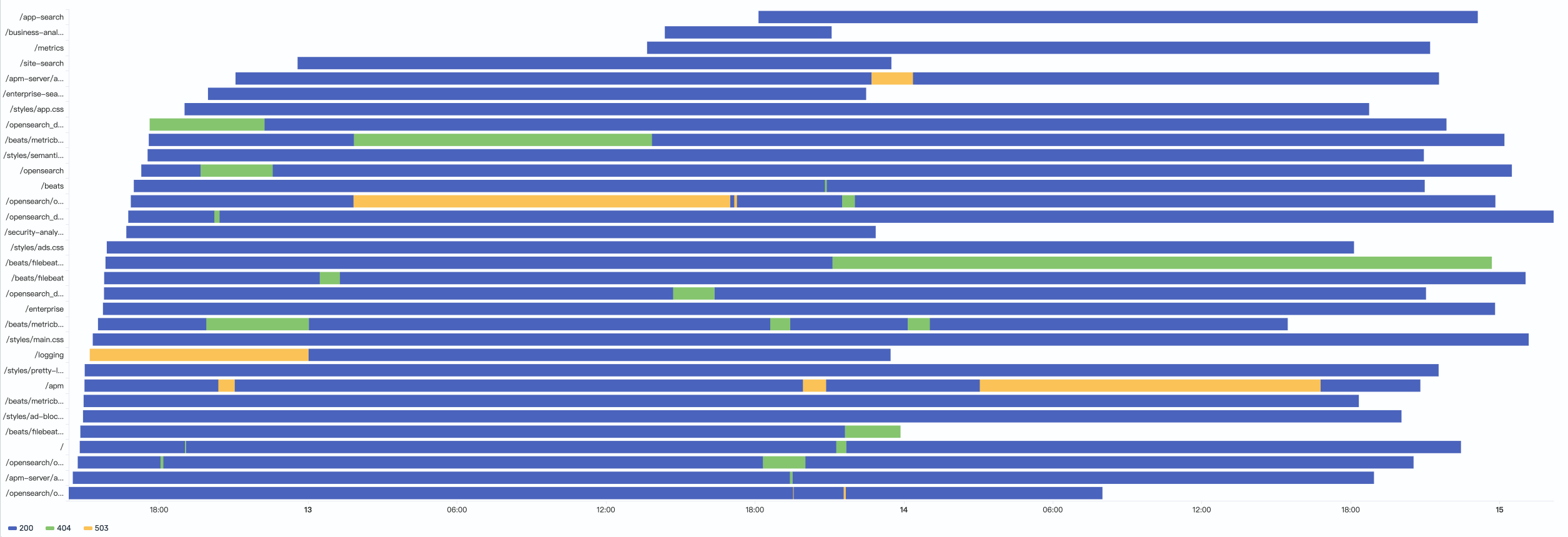
Multi-category state timeline
Add a categorical grouping field to display multiple rows of state timelines:
source = opensearch_dashboards_sample_data_logs | fields timestamp, request, response
After running this query, select State Timeline as the chart type. The fields are mapped as follows:
- The X-Axis displays the
timestampfield. - The Y-Axis displays the
requestfield. - The Color field displays the
responsefield.
The result shows each request path’s response status over time, making it easy to identify which endpoints experience frequent instability, as shown in the following image.
Configuring a state timeline
You can configure the following settings in the configuration panel.
Fields
In the Fields section, configure the fields displayed on each axis.
| Field | Description |
|---|---|
| X-Axis | Select a date field for the horizontal axis. Each data point’s timestamp serves as the start time of a state region. |
| Y-Axis | Select a categorical field to group state timelines into separate rows. Each unique value is rendered as its own row. Optional for single-category timelines. |
| Color | Select a categorical or numeric field to define the state at each time point. Categorical fields represent discrete states (such as running, stopped, or degraded). Numerical fields can represent states when each value corresponds to a distinct state (for example, HTTP status codes 200, 404, 503). For continuous numerical values, use value mappings to define ranges as named states. |
Split
In the Split by dropdown list, select a field to split the chart into separate elements by value. For more information, see Split.
Value mappings
Value mappings replace raw data values with custom labels and colors. The following mapping types are available.
Value mapping: Maps a specific value (numerical or categorical) to a custom display text and color. For example, map the HTTP status code 200 to display as “Success” in green, and 503 to display as “Error” in red.
Range mapping: Maps a numerical range to a custom display text and color. For example, map the range [0, 300) to display as “Low” and [300, 800) to display as “Medium”.
Each mapping entry has the following options.
| Setting | Description |
|---|---|
| Value/Range | The target value or numeric range to match. For value mappings, enter a specific value. For range mappings, define a start and end value (start-inclusive, end-exclusive). |
| Display text | The label to show in place of the original value. If left blank, the original value is displayed. |
| Color | A custom color for the mapped value. If left undefined, a color is automatically assigned. |
For a complete example, see Applying value mappings.
Thresholds
For information about configuring thresholds, see Thresholds.
Axes
The X-axis and Y-axis share the same configuration options. For more information, see Axes.
State timeline
Use the following settings to customize the appearance and behavior of the state timeline.
| Setting | Description |
|---|---|
| Use threshold color | When enabled, state region colors are determined by threshold ranges rather than the default or mapped colors. |
| Show display text | When enabled and a value mapping with display text is configured, the mapped text is shown inside each state region. When disabled, no text is displayed. |
| Row height | Controls the height of each state bar. A value of 0 produces the minimum bar width, and 1 produces the maximum bar width. |
| Disconnect values | Controls whether state regions are visually disconnected when gaps exceed a specified duration. Never keeps all regions connected. Threshold disconnects regions when the gap between data points exceeds the configured threshold. |
| Threshold (disconnect) | Sets the duration threshold for disconnecting values. If a gap between consecutive data points exceeds this threshold, the bars are rendered as separate disconnected regions. Specify as a duration (for example, 1h or 30m). |
| Connect null values | Controls how null values (gaps in the data) appear on the chart. Never leaves gaps visible. Threshold connects gaps only when they fall within the configured threshold. |
| Threshold (connect) | Sets the duration threshold for connecting null values. If a gap between data points falls within this threshold, the points are connected, bridging the gap. Specify as a duration (for example, 1h or 30m). |
Legend
The legend summarizes the visual color encodings used in the chart.
| Setting | Description |
|---|---|
| Show legend | Shows or hides the legend. |
| Position | Controls where the legend appears relative to the chart. Supported values: Left, Right, Top, Bottom. |
Tooltip
Toggle the Show tooltip selector to enable or disable tooltips.