Creating aggregation-based visualizations
Aggregations are the analytics engine behind most visualizations in OpenSearch Dashboards. They calculate statistics (metrics) and group data into categories (buckets) so that results can be displayed as charts, tables, and maps. When you configure a visualization in the Visualize application, OpenSearch Dashboards translates your selections into aggregation queries automatically.
The following visualization types use aggregations: Area, Horizontal Bar, Vertical Bar, Coordinate Map, Data Table, Gauge, Goal, Heat Map, Line, Metric, Pie, Region Map, and Tag Cloud.
For a complete list of available metrics and buckets, see Configuring visualizations.
In this tutorial, you’ll create a Vertical Bar visualization using the sample flight data and learn how to use metric aggregations, bucket aggregations, split series, percentiles, pipeline aggregations, and top hits.
Prerequisites
The examples on this page use the Sample flight data dataset. If you haven’t added sample data yet, see Prepare your data.
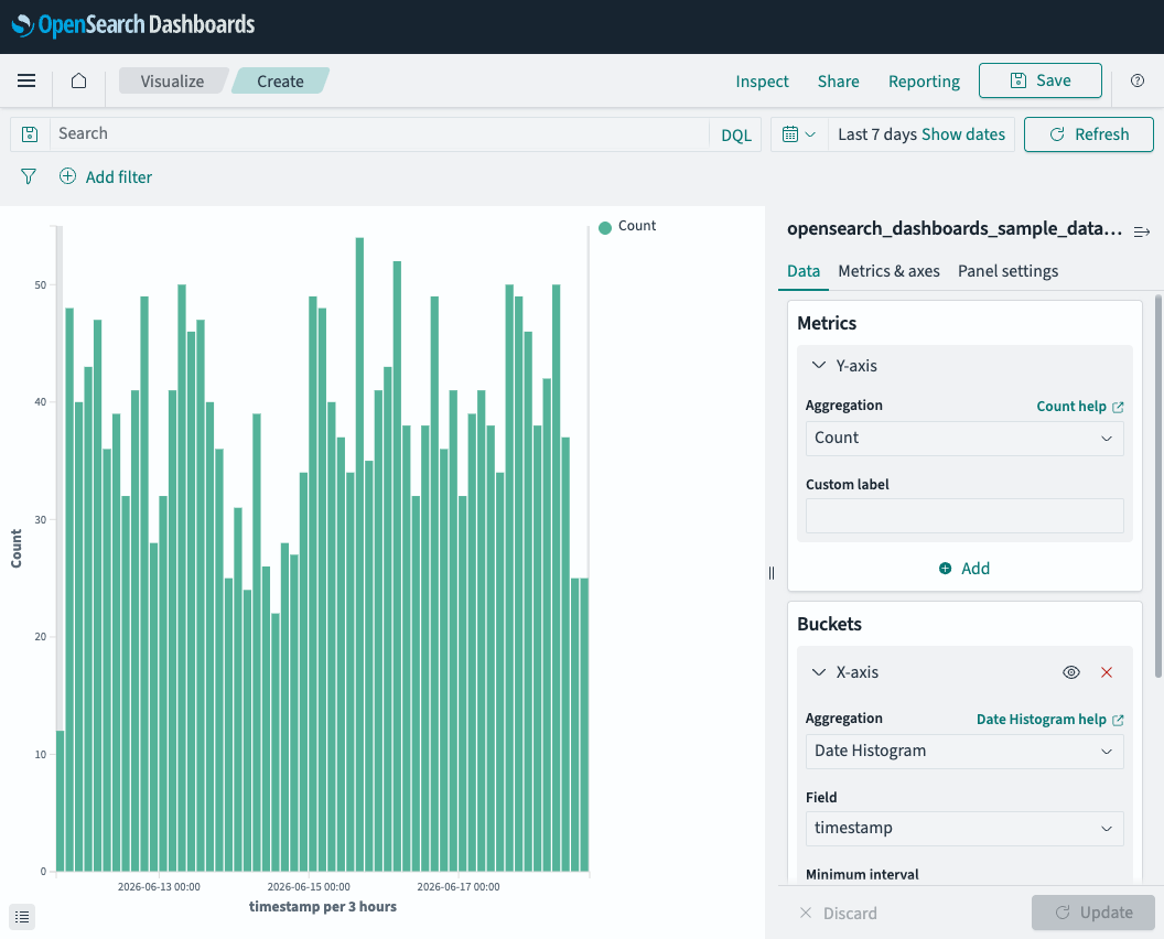
Example 1: Flight count over time
This example uses the default Count metric with a Date Histogram bucket to show the number of flights per time interval.
To create a flight count visualization, follow these steps:
- In the left navigation menu, select OpenSearch Dashboards > Visualize.
- Select Create visualization.
- Select Vertical Bar, then select opensearch_dashboards_sample_data_flights as the source.
- Set the time filter to Last 7 days.
- In the Buckets panel, select Add > X-axis.
- From the Aggregation dropdown list, select Date Histogram.
- Verify that the Field is set to timestamp.
- Select Update.
The chart displays the number of flights per 3-hour interval. The Y-axis shows Count—the number of documents (flights) in each time bucket. Because Count is the default metric, no field selection is required.
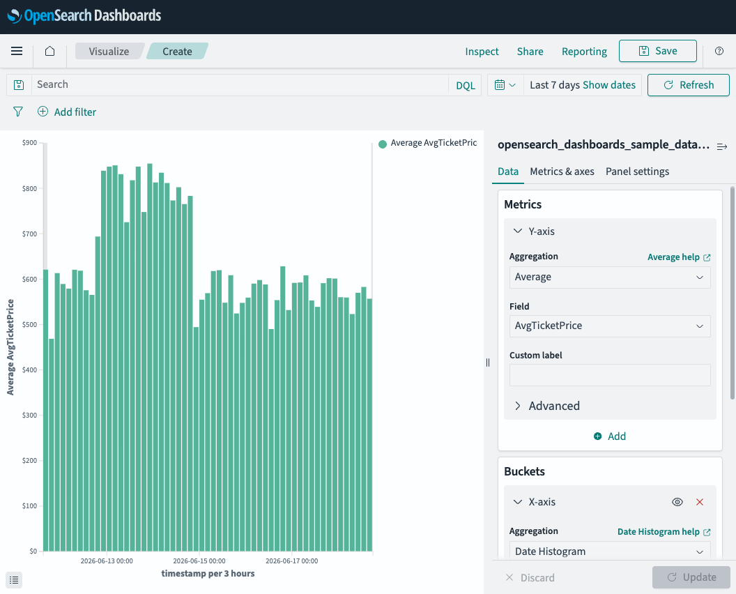
Example 2: Average ticket price over time
This example replaces Count with the Average metric to show how ticket prices change over time.
To change the metric to Average, follow these steps:
- In the Metrics panel, select the Y-axis section.
- From the Aggregation dropdown list, select Average.
- From the Field dropdown list, select AvgTicketPrice.
- Select Update.
The Y-axis now shows dollar values instead of document counts. Each bar represents the average ticket price across all flights in that time interval.
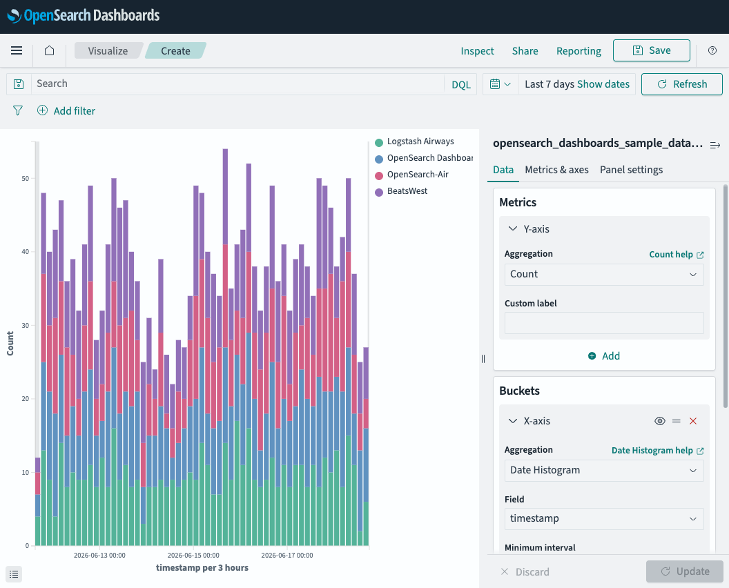
Example 3: Flight count by carrier
This example adds a Split series bucket to break down the Count metric by airline carrier.
To split the series by carrier, follow these steps:
- In the Metrics panel, change the Aggregation back to Count.
- In the Buckets panel, select Add > Split series.
- From the Aggregation dropdown list, select Terms.
- From the Field dropdown list, select Carrier.
- Select Update.
The chart now displays stacked bars, with each color representing a different airline. The legend identifies each carrier. This configuration creates a nested aggregation: the Date Histogram groups flights into time buckets, and the Terms aggregation subdivides each bucket by carrier.
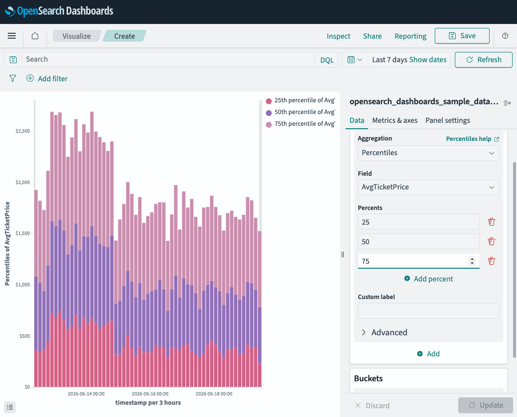
Example 4: Ticket price percentiles over time
This example uses the Percentiles metric to show the distribution of ticket prices across time intervals. Unlike Average (which returns a single value), Percentiles returns multiple values—one for each percentile you configure.
To create a Percentiles visualization, follow these steps:
- In the Metrics panel, select the Y-axis section.
- From the Aggregation dropdown list, select Percentiles.
- From the Field dropdown list, select AvgTicketPrice.
- In the Percents section, remove the default values and enter
25,50, and75(the interquartile range). Use the delete icon next to each value to remove it, and select Add percent to add new ones. - In the Buckets panel, verify that the X-axis is set to Date Histogram on the timestamp field.
- Select Update.
The chart displays three stacked series—one for each percentile. The 50th percentile (median) shows the middle value, while the gap between the 25th and 75th percentiles shows the spread of ticket prices in each time bucket.
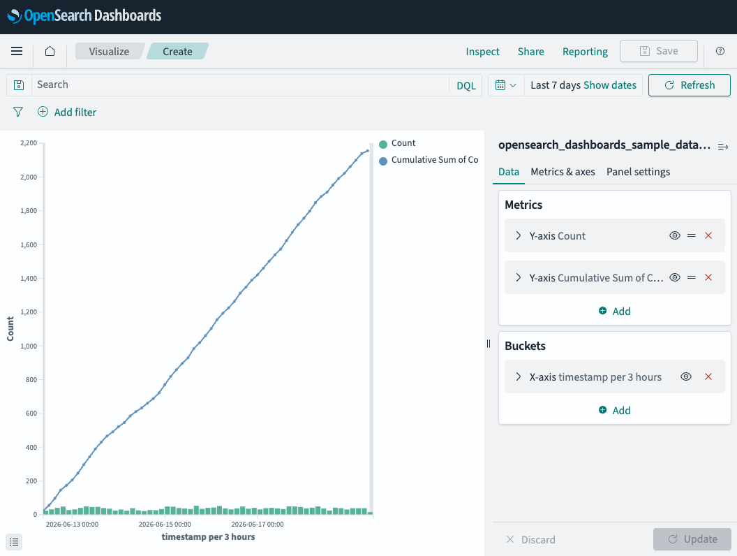
Example 5: Cumulative flight count
This example uses the Cumulative Sum pipeline aggregation to show a running total of flights. Pipeline aggregations operate on the output of another metric rather than directly on document fields.
To add a cumulative sum to your visualization, follow these steps:
- In the Metrics panel, verify that the first Y-axis is set to Count.
- Select Add to create a second metric.
- From the Aggregation dropdown list, scroll down to Parent Pipeline Aggregations and select Cumulative Sum.
- In the Metric dropdown list, select Custom metric.
- In the nested Aggregation dropdown list that appears, select Count.
- In the Buckets panel, verify that the X-axis is set to Date Histogram on the timestamp field.
- Select Update.
The chart displays the per-interval Count as bars along the bottom and the Cumulative Sum as a rising line. The line shows the total number of flights accumulated over time.
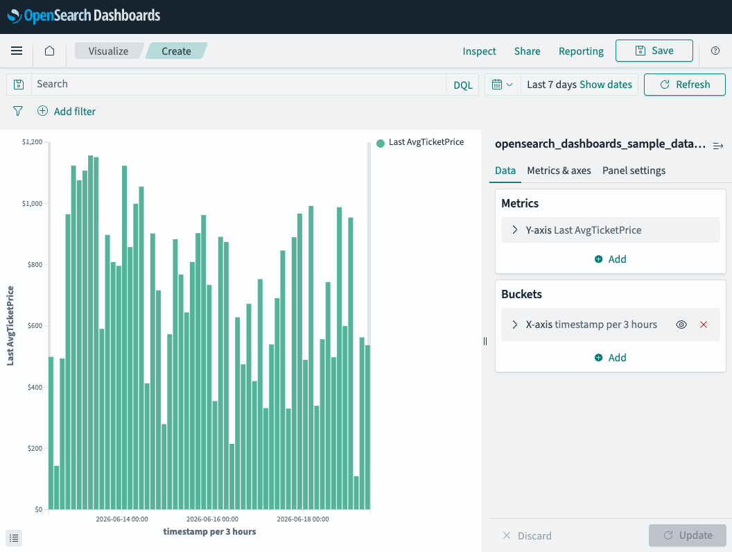
Example 6: Most recent ticket price over time
This example uses the Top Hit metric to display the most recent ticket price in each time bucket. Top Hit has the most configuration options of any metric: it lets you control which document values are returned, how many, and in what order.
To create a Top Hit visualization, follow these steps:
- In the Metrics panel, select the Y-axis section.
- From the Aggregation dropdown list, select Top Hit.
- From the Field dropdown list, select AvgTicketPrice.
- From the Aggregate with dropdown list, select Max (this determines how multiple values within the same bucket are combined).
- Set Size to
1(return one value per bucket). - From the Sort on dropdown list, select timestamp.
- From the Order dropdown list, select Descending (most recent first).
- In the Buckets panel, verify that the X-axis is set to Date Histogram on the timestamp field.
- Select Update.
The chart displays the most recent (highest-timestamp) ticket price in each 3-hour interval. Unlike Average, which smooths all values together, Top Hit shows a single document’s actual value, which is useful for tracking the latest state per time window.
Next steps
- To learn about all available metric and bucket aggregations, see Configuring visualizations.
- To understand how aggregations work in the API, see Aggregations.