Area chart
An area chart plots data points connected by lines with the region below filled in, making it ideal for visualizing volume and composition over time. You can stack multiple series to see how each category contributes to the total.
Creating an area chart
The following examples build on each other, starting with a basic chart and adding complexity. Before you begin, complete the prerequisites.
Basic area chart
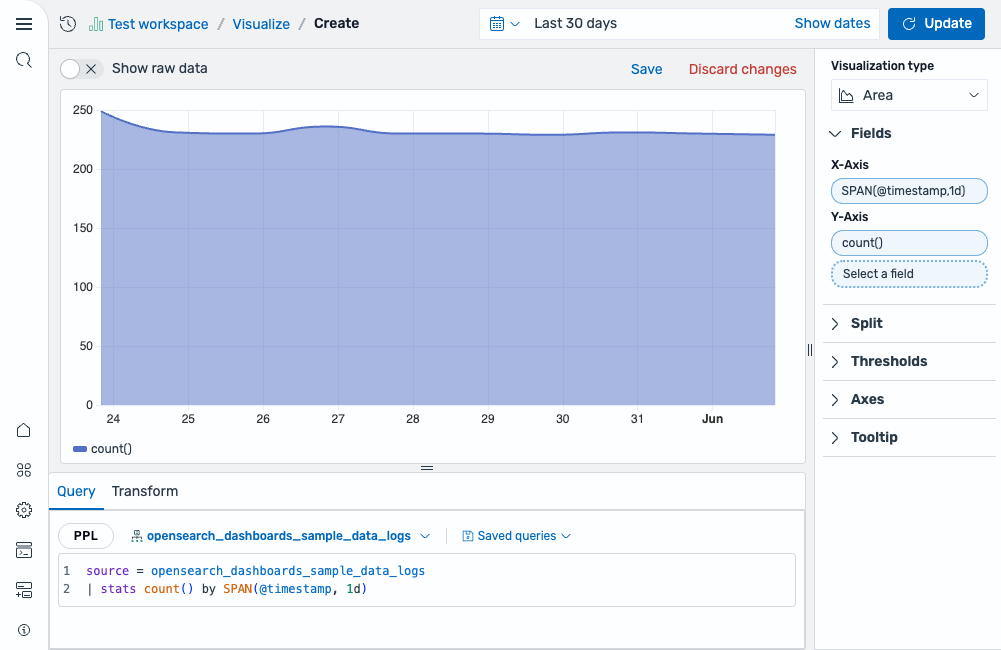
Start with an aggregation query that counts events over time:
source = opensearch_dashboards_sample_data_logs | stats count() by SPAN(@timestamp, 1d)
After running this query, the visualization editor automatically maps the fields:
- The X-Axis displays the
SPAN(@timestamp, 1d)field. - The Y-Axis displays the
count()field.
The result is a single filled area showing the event count per day, as shown in the following image.
Stacked area chart
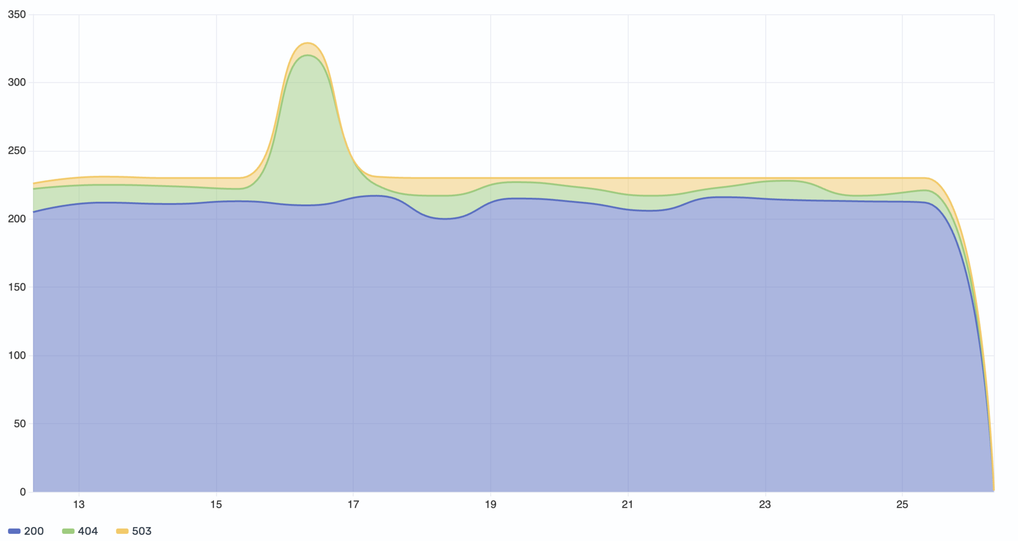
Add a third dimension to your query to split the data into multiple stacked series by category:
source = opensearch_dashboards_sample_data_logs | stats count() by SPAN(@timestamp, 1d), response
This query groups the count by both time and the response field (HTTP status codes). Select response as the Color field to render a separate stacked area for each status code value (for example, 200, 404, 503).
The result is a stacked area chart that displays each HTTP response code in a distinct color. The chart stacks the areas on top of each other, showing both individual category volumes and the total across all categories, as shown in the following image.
Configuring an area chart
You can configure the following settings in the configuration panel.
Fields
In the Fields section, configure the fields displayed on each axis.
| Field | Description |
|---|---|
| X-Axis | Select a date or numeric field for the horizontal axis that defines the buckets along which data is plotted (for example, SPAN(@timestamp, 1d)). |
| Y-Axis | Select one or more numeric fields to plot as separate areas. When multiple fields are selected, each renders as its own area layer. |
| Color | Select a categorical field to split the data into multiple stacked series, each rendered in a different color. For example, use a response status code field to display separate stacked areas for each HTTP status code. |
Split
In the Split by dropdown list, select a field to split the chart into separate elements by value. For more information, see Split.
Thresholds
For information about configuring thresholds, see Thresholds.
Axes
The X-axis and Y-axis share the same configuration options. For more information, see Axes.
Tooltip
Toggle the Show tooltip selector to enable or disable tooltips.