Line chart
A line chart plots data points connected by lines, making it ideal for visualizing trends and changes over time. You can compare multiple series on the same time axis and use a secondary Y-axis to correlate metrics with different scales.
Creating a line chart
The following examples build on each other, starting with a basic chart and adding complexity. They use the sample web log dataset. Before you begin, complete the prerequisites.
Basic line chart
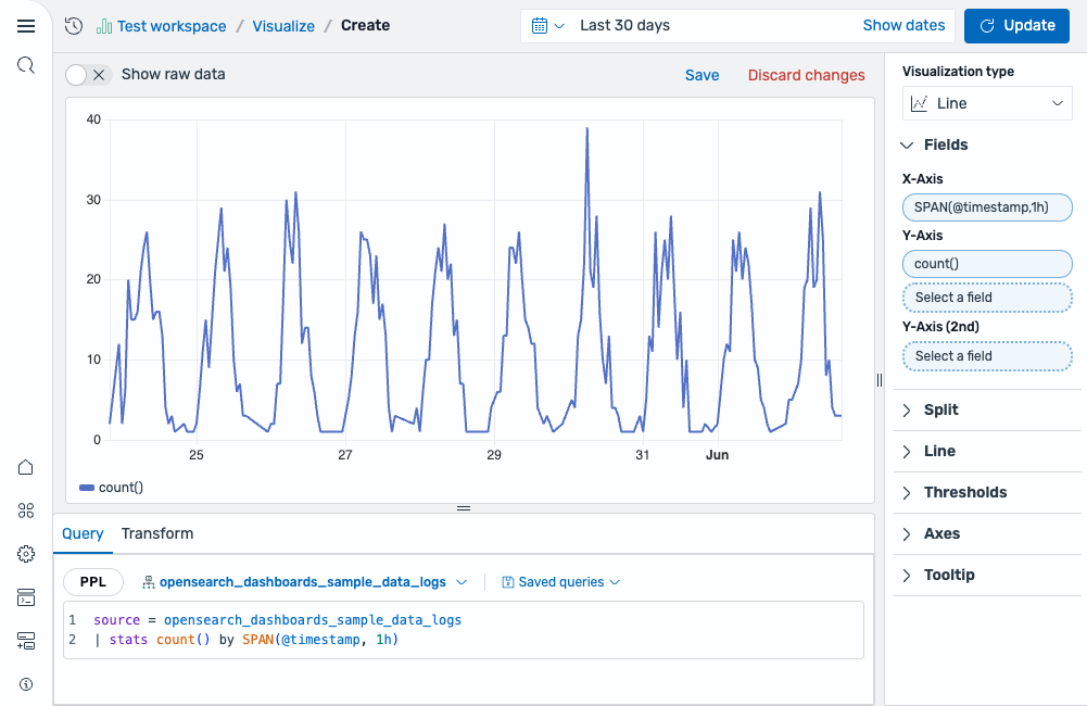
Start with an aggregation query that counts events over time:
source = opensearch_dashboards_sample_data_logs | stats count() by SPAN(@timestamp, 1h)
After running this query, the visualization editor automatically selects a Line chart and maps the fields:
- The X-Axis displays the
SPAN(@timestamp, 1h)field. - The Y-Axis displays the
count()field.
The result is a single line showing the event count per hour, as shown in the following image.
Multi-series line chart
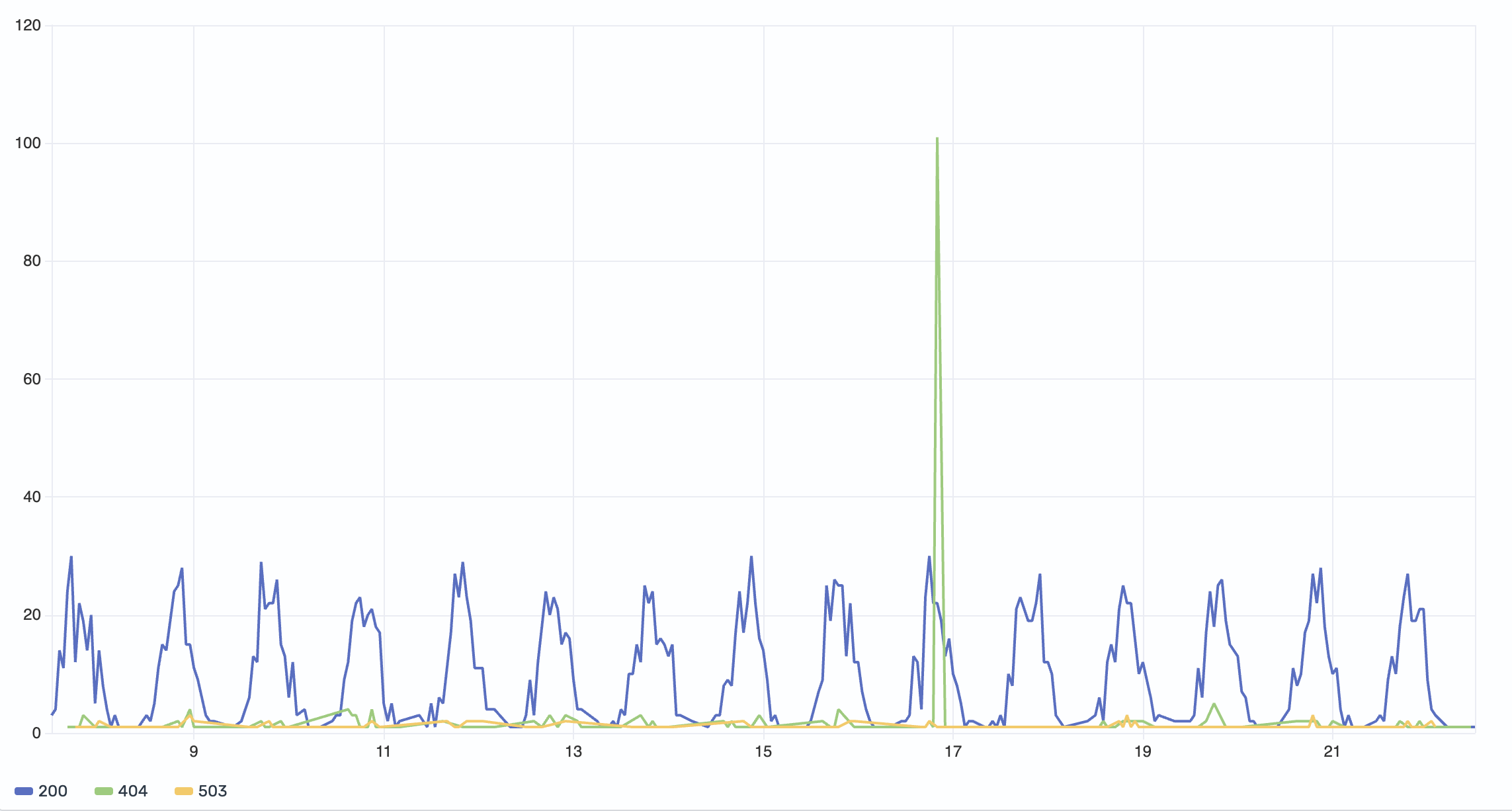
Add a third dimension to your query to split the data into multiple series by category:
source = opensearch_dashboards_sample_data_logs | stats count() by SPAN(@timestamp, 1h), response
This query groups the count by both time and the response field (HTTP status codes). Select response as the Color field to render a separate line for each status code value (for example, 200, 404, 503).
The result is a multi-series line chart where each HTTP response code is displayed in a distinct color, as shown in the following image.
Multiple Y-Axis fields
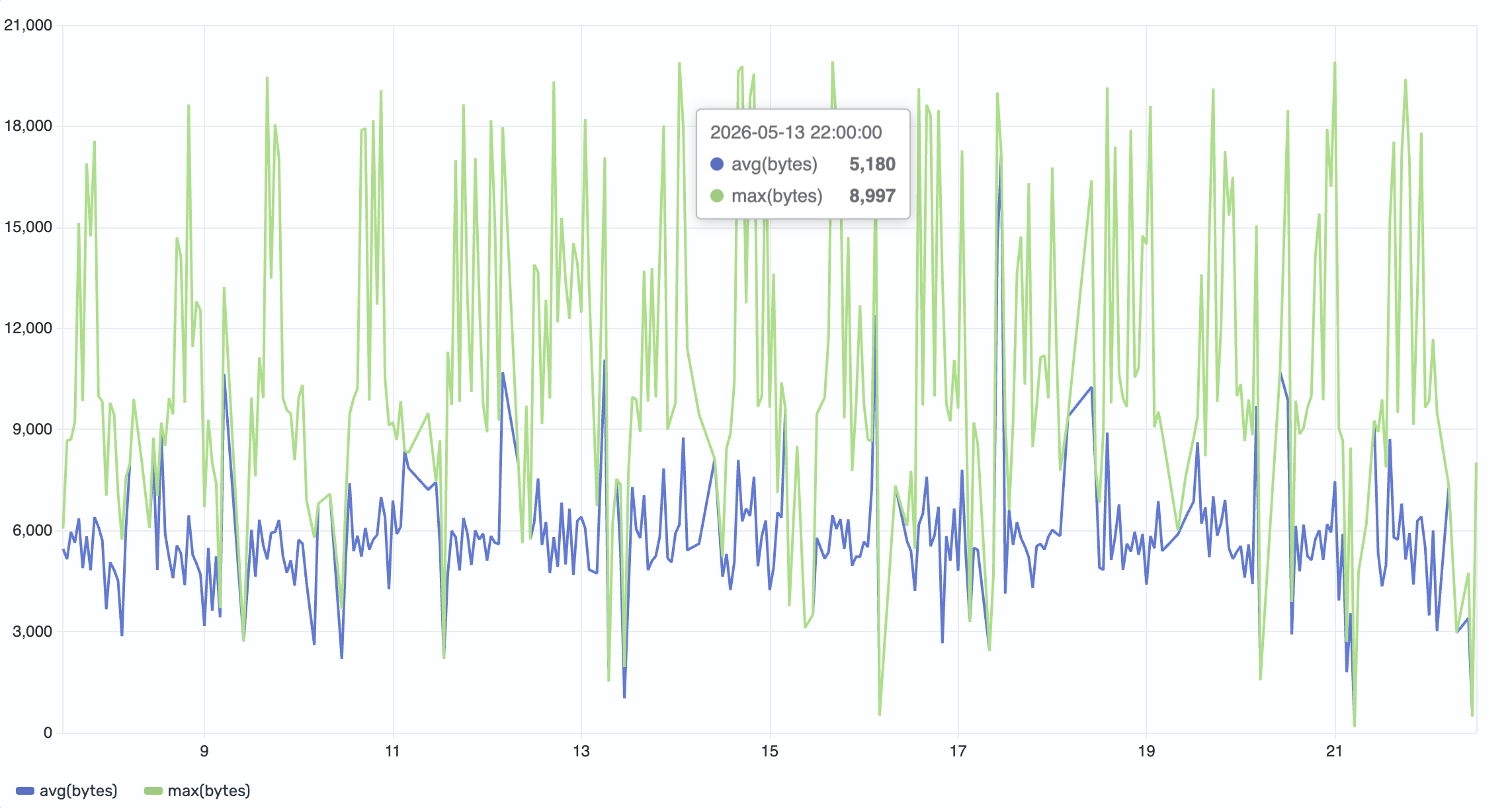
When your query computes multiple metrics, you can plot them all on the same chart:
source = opensearch_dashboards_sample_data_logs | stats avg(bytes), max(bytes) by SPAN(@timestamp, 1h)
This query returns two numeric fields: avg(bytes) and max(bytes). Select avg(bytes) and max(bytes) in the Y-Axis field list to plot them as separate lines on the same scale.
The result shows both the average and maximum byte values over time, as shown in the following image.
Secondary Y-Axis (dual axis)
When two metrics have significantly different scales, plotting them on the same axis can make one appear flat. Use the Y-Axis (2nd) field to give the second metric its own scale on the right side of the chart.
Using the same query as the previous example:
source = opensearch_dashboards_sample_data_logs | stats avg(bytes), max(bytes) by SPAN(@timestamp, 1h)
This time, assign avg(bytes) to the Y-Axis and max(bytes) to the Y-Axis (2nd).
The result is a dual-axis chart. The left axis scales to avg(bytes) and the right axis scales to max(bytes), as shown in the following image.
Configuring a line chart
You can configure the following settings in the configuration panel.
Fields
In the Fields section, configure the fields displayed on each axis.
| Field | Description |
|---|---|
| X-Axis | Select a date or numeric field for the horizontal axis. This field defines the buckets along which data is plotted (for example, SPAN(@timestamp, 1h)). |
| Y-Axis | Select one or more numeric fields to plot as separate lines. When multiple fields are selected, each renders as its own line on the same scale. |
| Y-Axis (2nd) | Select a numeric field to overlay on a secondary axis with its own scale. Use this when two metrics have different units or magnitudes. |
| Color | Select a categorical field to split the data into multiple series, each rendered in a different color. |
Split
In the Split by dropdown list, select a field to split the chart into separate elements by value. For more information, see Split.
Line
The following table describes the line style settings.
| Setting | Description |
|---|---|
| Style | Controls whether the chart displays lines with dots (Default), lines without dots (Line only), or dots without connecting lines (Dots only). |
| Interpolation | Determines how points are connected. Straight draws direct lines between points. Smooth applies a curve. Stepped creates a staircase pattern, useful for data that changes at discrete intervals. |
| Line width | Sets the thickness of the lines in pixels. Supports values in the 1–10 range. |
| Show current time marker | When enabled, shows a vertical marker on the chart indicating the current time. |
Thresholds
For information about configuring thresholds, see Thresholds.
Axes
The X-axis and Y-axis share the same configuration options. For more information, see Axes.
Tooltip
Toggle the Show tooltip selector to enable or disable tooltips.