Standard options
Standard options control how numeric values are formatted in a visualization. Use them to set units, custom suffixes, decimal precision, and, for charts with a scale, minimum and maximum values.
Supported chart types
The following table lists the standard options supported by each visualization type.
| Visualization type | Minimum and maximum | Units | Unit suffix | Decimals |
|---|---|---|---|---|
| Area chart | Yes | Yes | Yes | Yes |
| Bar chart | Yes | Yes | Yes | Yes |
| Bar gauge chart | Yes | Yes | Yes | Yes |
| Gauge chart | Yes | Yes | Yes | Yes |
| Heatmap | No | Yes | Yes | Yes |
| Histogram | Yes | Yes | Yes | Yes |
| Line chart | Yes | Yes | Yes | Yes |
| Metric chart | No | Yes | Yes | Yes |
| Pie chart | No | Yes | Yes | Yes |
| Scatter plot | Yes | Yes | Yes | Yes |
| State timeline | No | No | No | No |
| Table | No | No | No | No |
Options
The following table describes the available standard options.
| Setting | Description |
|---|---|
| Min | The lower bound of the value scale. For Cartesian charts, this sets the value-axis minimum. For gauge and bar gauge charts, this sets the scale minimum. |
| Max | The upper bound of the value scale. For Cartesian charts, this sets the value-axis maximum. For gauge and bar gauge charts, this sets the scale maximum. |
| Units | The unit displayed with the value. Some units, such as currency symbols, appear before the value. Other units appear after the value or scale the value automatically. |
| Unit suffix | Custom text appended after the unit or value, for example, /sec. Use this setting to show custom units or rates. |
| Decimals | The number of decimal places to display. Leave this setting empty to use automatic precision. |
Units
The Units menu groups common formats such as numbers, percentages, currencies, data units, time units, mass units, and length units.
For unit groups that support scaling, the selected unit acts as the input unit, and the visualization converts the value to the most readable unit in the same group. For example, if Units is set to bytes(B), a value of 1000 is displayed as 1 KB.
Some units only change the displayed label or symbol. For example, a currency unit can display a symbol before the value, while a percentage unit appends %.
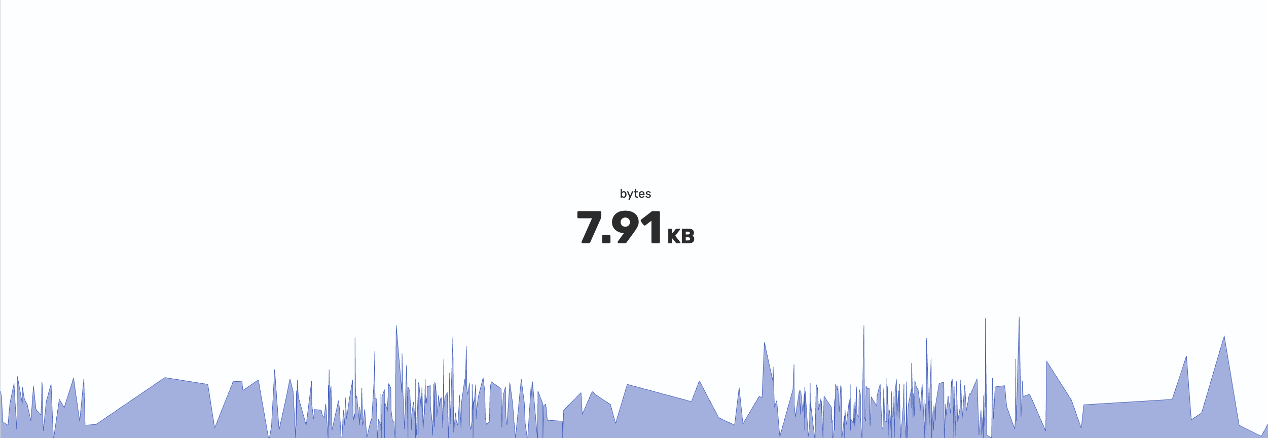
The following metric chart displays an underlying value of 7911 with Units set to bytes(B).
Unit suffix
Use Unit suffix to append custom text after the formatted value. This is useful for rates or custom units.
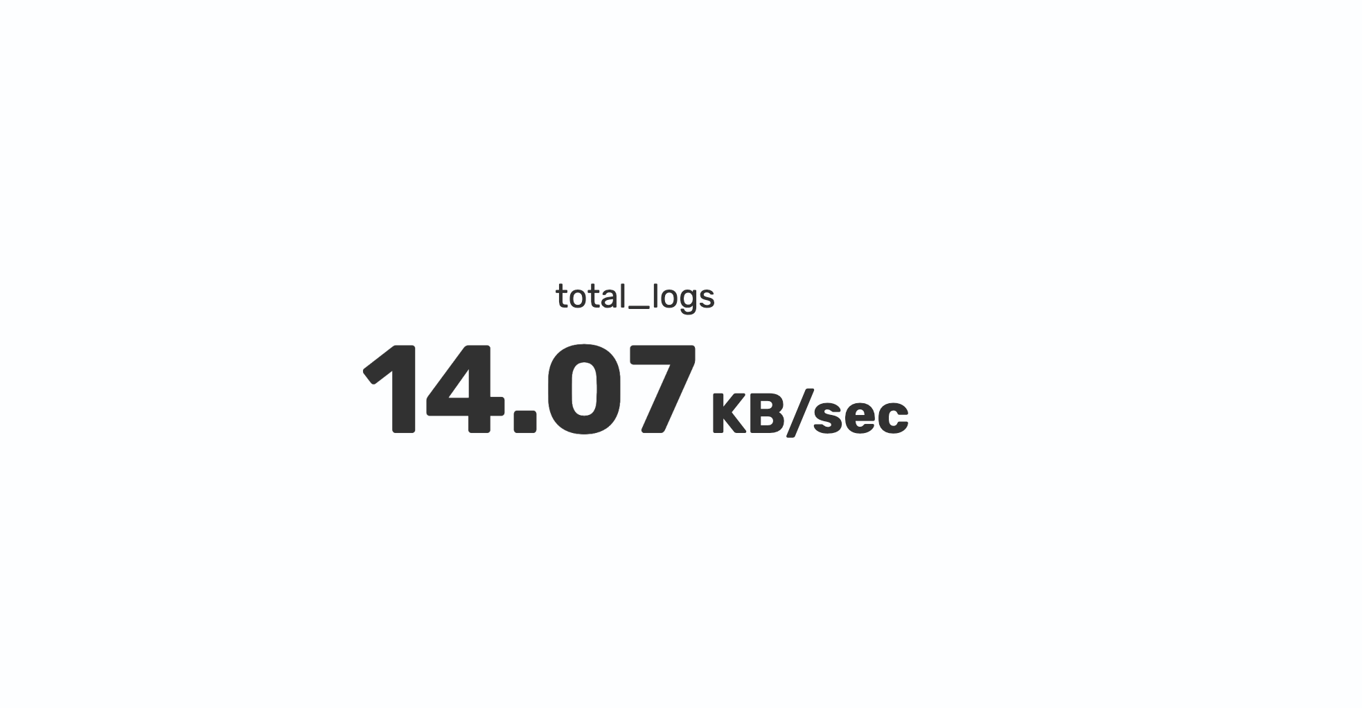
For example, to display byte rates in a metric chart, set Units to bytes(B) and set Unit suffix to /sec. With Decimals set to automatic precision, an underlying value of 14074 total bytes is displayed as 14.07 KB/sec.
Decimals
Use Decimals to control numeric precision. For example, enter 2 to display two decimal places. Leave this setting empty to let the visualization choose the precision automatically.
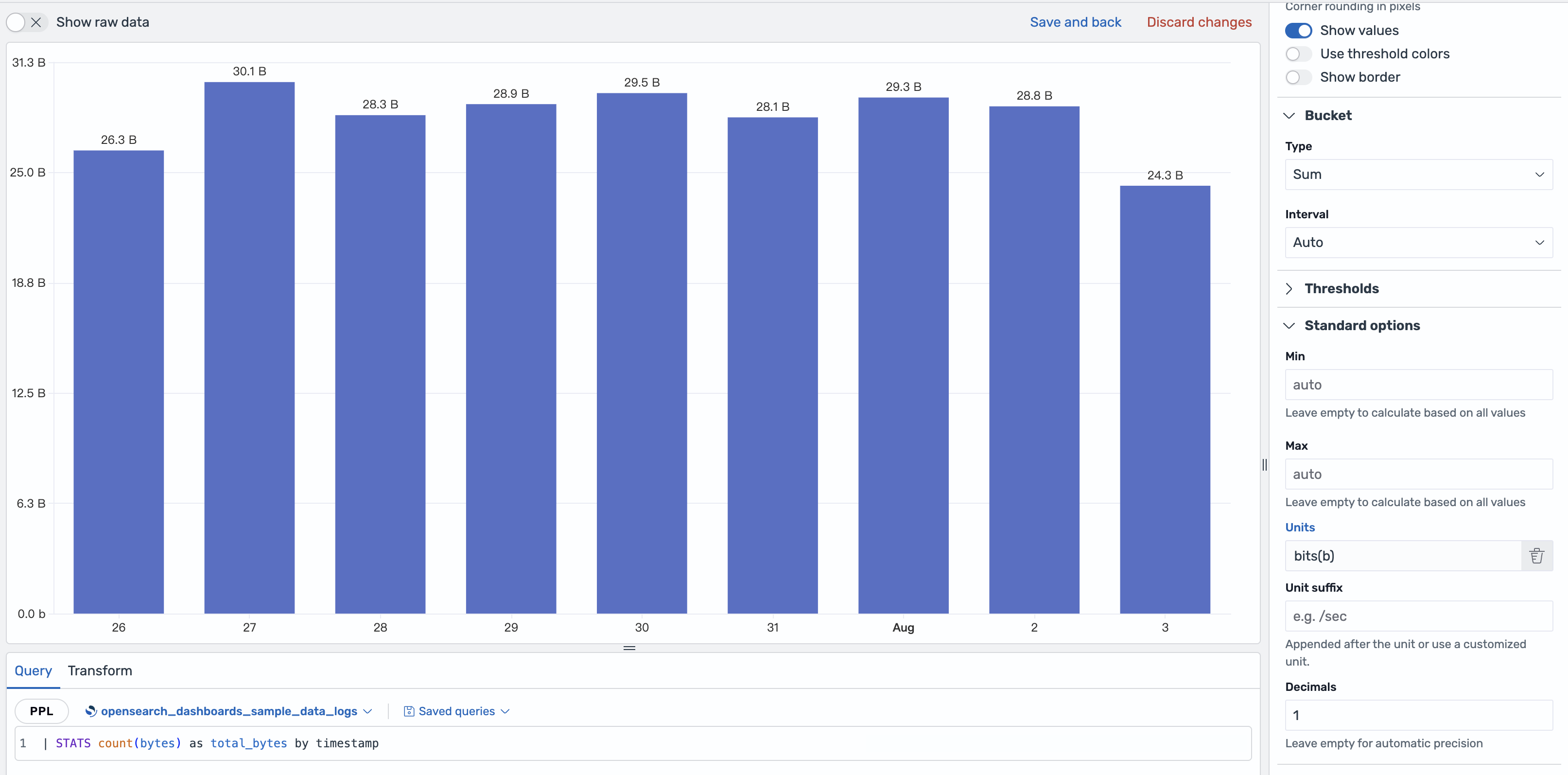
The following bar chart has Units set to bits(b) and Decimals set to 1. For Cartesian charts, unit formatting also applies to axis labels.
Minimum and maximum
Use Min and Max to define the displayed value range.
For Cartesian charts, such as area, bar, histogram, line, and scatter charts, Min and Max set the value-axis range.
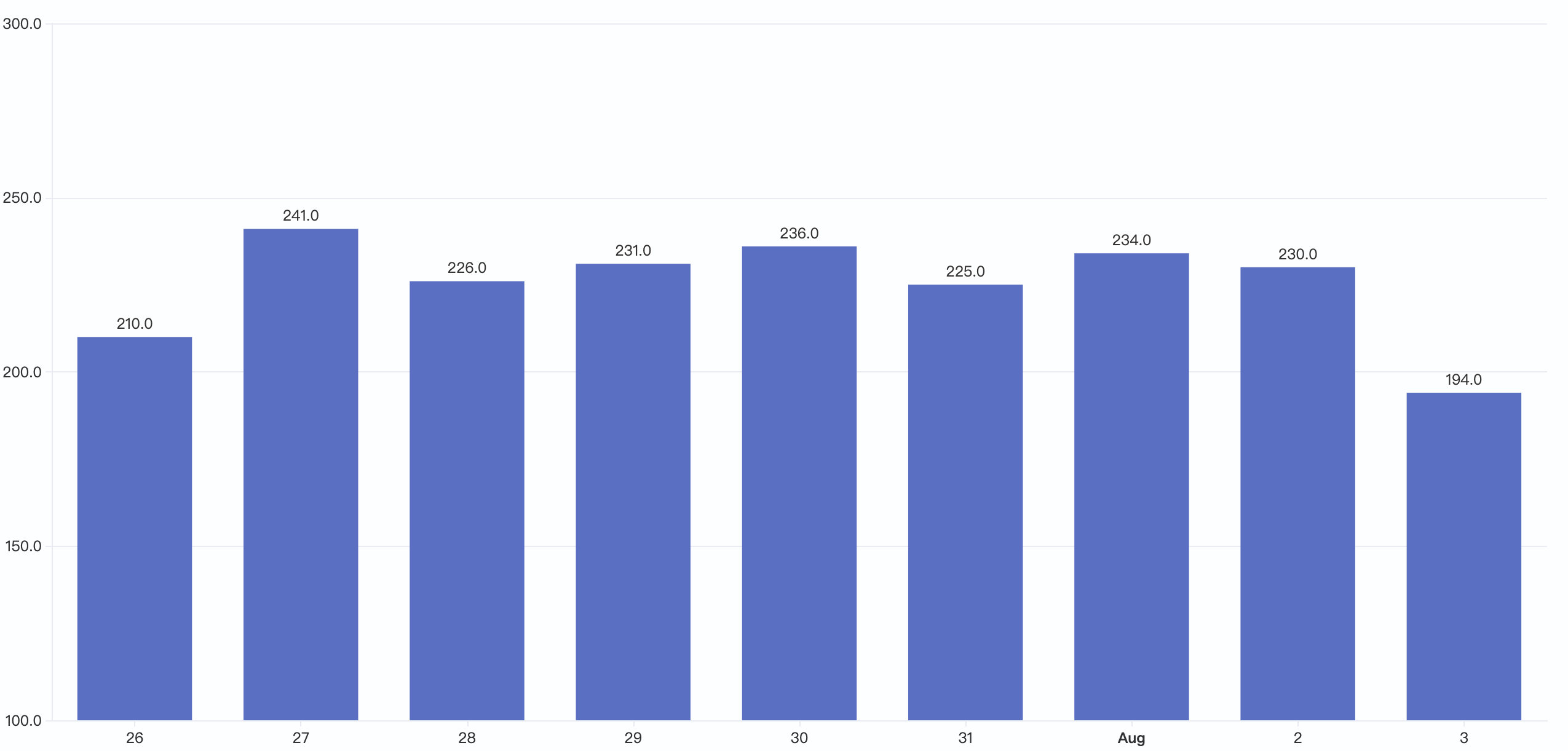
The following bar chart has Min set to 100 and Max set to 300. The bar baseline starts at 100, so values below this range are clipped, and the value axis extends to 300.
For gauge and bar gauge charts, Min and Max define the scale boundaries. Thresholds and filled ranges are calculated within this range. When left empty, the visualization calculates the range automatically.
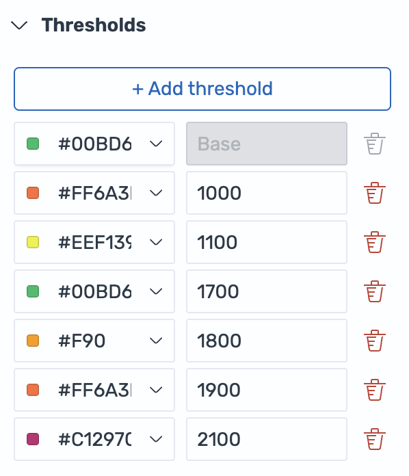
The following image shows a threshold configuration with a base color and steps at 1000, 1100, 1700, 1800, 1900, and 2100.
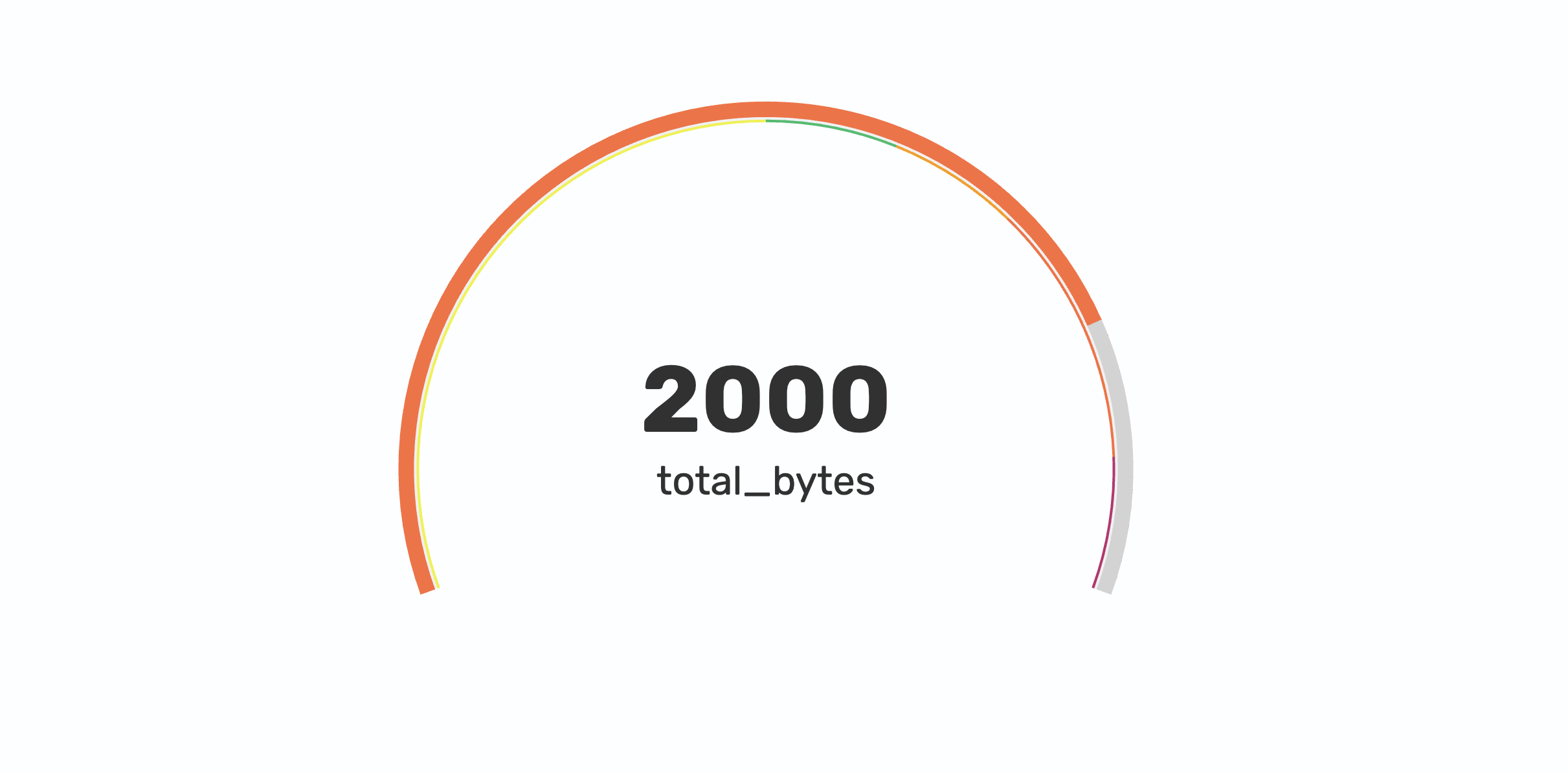
The following gauge chart uses that threshold configuration with a value of 2000, Min set to 1200, and Max set to 2200. The gauge scale uses this range to position the threshold segments.